GL Bader


 1
1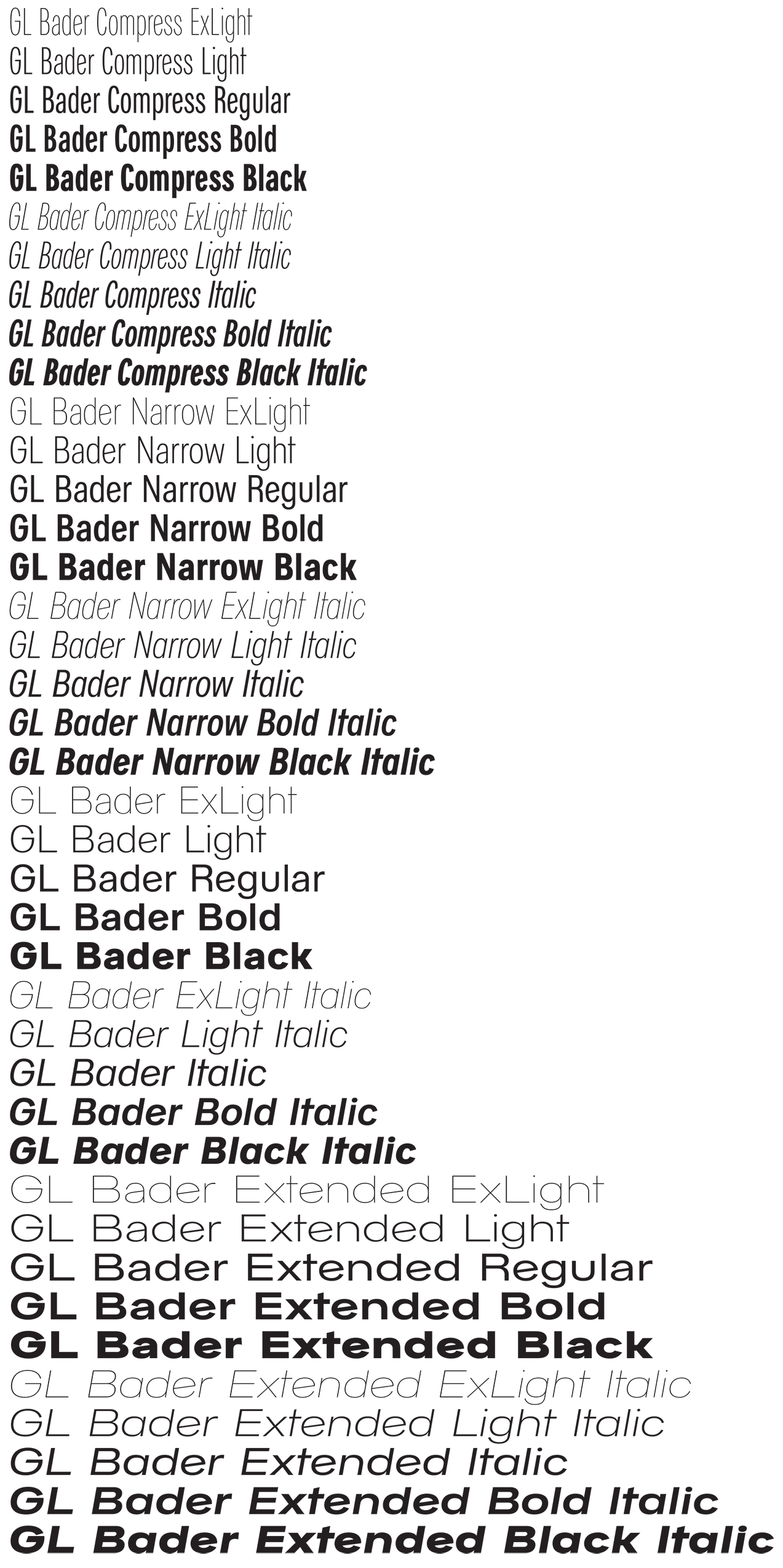 2
2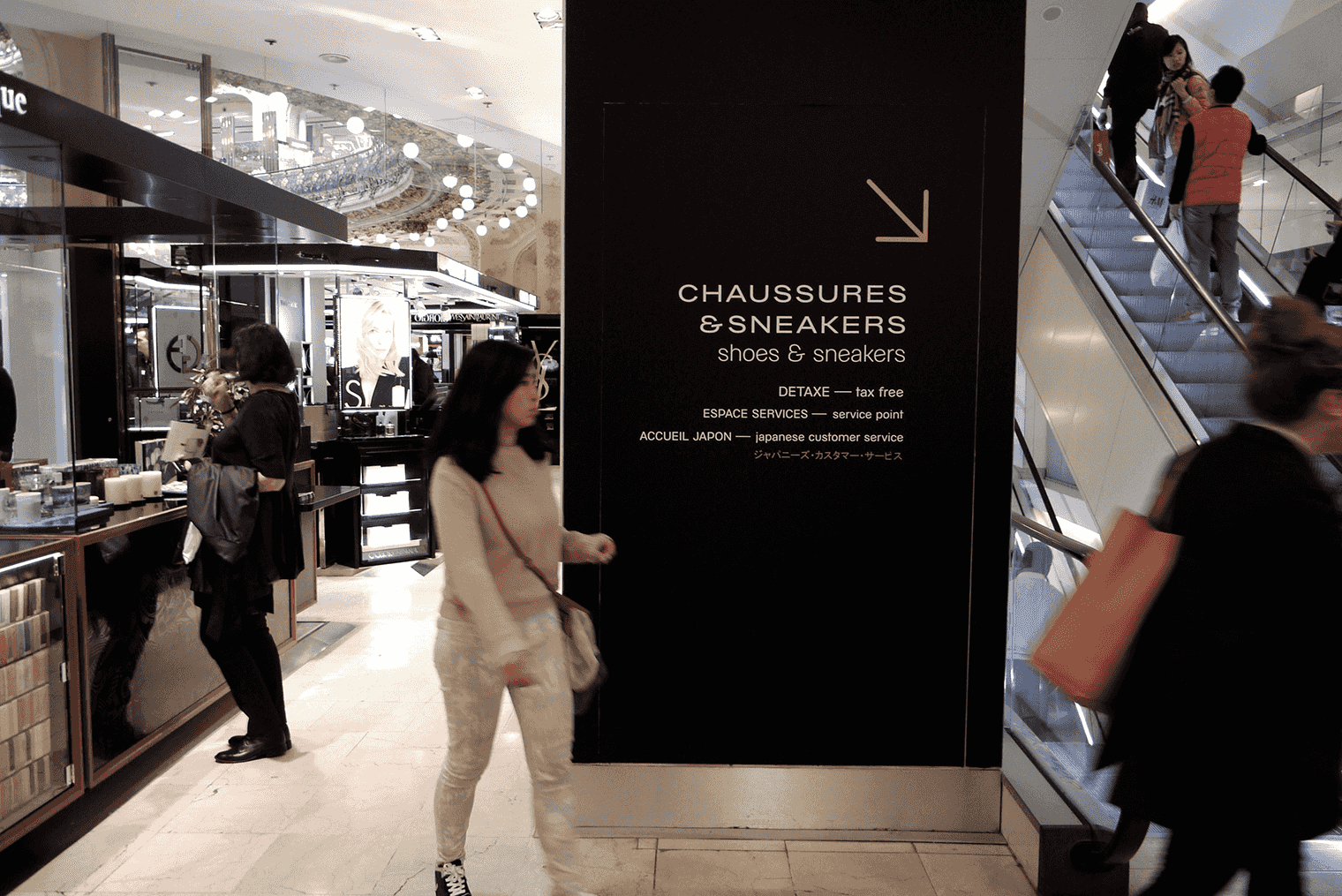 3
3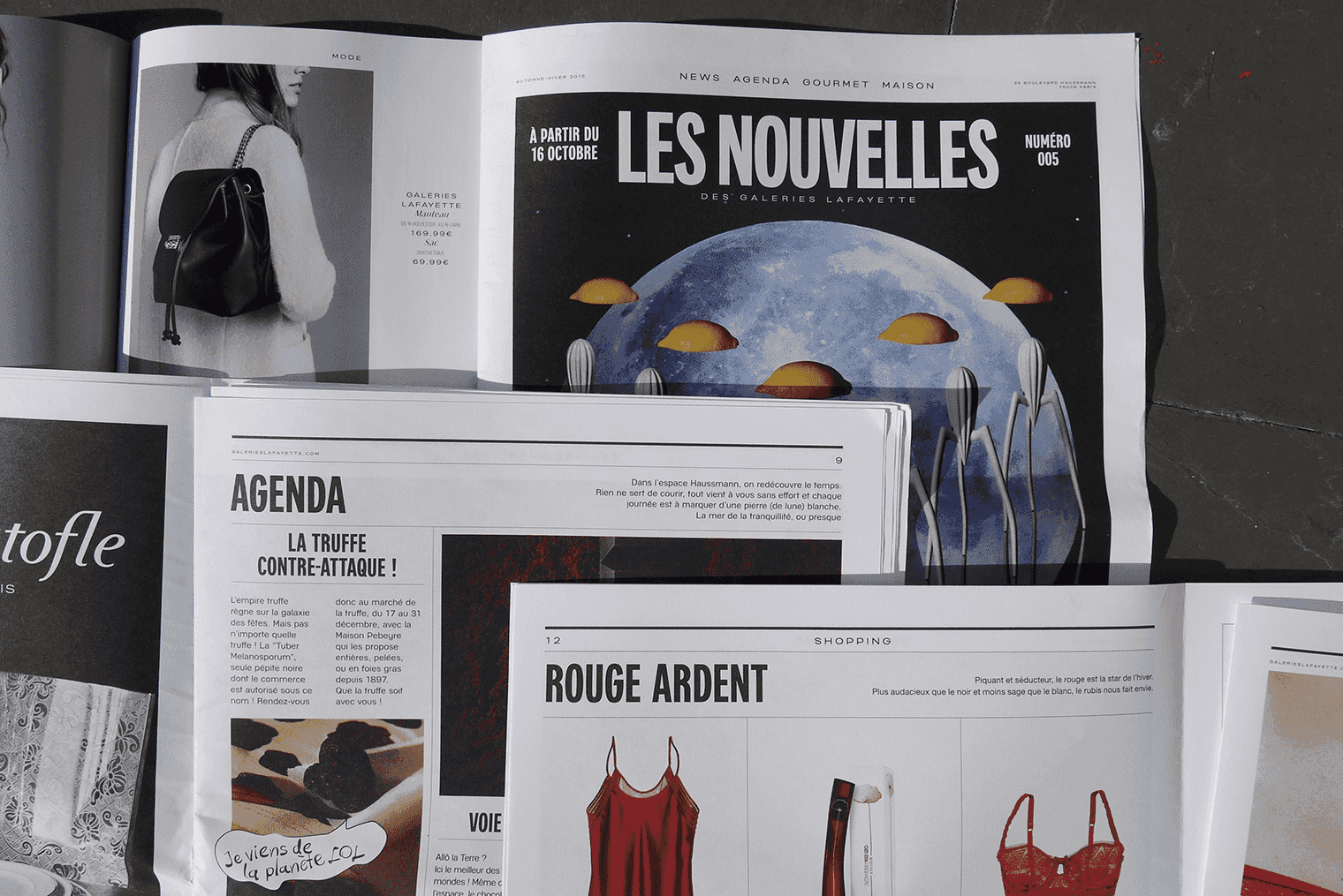 4
4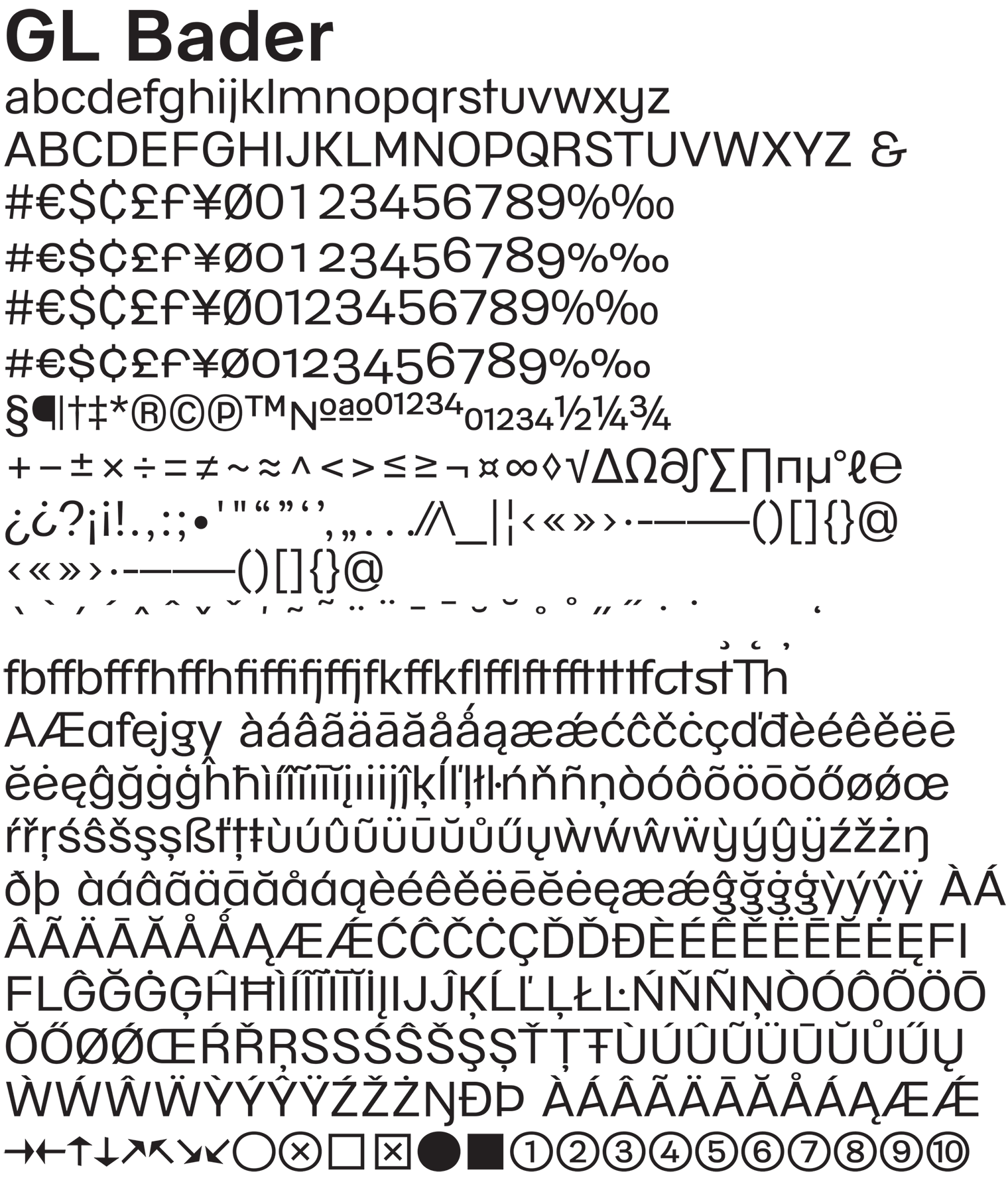 5
5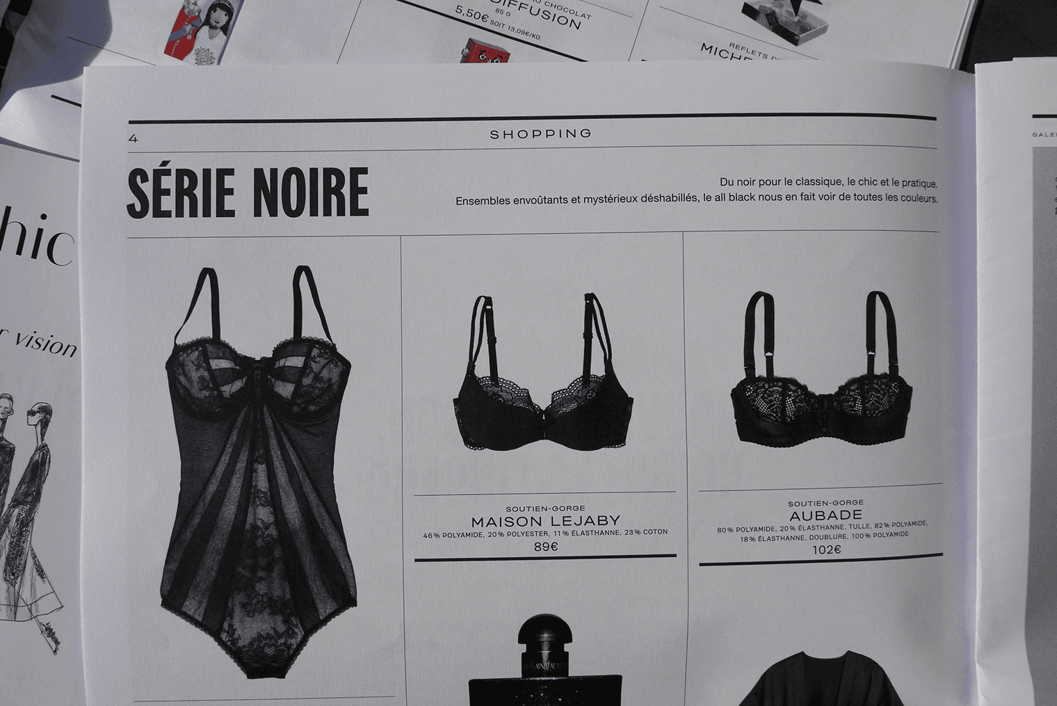 6
6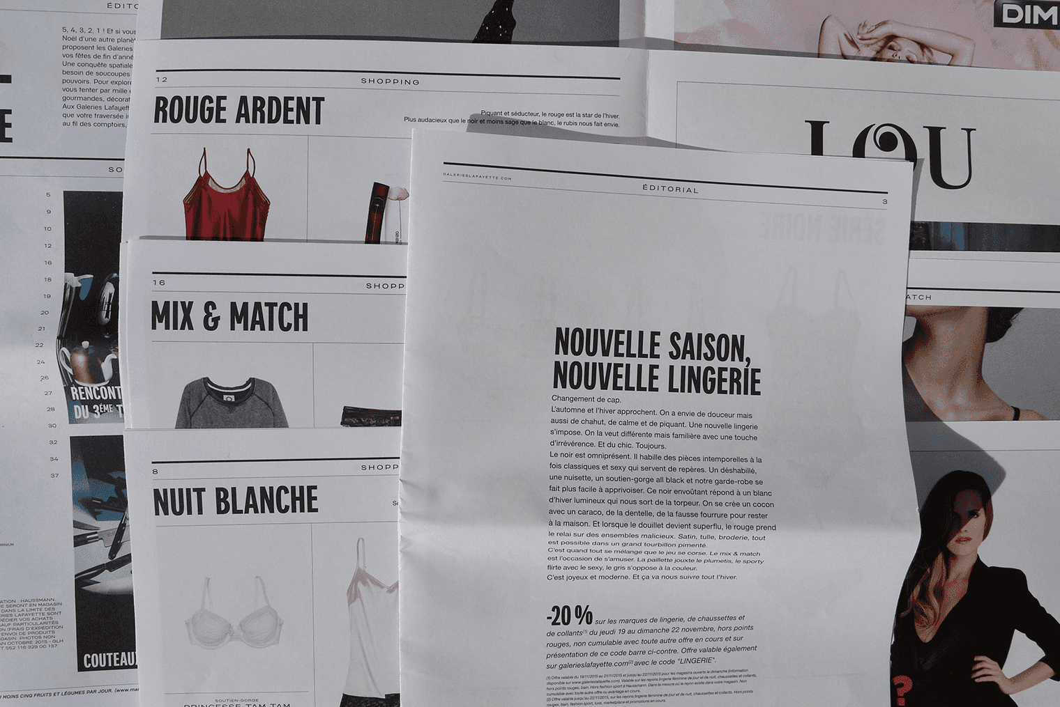 7
7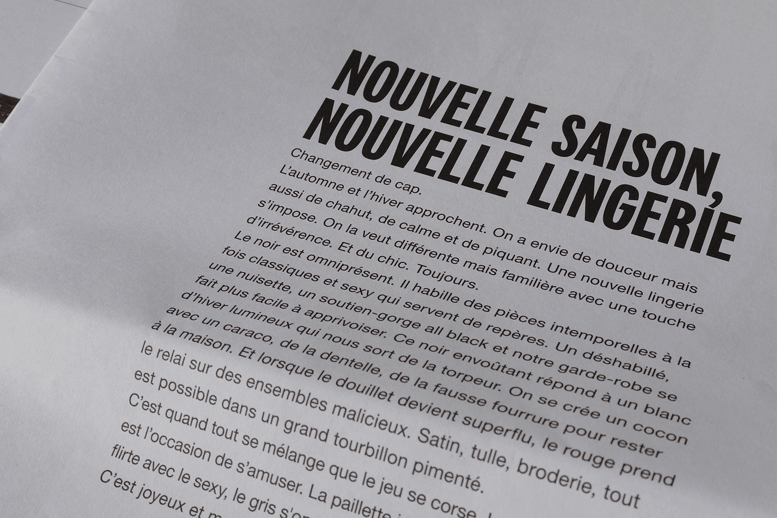 8
8 9
9We built a tool to radically strengthen Galeries Lafayette brand in today’s world
The GL Bader is rooted in the long history of the Galeries Lafayette who started in 1894 when Théophile Bader and Alphonse Kahn opened their first store “At Galeries Lafayette” in Paris. This neo-grotesque sans serif family, along the GL Kahn accompany the new visual identity and communication campaign launched in September 2015. The design of the GL Bader was built according to a synthesis of research in the archives of Galeries Lafayette, including the brand created by Peter Knapp and Jean Widmer in 1958. The large range of widths and weights of GL Bader is also influenced by the variety of styles of Parisian shop signs from the early twentieth century.
While the GL Bader was designed in various widths and weights, the objective is to meet the needs of Galeries Lafayette. GL Bader and GL Kahn are built to suggest mixtures and contrasts allowing specific atmospheres designed for the different departments: woman fashion, man fashion, children, beauty, home and gourmet. Built separetly, but on similar proportions to be easily used jointly, few glyphs feature similar ideas through the two families: y built from a u; e with a little diagonal bar, specific R tail, etc. The y is also very useful in the context of the word mark Galeries Lafayette, as it bring a regularity to the last word.
The GL Bader is a typeface family in four widths and weights, which for the first time in the history of the department store will define the multifaceted identity territory through the varied and inventive uses.
Client: Galeries Lafayette.
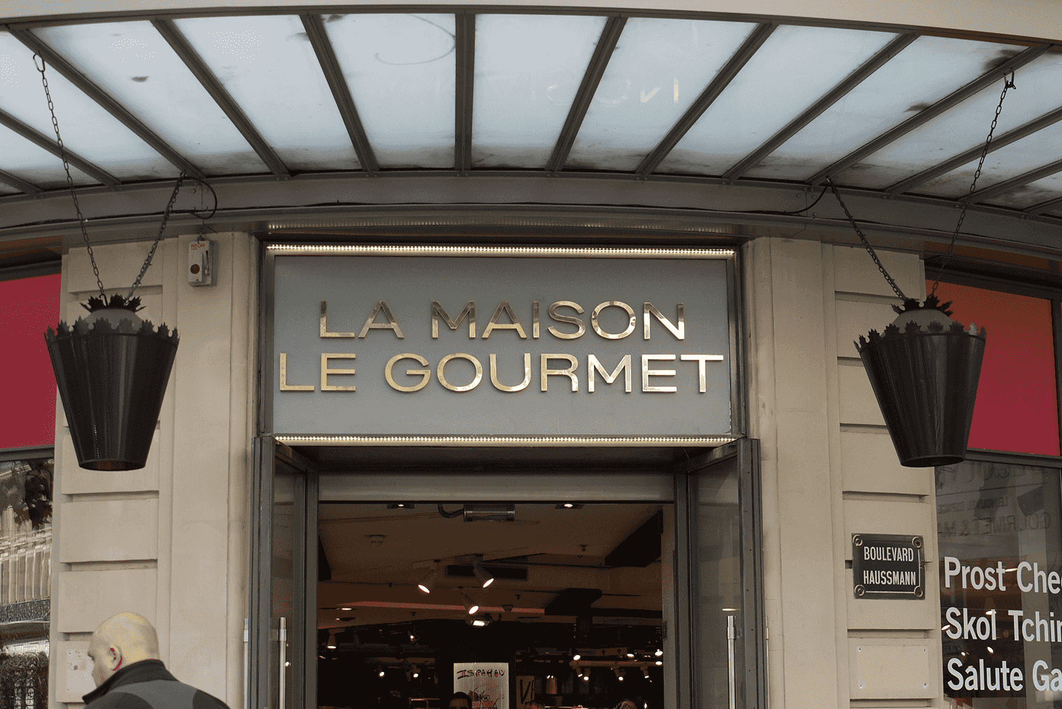
1. Galeries Lafayette, La Maison, le Gourmet
2. Galeries Lafayette, signage at Hausmann
3. to 7. Les Nouvelles, publication
Copyright
Typeface family including GL Bader and GL Kahn is designed for an exclusive use by Galeries Lafayetteand will never be publicly available.