Parisine


 1
1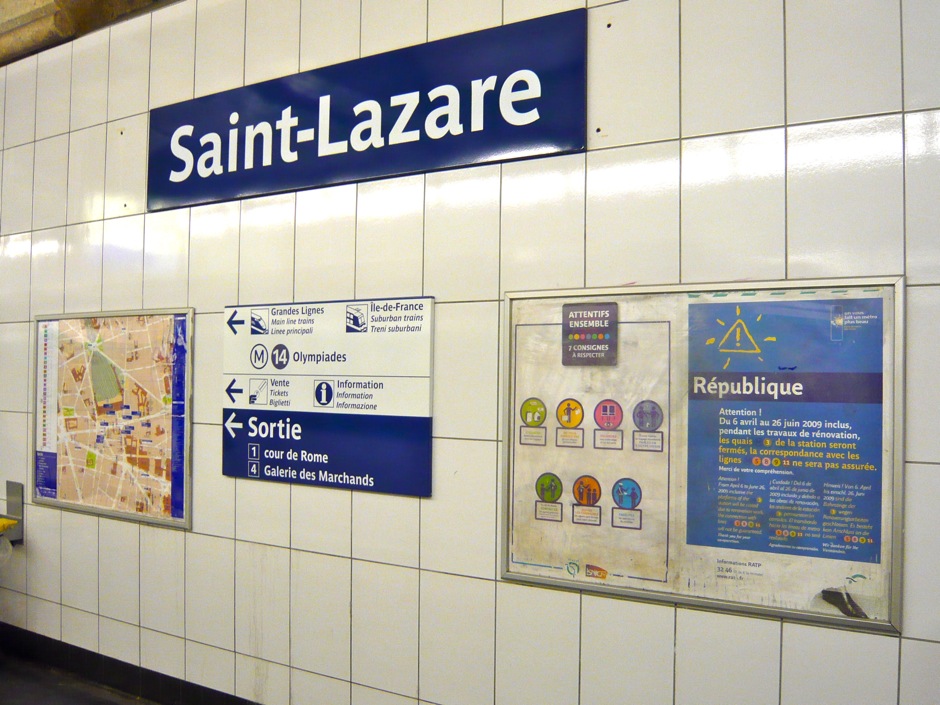 2
2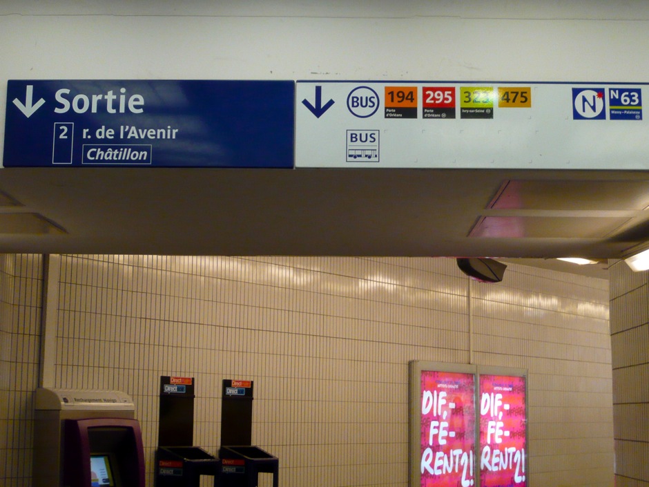 3
3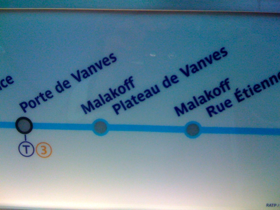 4
4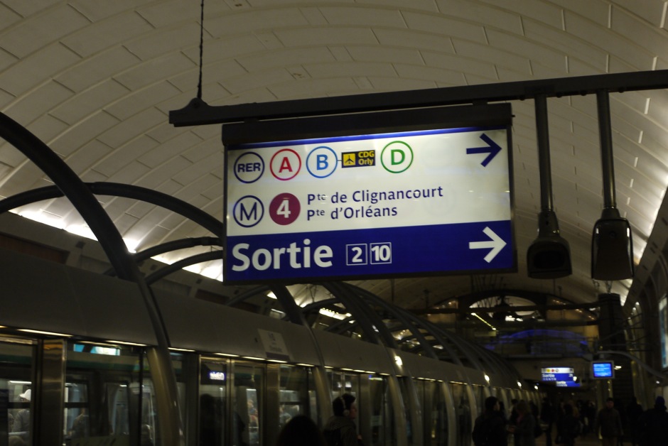 5
5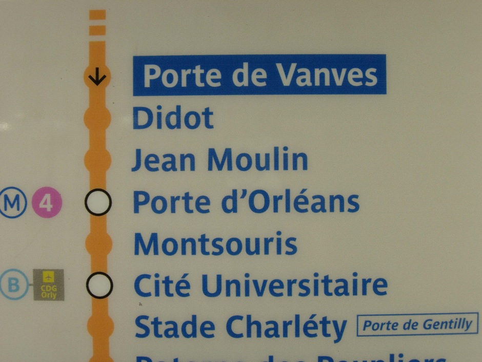 6
6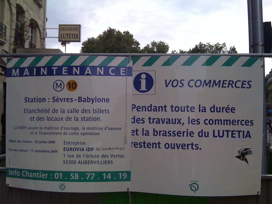 7
7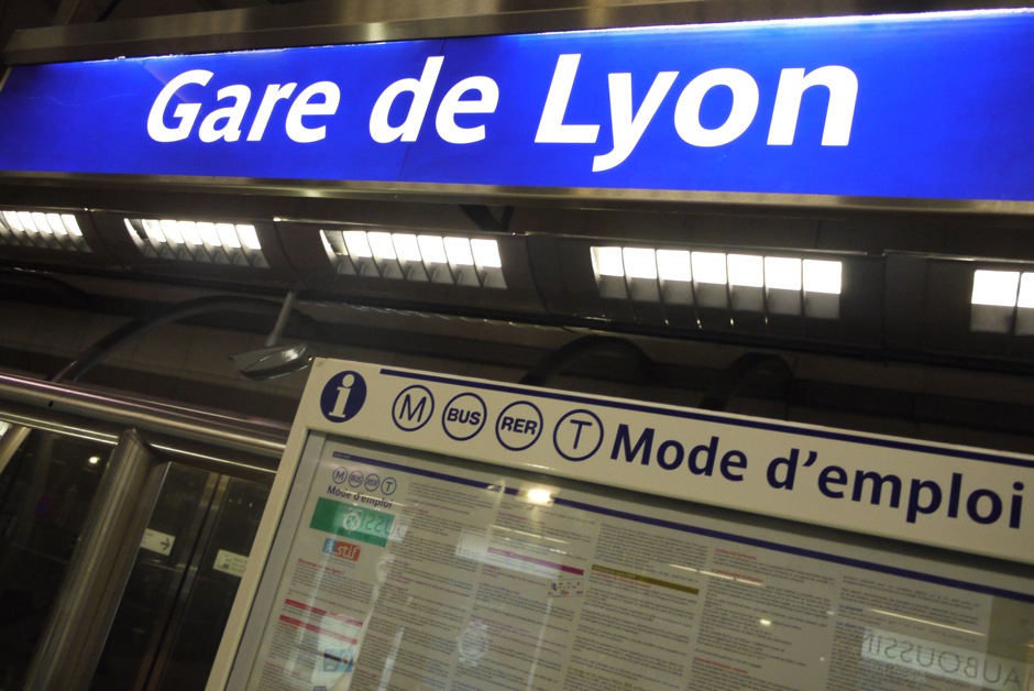 8
8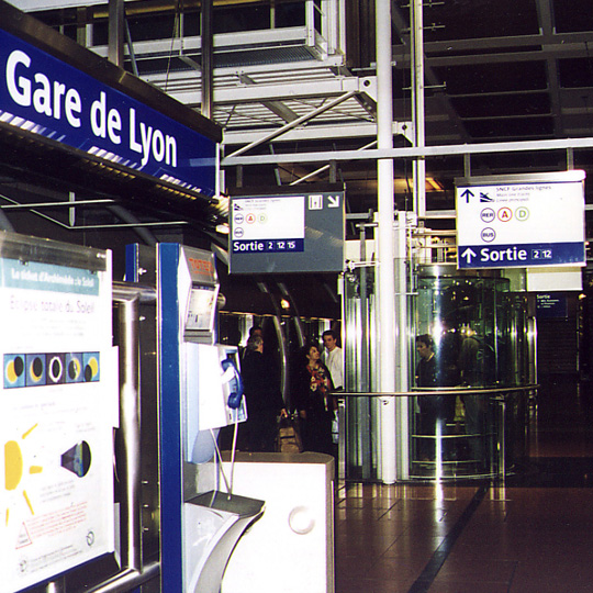 9
9Parisine
Parisine has been designed for Ratp to solely fulfil the unique needs of signage legibility. Later, the family was revised and extended for use in maps and external communication. Not connected with RATP, Parisine Plus appeared also in 1999. Much later, Parisine Office was created for Ratp’s internal and external communication. Now, the next step has been to create an OpenType version of the original Parisine. The glyph set has surpassed the usual 250 to a size of more than 700, which allows for the composition of numerous Latin-script European languages. Along with small caps available in all weights, 4 sets of figures are provided–lining and oldstyle–in tabular and proportional widths, depending on the version. Miniscule lowercase and figures for automated fractions, are also included.
Head of Design: Yo Kaminagai.
Client: RATP.
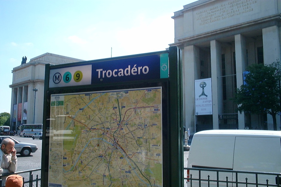
1. to 9. Parisine typeface in use in RATP public transports in Paris.
→ About Parisine
→ Parisine helps Parisians catch the right bus
→ Parisine Plus and its fancy type effects
Copyright
Parisine is publicly available through Typofonderie and not limited to RATP use.