Sephora


 1
1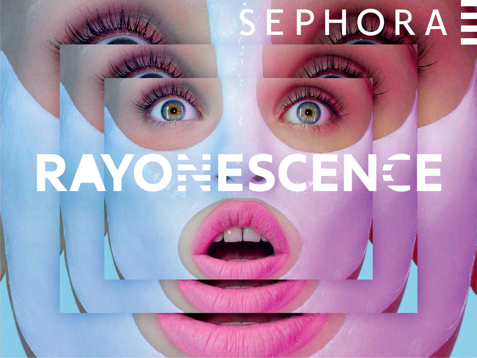 2
2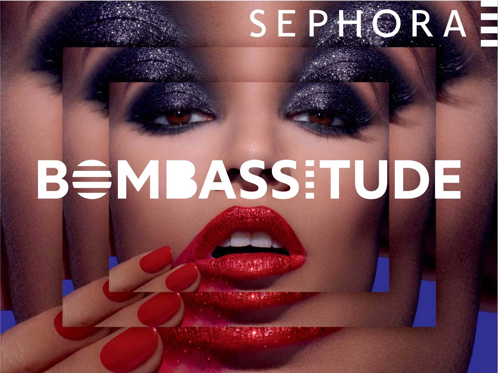 3
3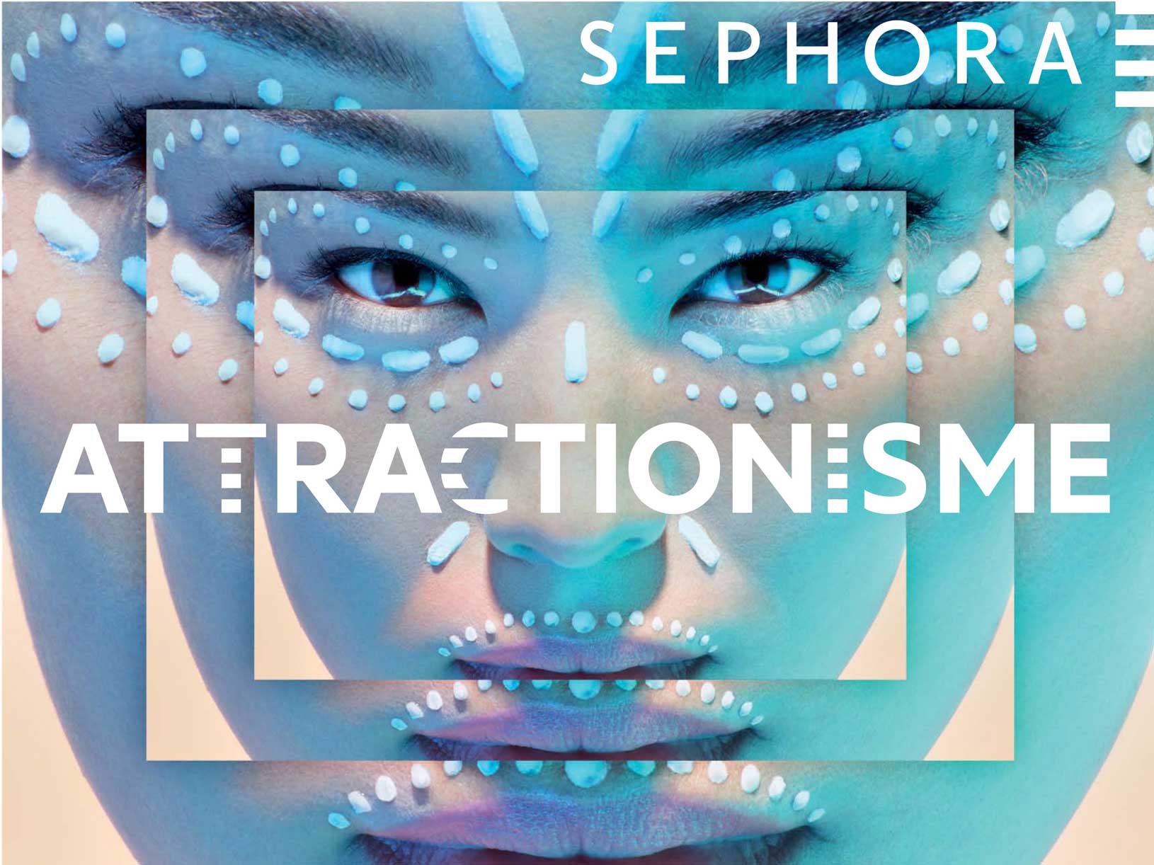 4
4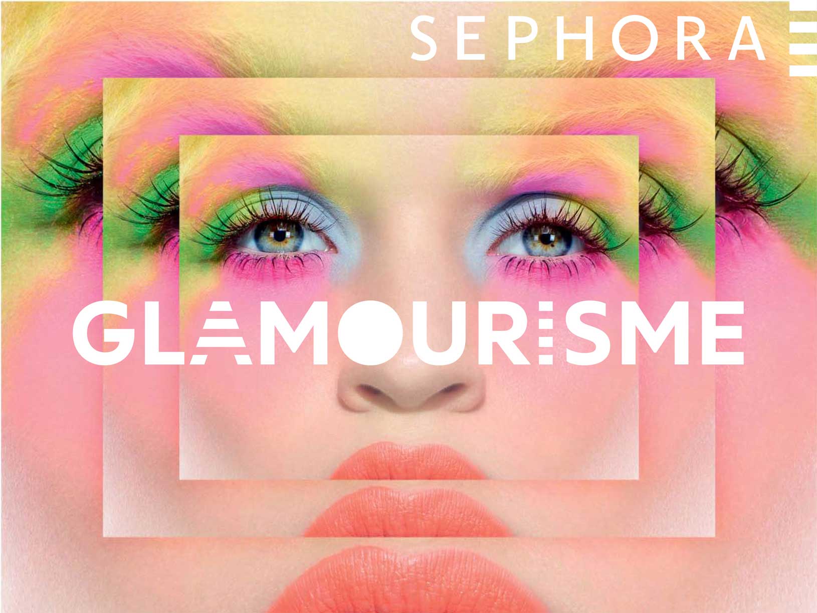 5
5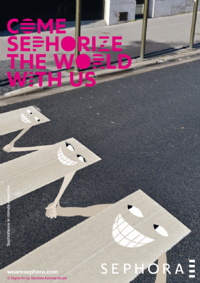 6
6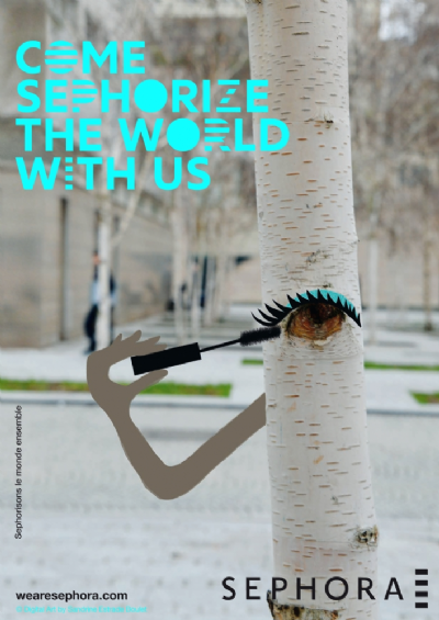 7
7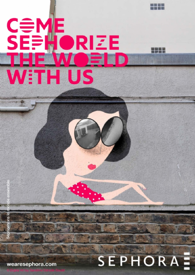 8
8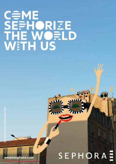 9
9Sephora
Sephora bespoke typeface is the result of great collaboration between BETC agency and ZeCraft. Sephora is one of the leading perfume and cosmetics stores in France who holds a long-standing presence in the beauty industry around the world. The french advertising company BETC strengthen the visual identity using black & white stripes already employed, but this time on the letters used to set company messages. They tested this idea with Century Gothic.
Our work, at ZeCraft was to highlighting the stripes through the design of different typeface design proposals. Therefore, we produced many weights testings, diverse endings in order to integrate the stripes well. The main things was to produce shapes who work well in every situations. This principle could not live properly without a mechanism based on OpenType features designed to be simple as possible to use. Simplicity was crucial for the users, from Sephora in house use to BETC agency. Designed by Stéphane Elbaz at ZeCraft, Sephora typeface was designed in Latin, Greek and Cyrillic to provide broad support for languages of the countries where Sephora stores are implemented.
Creative Director: Florence Bellisson.
Client: BETC.
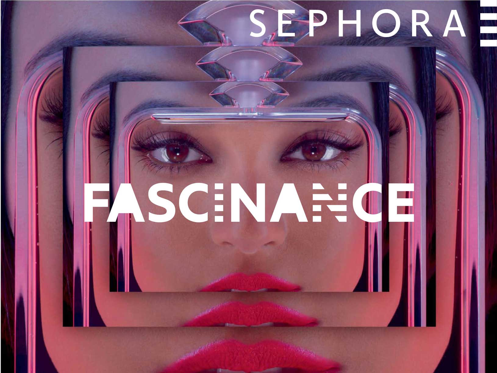
1. to 5. Sephora in use on 2012 Campaign by BETC.
6. to 9. Sephora in use on 2013 Campaign by BETC with Sandrine Estrade.
Copyright
Typeface designed for an exclusive use by Sephora and will never be publicly available.