Away


 1
1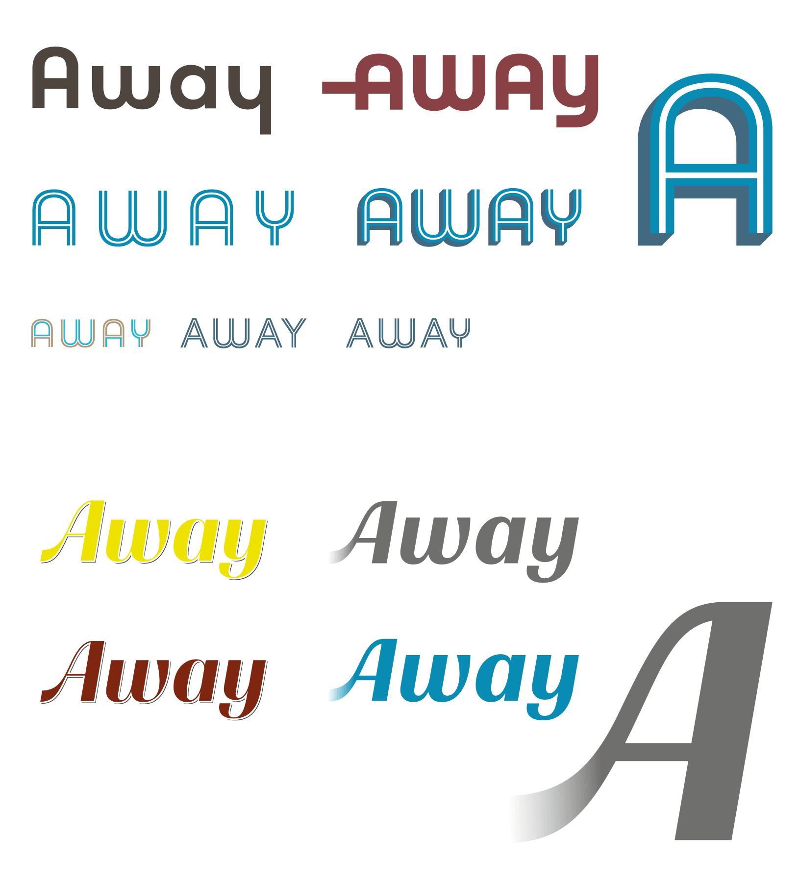 2
2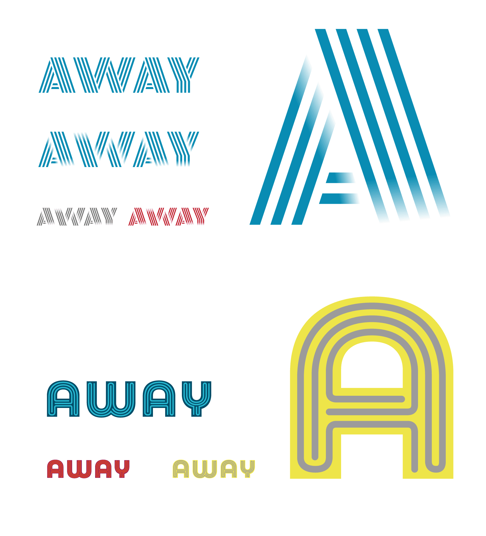 3
3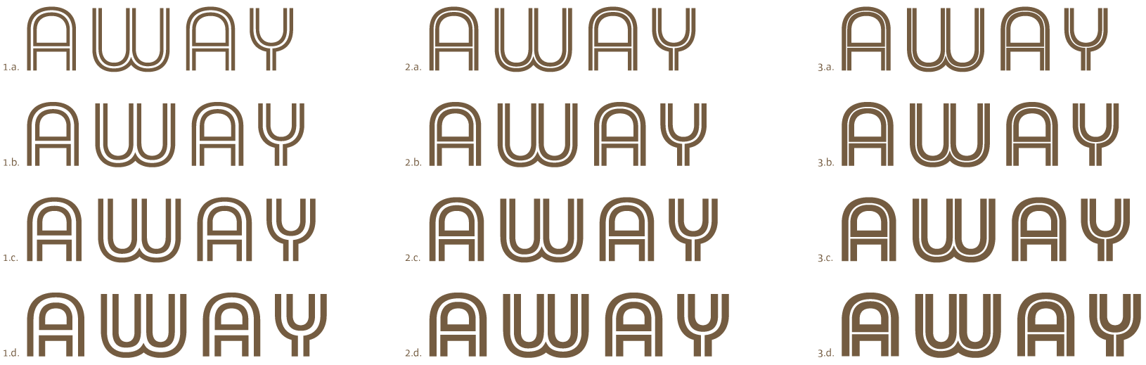 4
4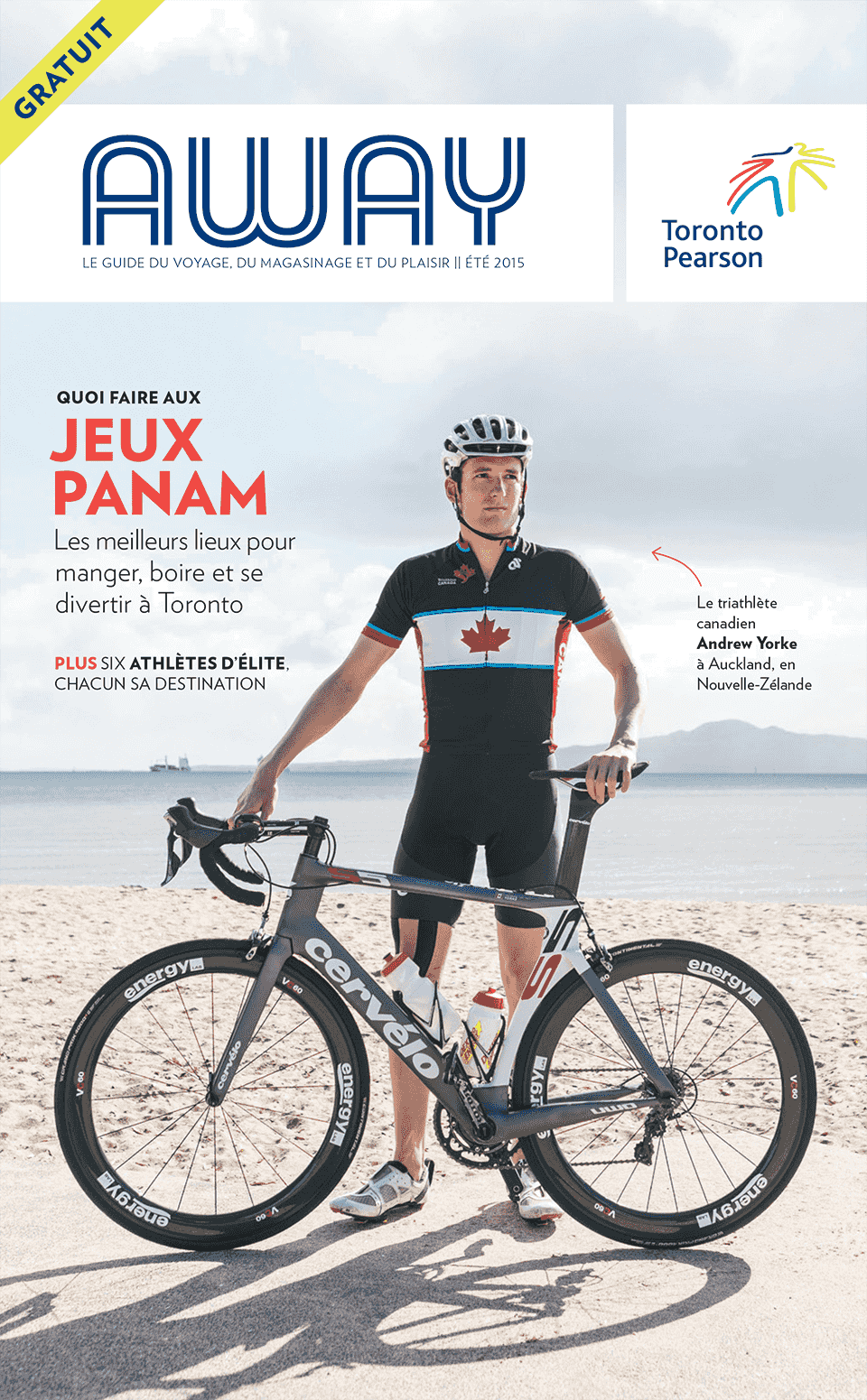 5
5 6
6 7
7An Inline rounded masthead to fit the concept of the new magazine
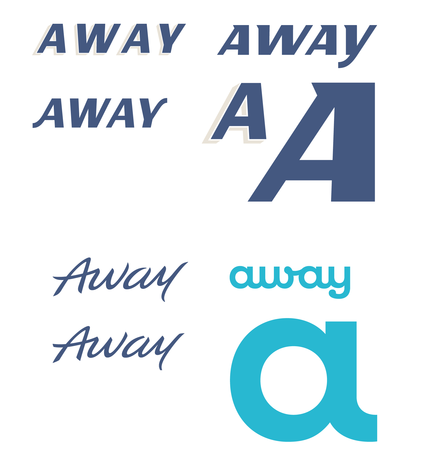
We worked with Una Janicijevic on the nameplate design of the quarterly magazine for passengers at Toronto Pearson International Airport. The concept is based on old signs seen on American Diners, who built the North American way of life. For the first presentation we’ve worked on several concepts presented here after. When the initial concept was selected, we searched for the best weight.
Creative Director: Una Janicijevic
Client: St Joseph Medias
Project: Away, the Toronto Pearson airport magazine
1. to 3. Earlier proposals from which the logotype concept was selected.
4. Towards the final logotype: Weight optimisations.
5. to 7. Cover designed by Una Janicijevic.
See online version of Away magazine