Gloria Vanderbilt


 1
1 2
2 3
3 4
4Gloria Vanderbilt
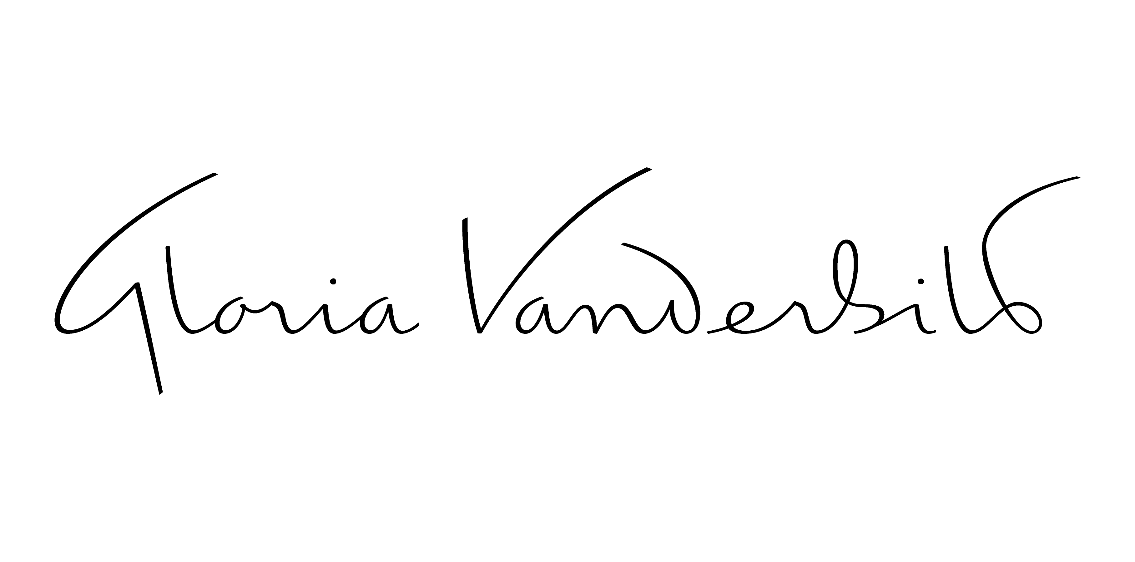
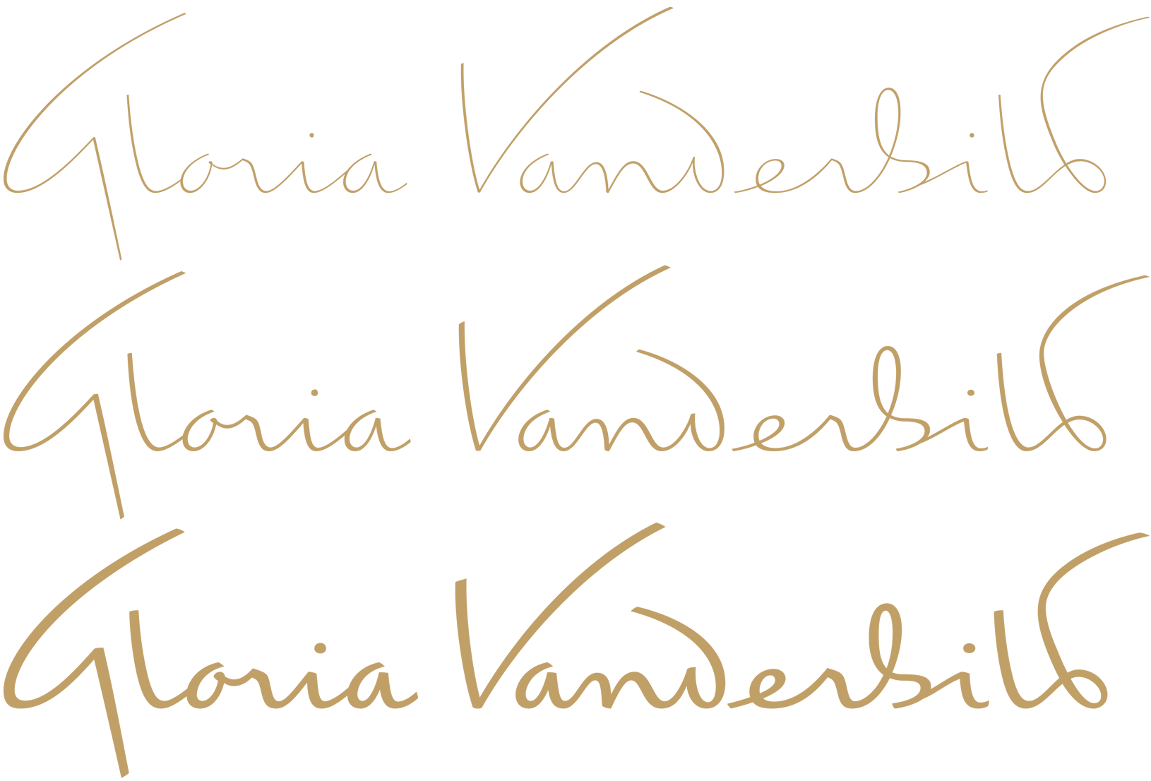
Logotype Gloria Vanderbilt, for AR New York, 2004. The historic version wasn’t very legible, we’ve rebuild it from writing sources, to bring back the right shapes. The new drawing based on writing is more legible, and now connections and ligatures make sense. Then, after various steps, discussions, a final artwork was finalised, expended into three variations depending the size of use.
Client: AR New York
Project: Gloria Vanderbilt
1. Gloria Vanderbilt: historic version.
2. Gloria Vanderbilt: three optical sizes designed.
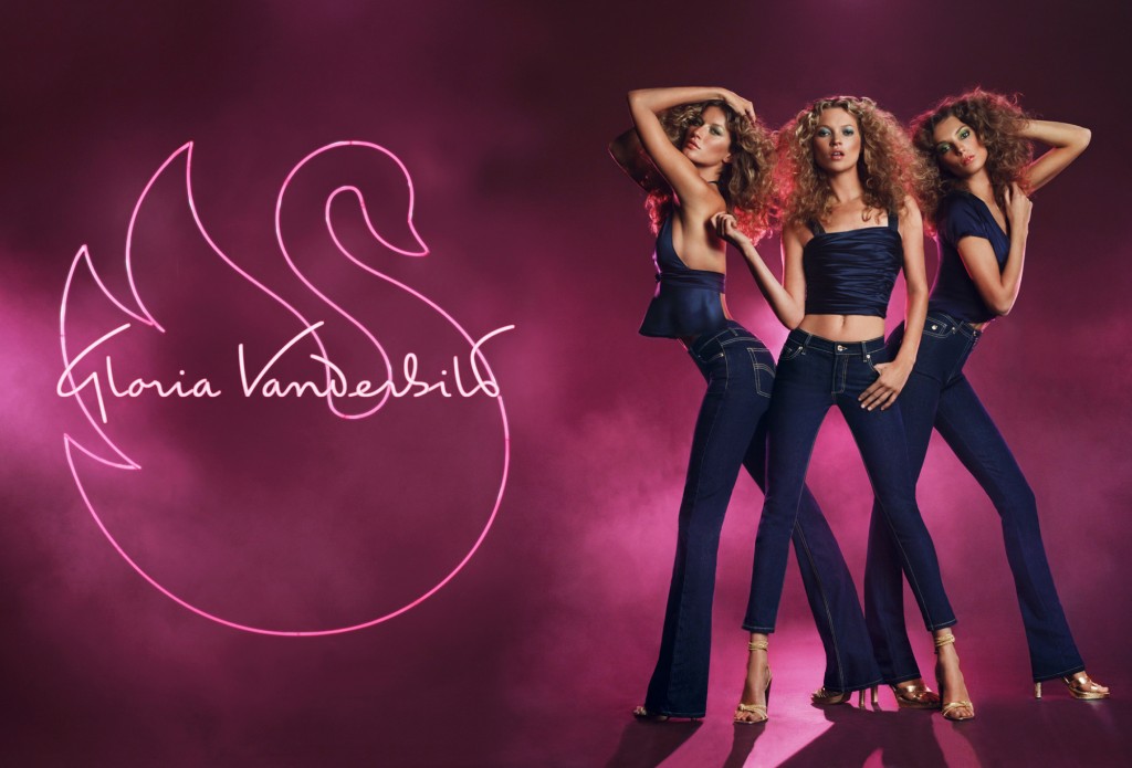
3. Gloria Vanderbilt Fall/Winter 2005 campaign by AR New York.
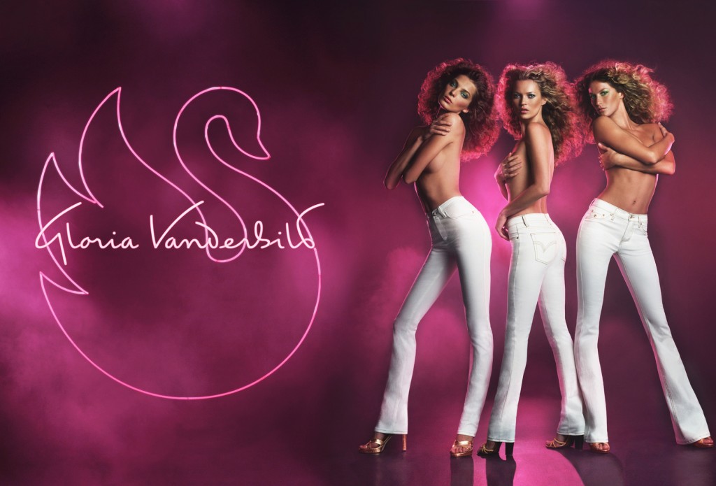
4. Gloria Vanderbilt Fall/Winter 2005 campaign by AR New York.