Broquet Pumps

 1
1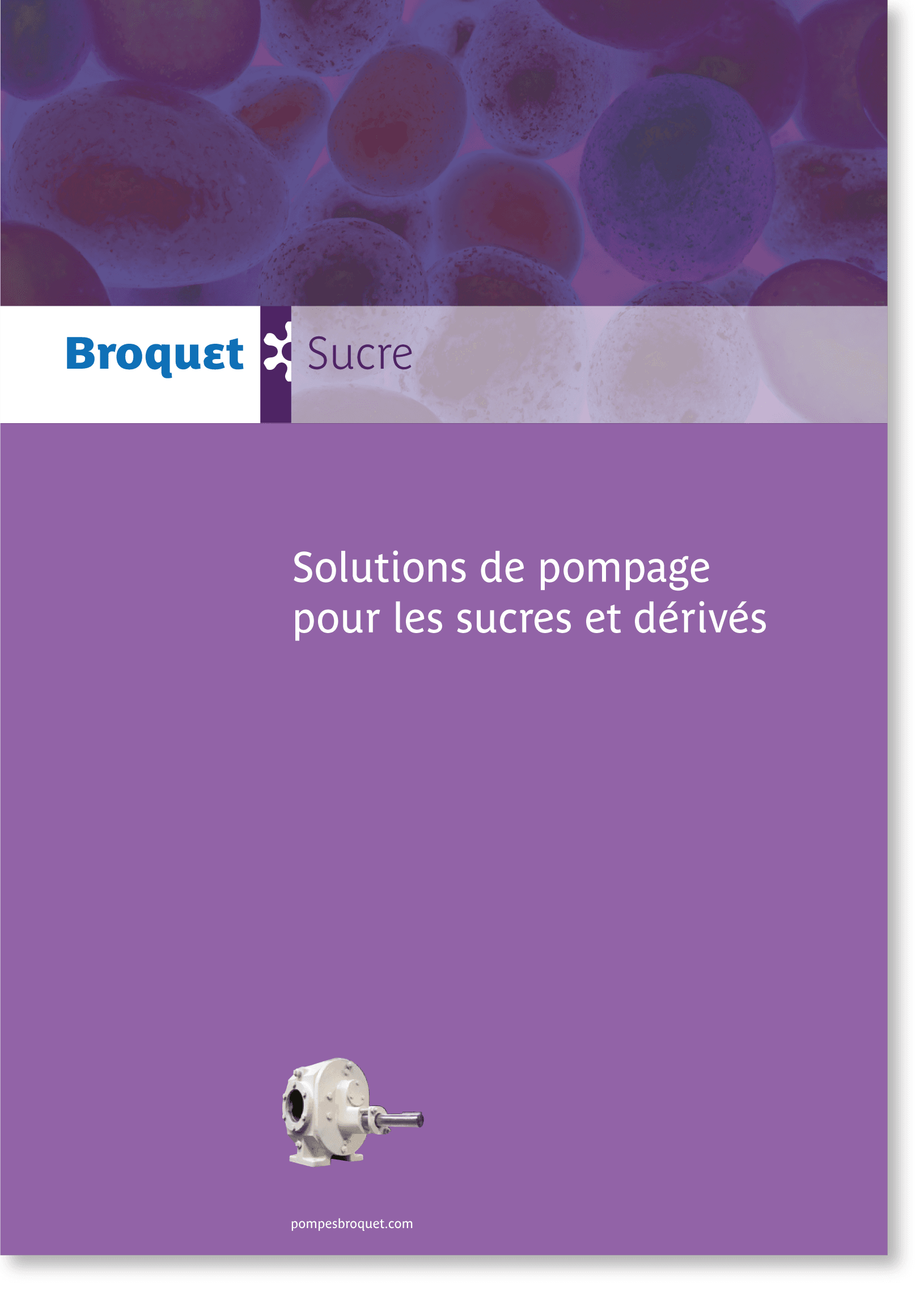 2
2 3
3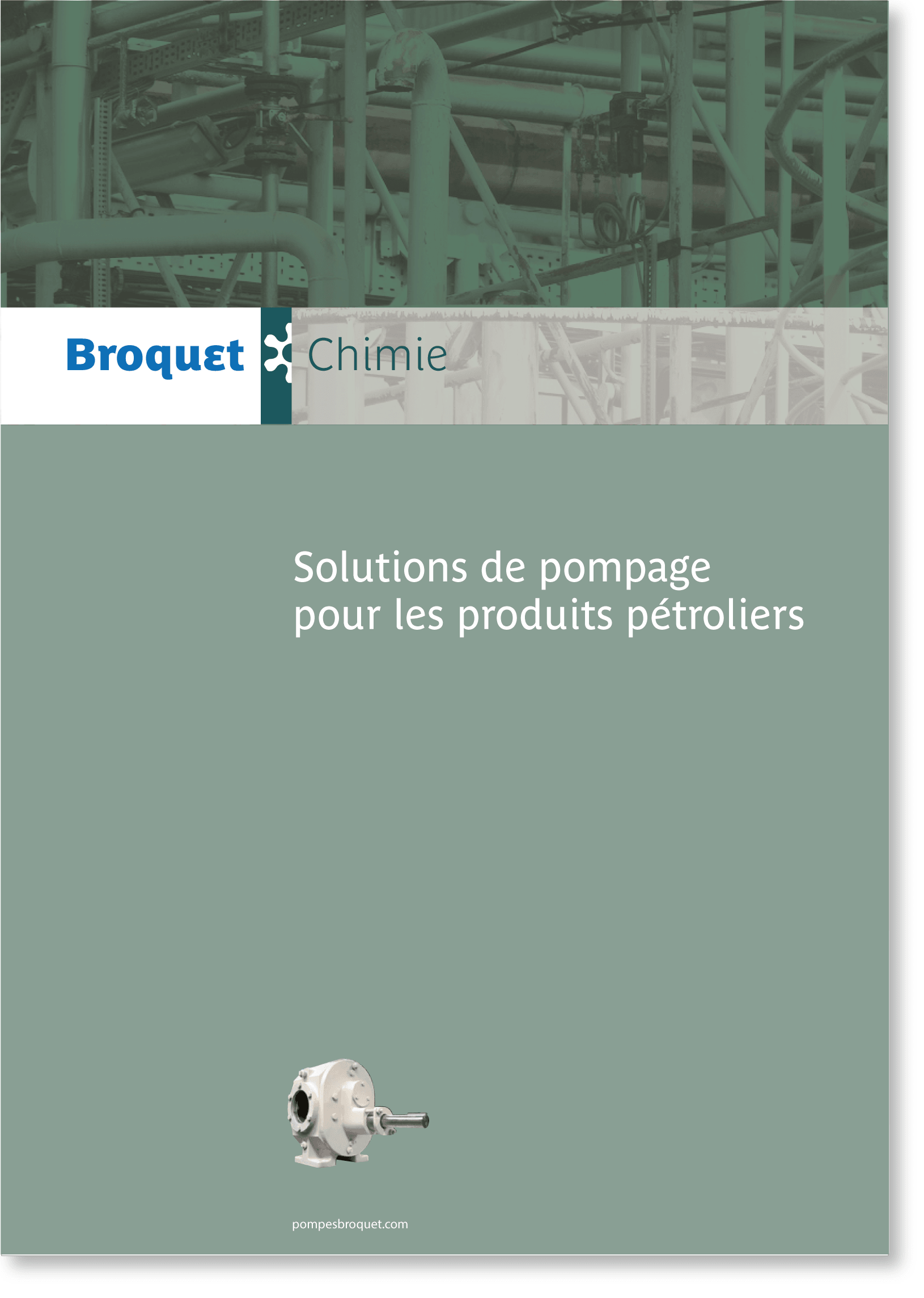 4
4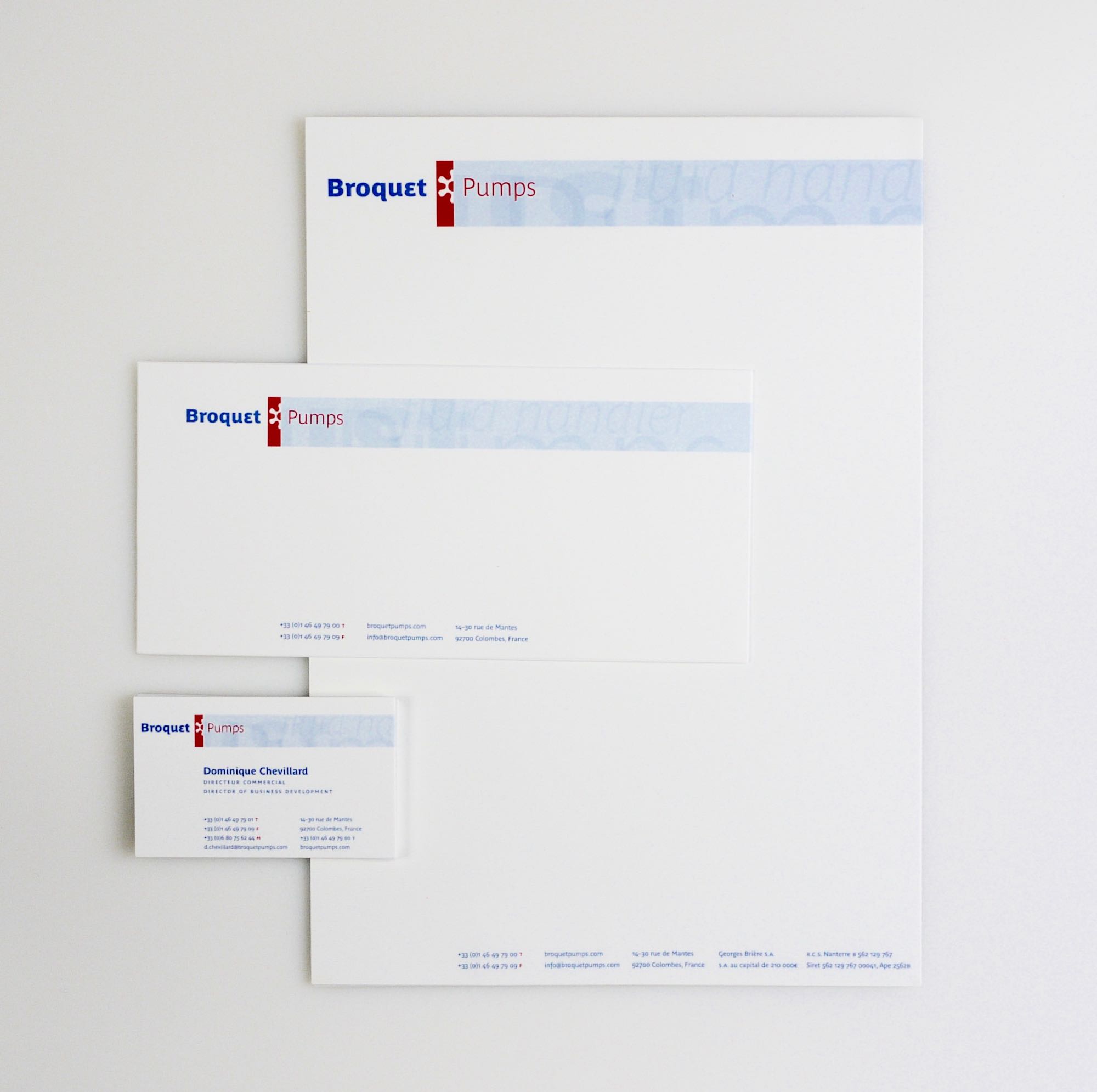 5
5 6
6 7
7 8
8 9
9 10
10Broquet Pumps identity
With 40 years experience in pumping liquids with particles or highly viscous, Broquets pumping solutions are considered as one of the most reliable on the market. They used since the 70s a simple logotype. We worked closely with Broquet Pumps to design an identity who will affirm their industrial heritage. As its a french company with strong international activities, we recommended a unique english name, rather than a localized variations. The logotype colors refers to the french flag indeed. We used Parisine Plus with the use of the e alternative to reveal the chemical, technical savoir-faire of the company.
Client: Broquet Pumps.
Typefaces: Parisine Plus.