Banette


 1
1 2
2 3
3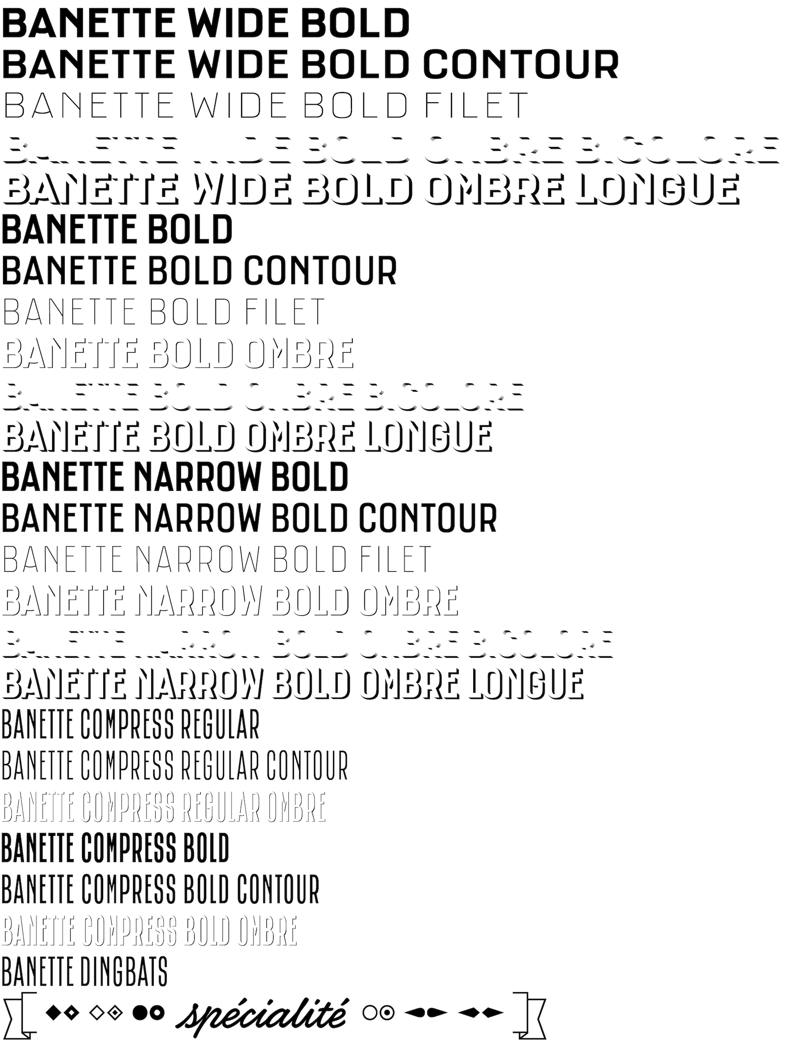 4
4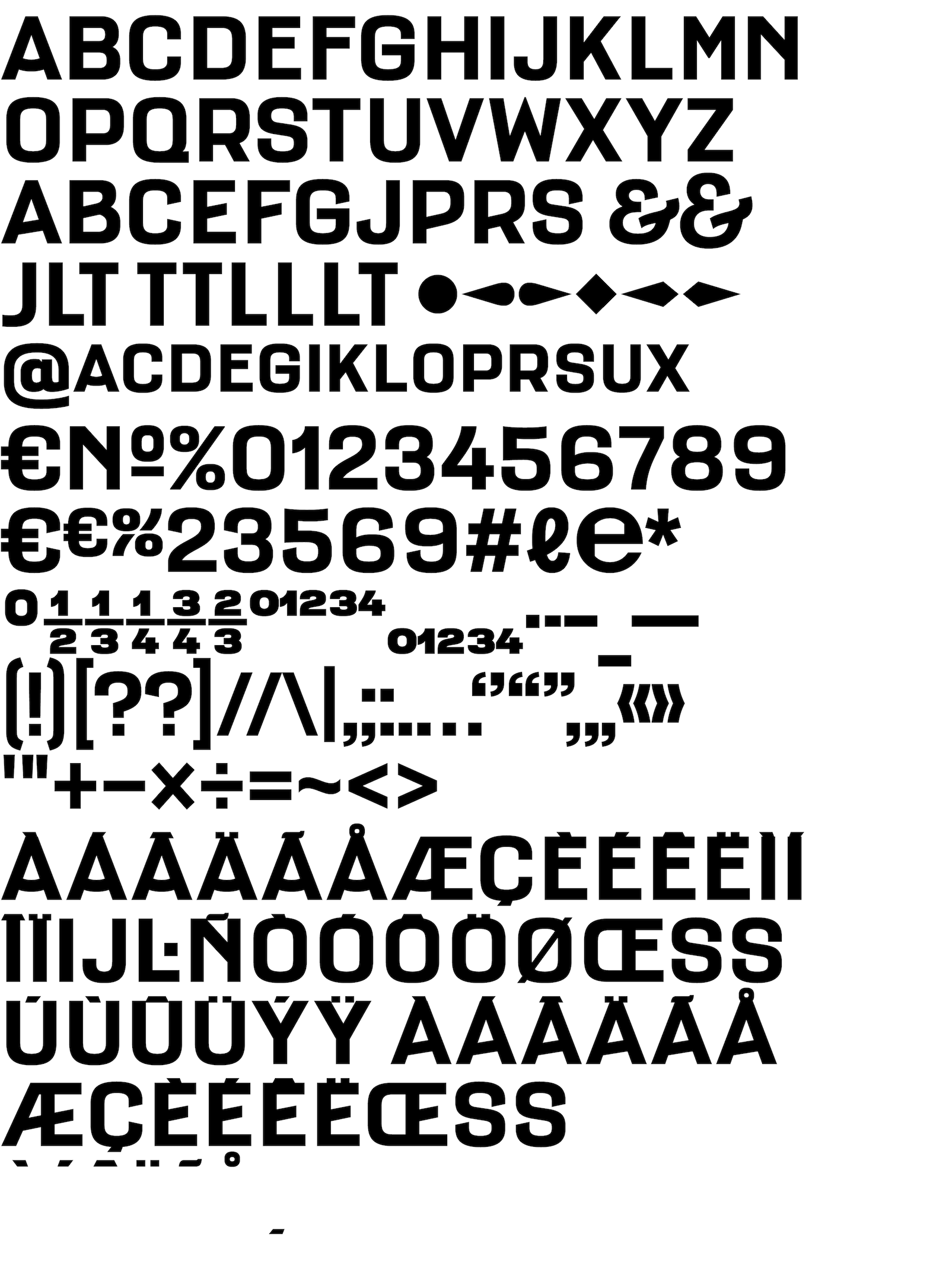 5
5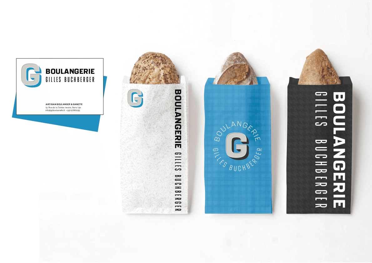 6
6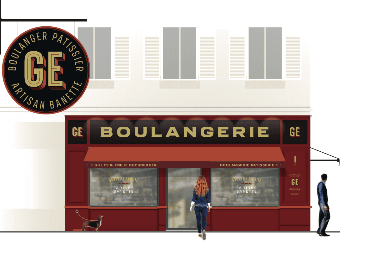 7
7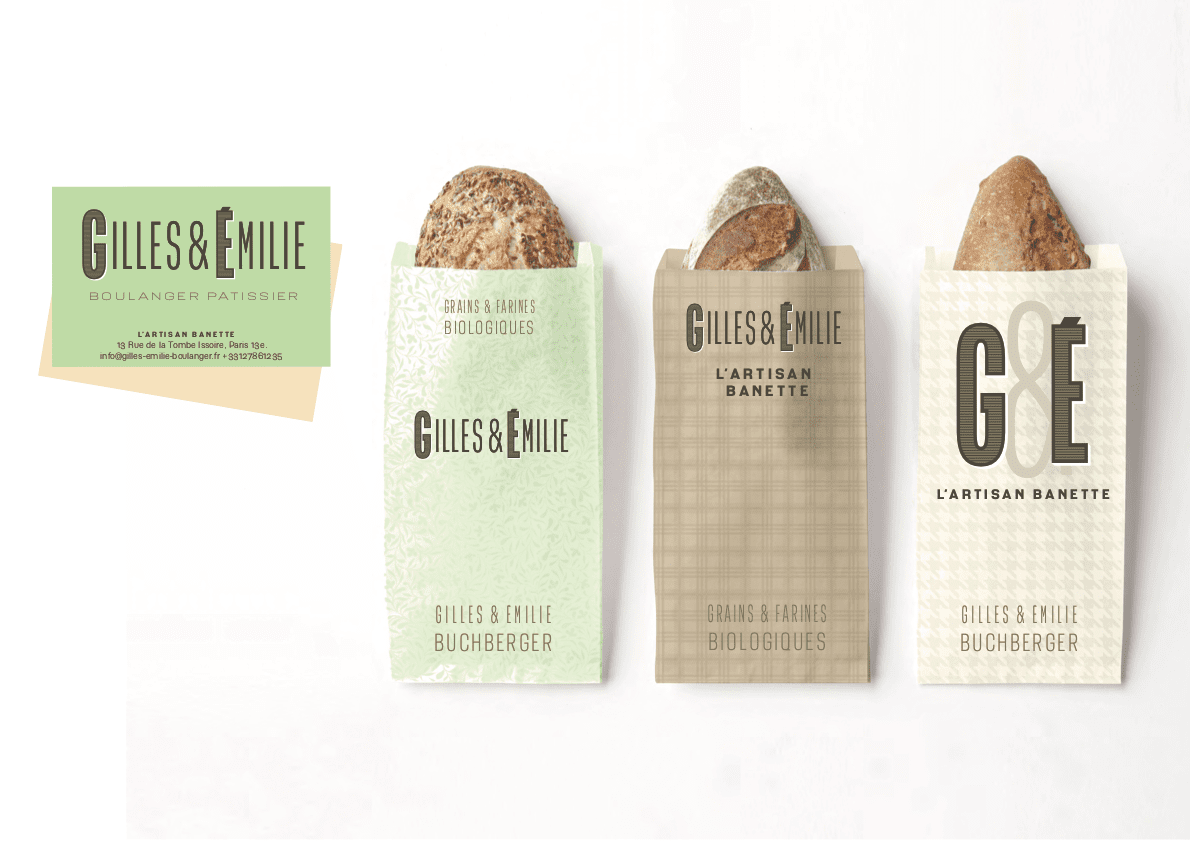 8
8A typographic tool for independent bakers
Designed for a group of bakers, the Banette typefaces are a tribute to the facades of mid-century French shops. Many elements of the letterforms are based on straight lines and aligned endings, because as observed in the various photographic archives consulted, the signs painters often used a system based on a repetition of simple shapes in order to keep visual coherence easily.
The Banette identity concept imagined by Les bons faiseurs is not based on a logotype, but on a collection of tools made available to bakers. The Banette typeface family was conceived as a typographic tool in the service of a modular visual identity.
The four widths are designed as to make believe that the signs of one facade are identical in widths to the other frontage yet of a different widths. As the sign painter who optically adapts his drawings, the Banette allows the same thing in digital. In addition, OpenType features allow different finishes (right and diagonal). Finally, the typefaces can be used in colours via layers that can be assembled in different ways according to the needs and the graphic style of a given bakery.
Client: Les Bons Faiseurs + Banette.
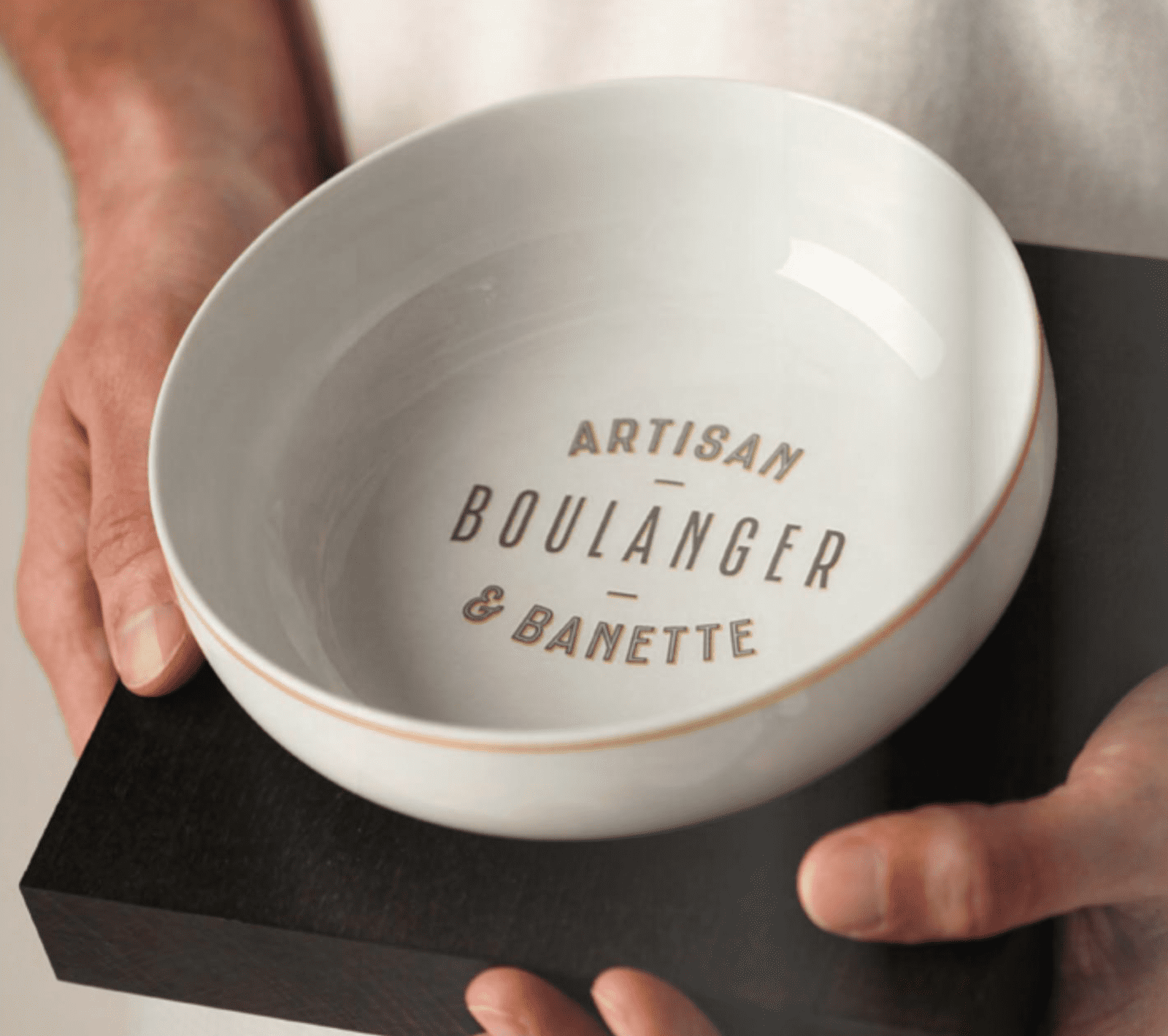
1. to 3. Banette in use.
4. Banette layered fonts.
5. Banette glyph set.
6. to 8. Extracts from earlier presentations who demonstrate the potentiality of the Banette typeface family.
Copyright
Banette is a proprietary typeface who will never be made available to the general public.