GL Kahn


 1
1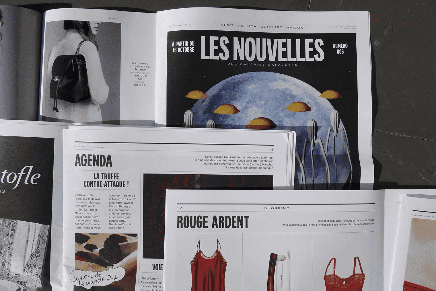 2
2 3
3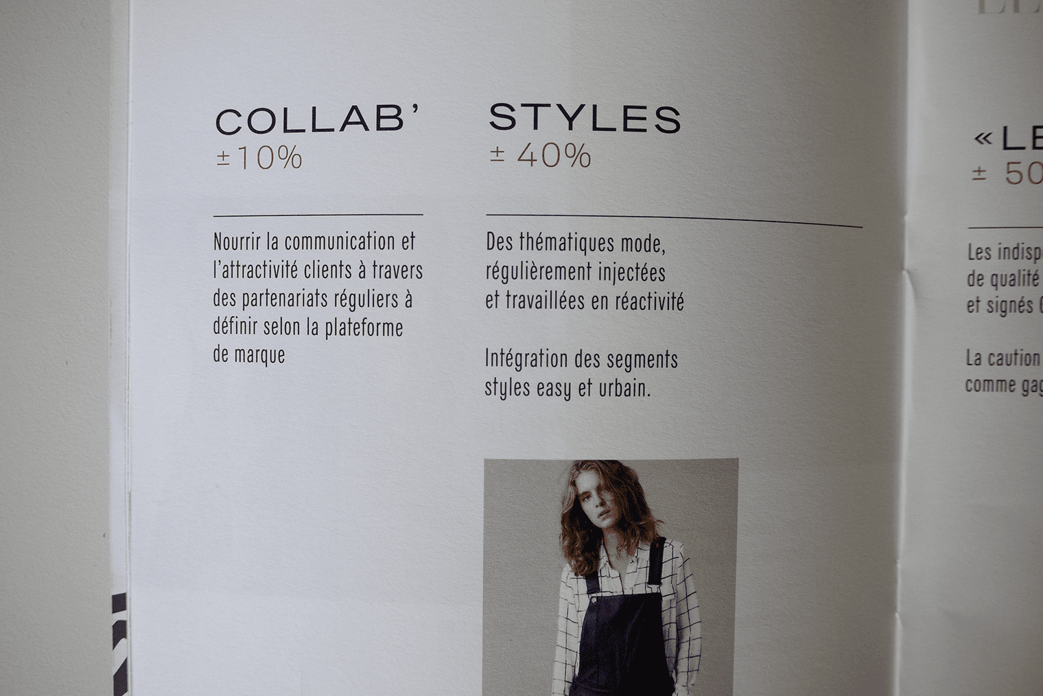 4
4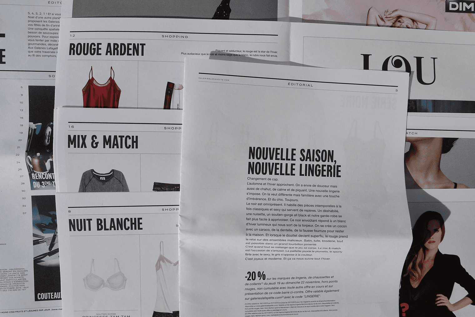 5
5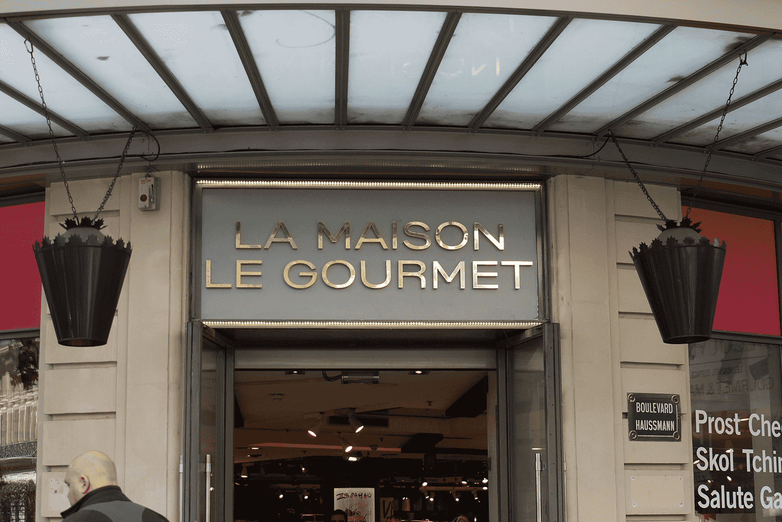 6
6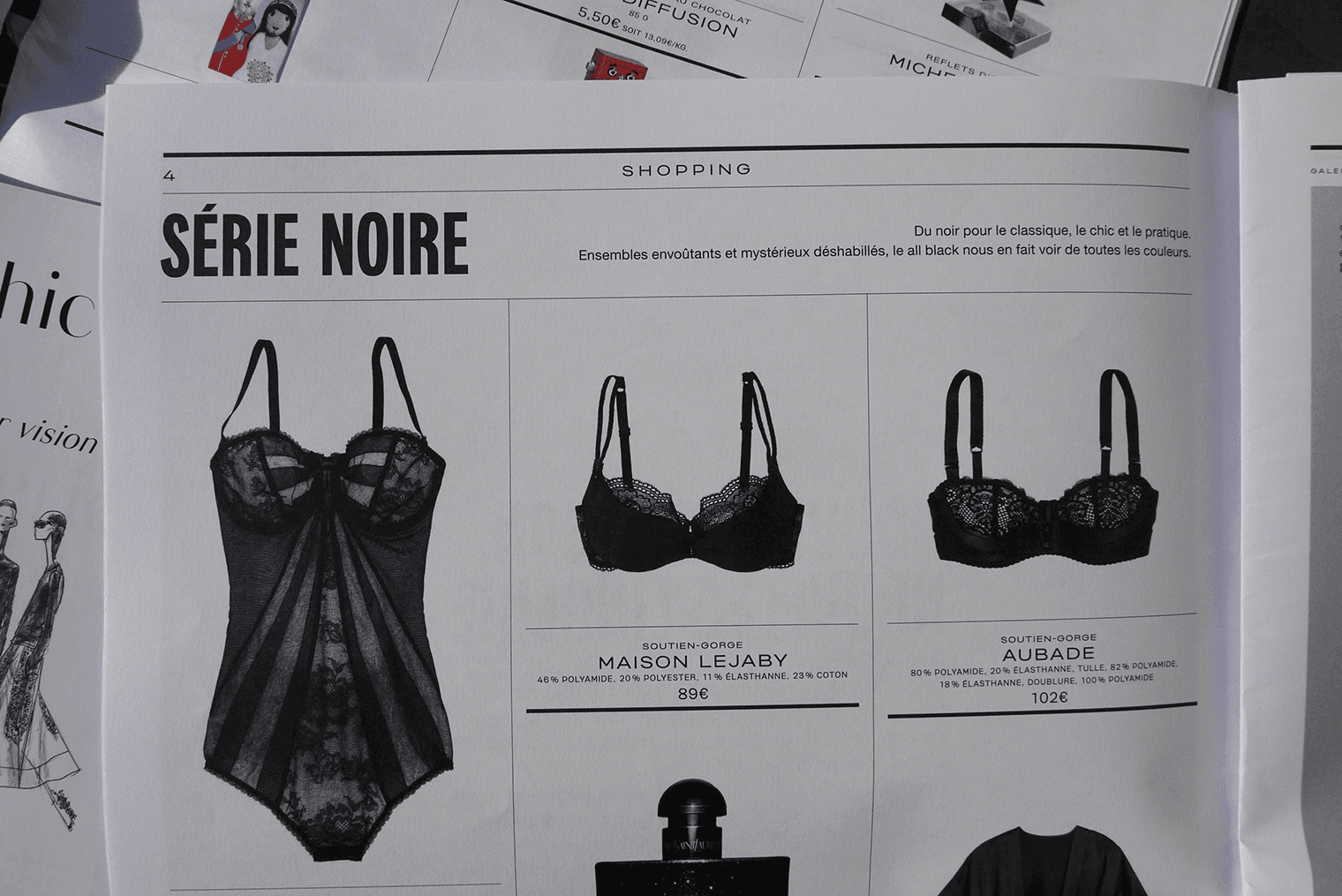 7
7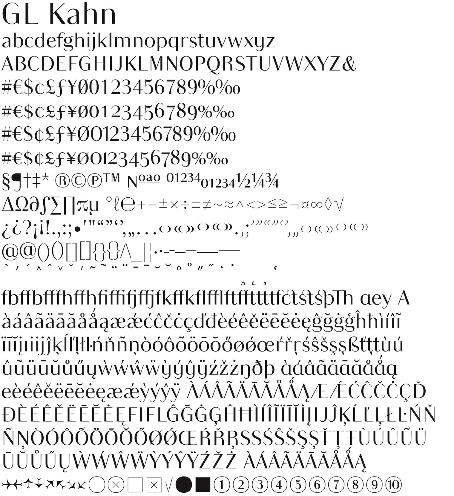 8
8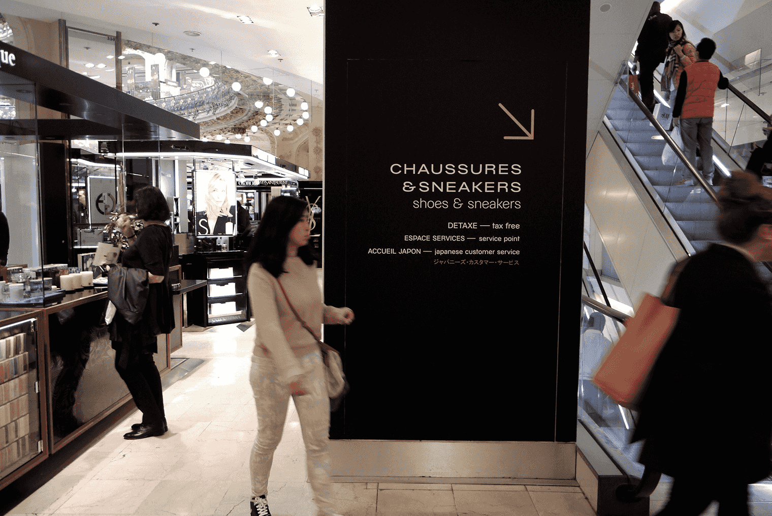 9
9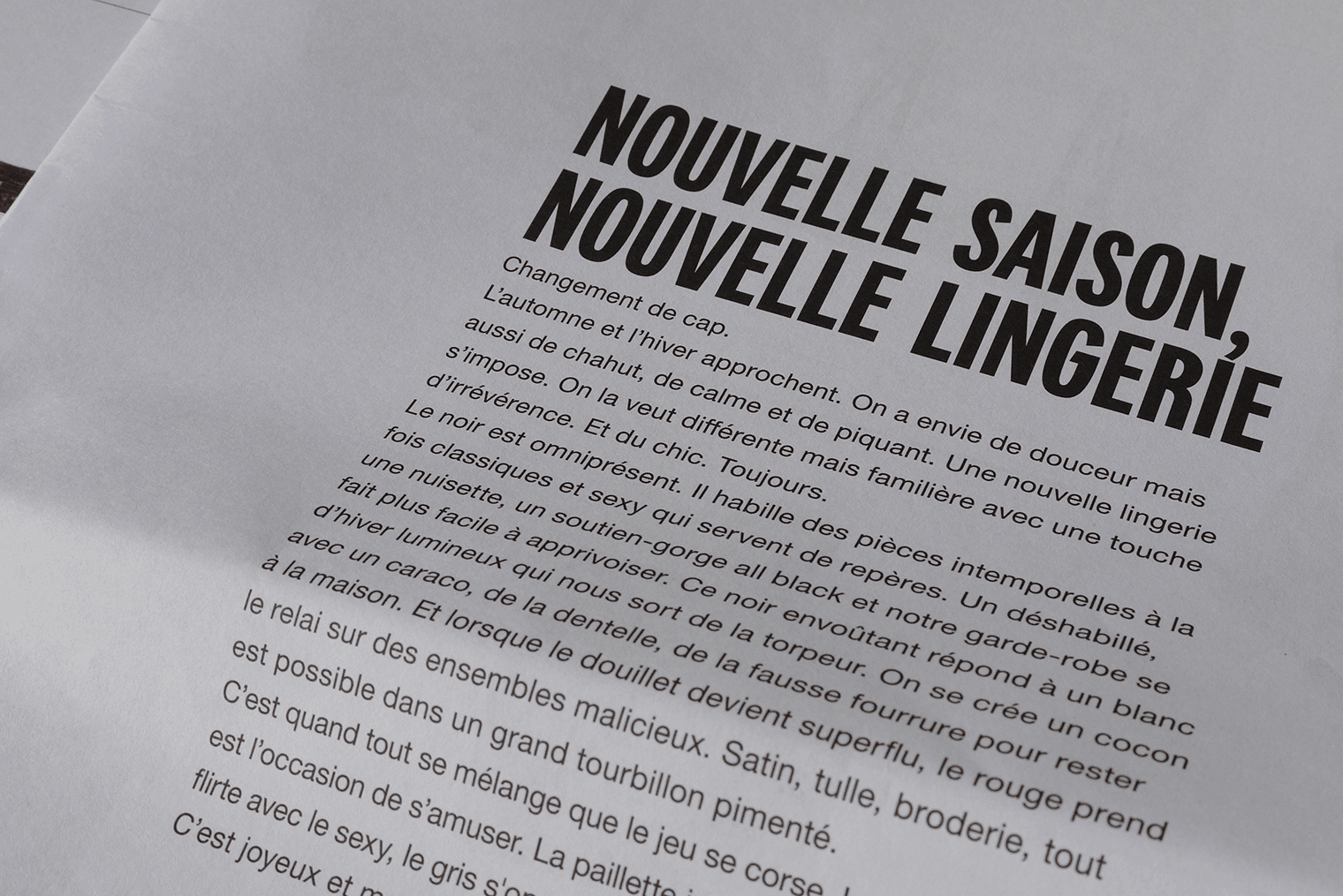 10
10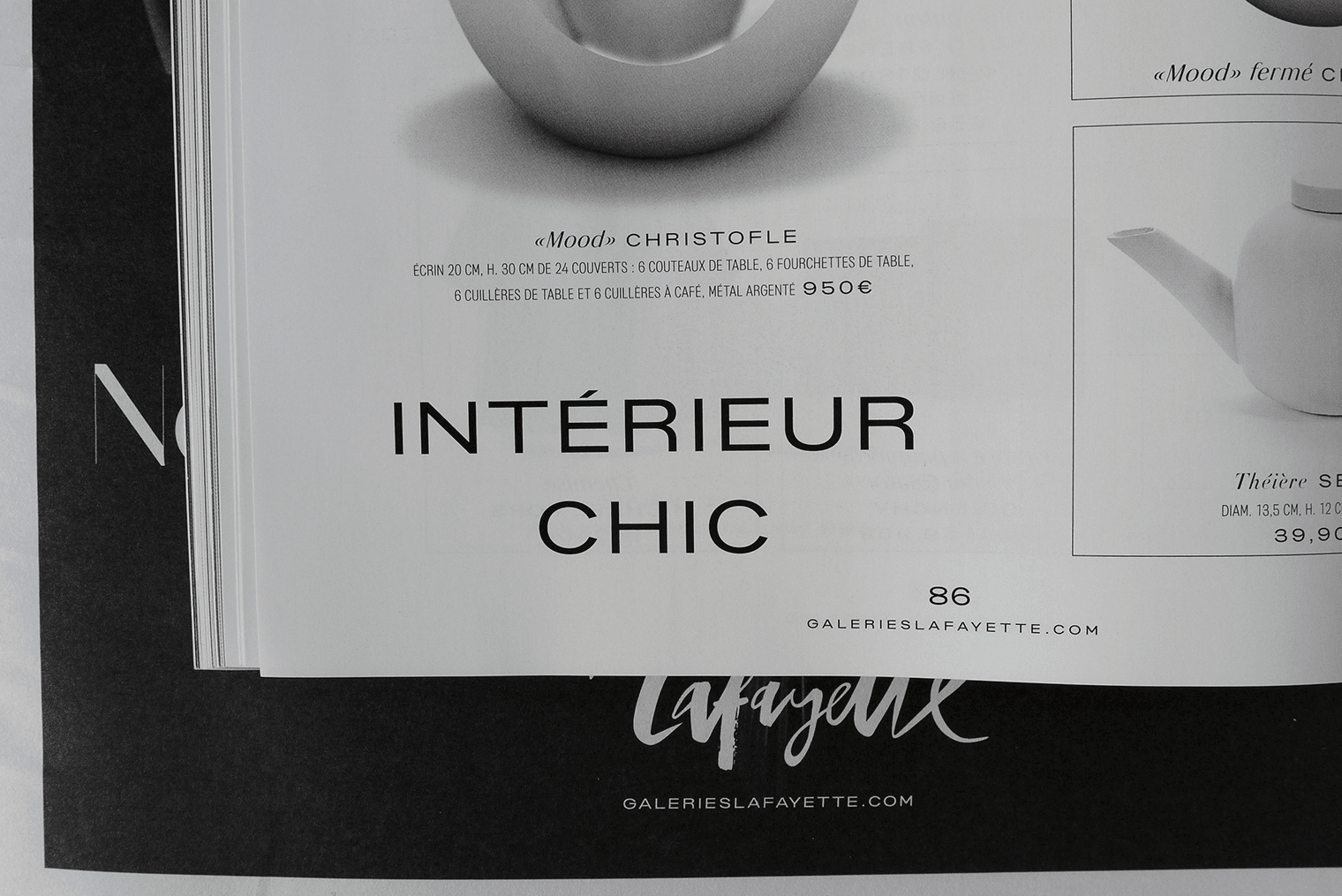 11
11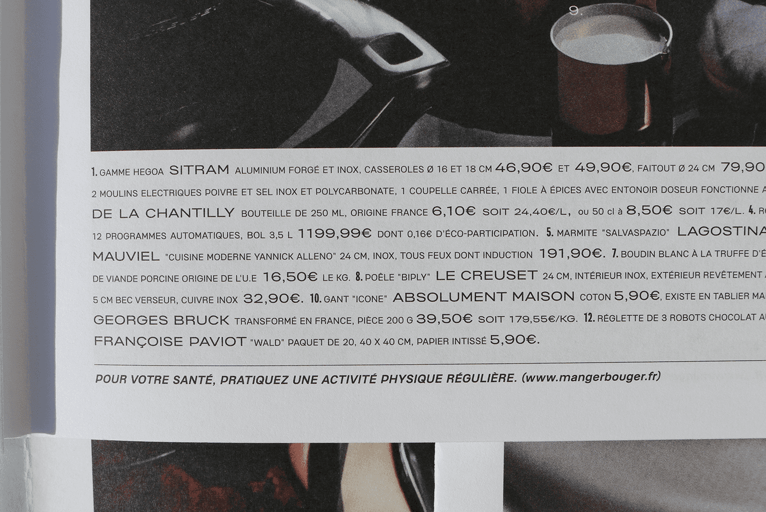 12
12GL Kahn for Galeries Lafayette helps to define the multifaceted identity
The GL Kahn is rooted in the long history of the Galeries Lafayette who started in 1894 when Théophile Bader and Alphonse Kahn opened their first store “At Galeries Lafayette” in Paris. This neo-didot sanserif family, along the GL Bader, accompany the new visual identity and communication campaign launched in September 2015. The design of the GL Kahn was built according to a synthesis of research in the archives of Galeries Lafayette and typefaces in use in early 20th century in France. Rather than designing from scratch a contrasted sanserif who will probably ended up as a crude, basic, common typeface with any atmosphere; it was crucial to rebuilt the sanserif shapes from a local tradition. The result is clearly a contrasted sanserif, but it takes its roots from late 19th french Didots such as found in Deberny typeface specimens at the time, and used by Galeries Lafayette in their early days.
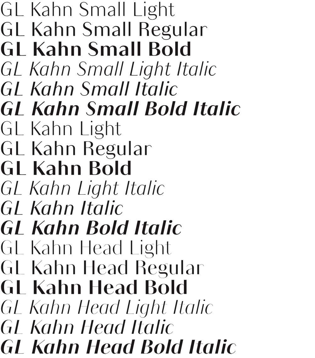
While the GL Bader was designed in various widths and weights, GL Kahn is provided in three weights featuring optical sizes variants. The premier use of the typeface will be large banners inside the department store and its various publications who emulate fashion magazines: a department store works in a similar way offering and explaining the multitude of possibilities to their clients through the seasons. GL Bader and GL Kahn are built to suggest mixtures and contrasts allowing specific atmospheres designed for the different departments: woman fashion, man fashion, children, beauty, home and gourmet. Built separetly, but on similar proportions to be easily used jointly, few glyphs feature similar ideas through the two families: y built from a u; e with a little diagonal bar, specific R tail, etc. The y is also very useful in the context of the word mark Galeries Lafayette, as it bring a regularity to the last word.
The GL Kahn is a typeface family in three weights featuring several optical sizes variants along along their matching italics which for the first time in the history of the department store will define the multifaceted identity territory through the varied and inventive uses.
Client: Galeries Lafayette.
1. Galeries Lafayette, La Maison, le Gourmet
2. Galeries Lafayette, signage at Hausmann
3. to 7. Les Nouvelles, publication
Copyright
Typeface family including GL Bader and GL Kahn is designed for an exclusive use by Galeries Lafayetteand will never be publicly available.