Parisine Girouette


 1
1 2
2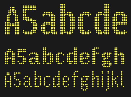 3
3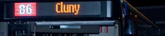 4
4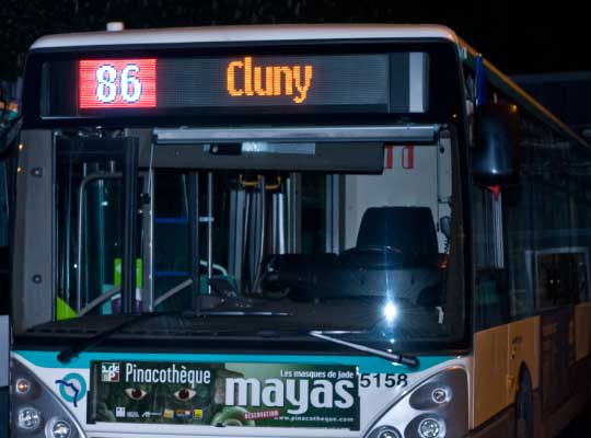 5
5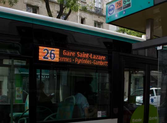 6
6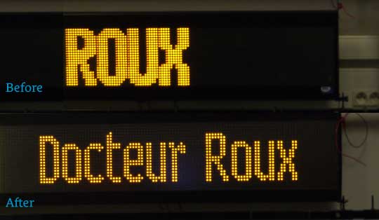 7
7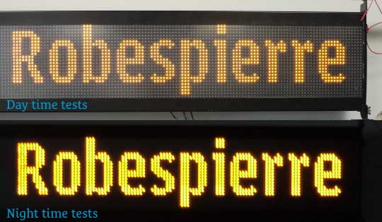 8
8Parisine Girouette
Over the past years, LEDs displays have been implemented on buses all over the world. Generally the typefaces on such displays was provided by manufacturers without any care about legibility and design. The users of buses suffered of the situation, and RATP decided to resolve the situation.
We worked closely over a year with the design departement, disabilities team at the RATP and users groups. One of crucial aspect was to resolve low resolution issues, as technical limitations. Indeed the main thing was the design of the letterforms themselves. We designed several versions, testing various weight, proportions until we found the acceptable solution. We advocated for static text, ever smaller when necessary rather than moving text in large size. A non static content generally move to fast to be read in good conditions, specially if the bus move too.
Parisine Girouette typefaces
Three typefaces depending the size and function have been delivered. Parisine Girouette Frontale is used for the main direction on the front of bus and was designed quite narrow to display a maximun of content. A great care have been take on the counters and various elements to increase differientation of the shapes. The figures can be described as “irregular” to avoid confusion on their shapes when used together. Caps where designed smaller and almost narrow as the lowercases to save space. Some glyphs feature small tricks to resolve spacing issues such the r. The system used on the buses can’t permit to add any kerning pairs, even worst, no blank spaces can be added outside of the glyphs. Spacing is decided during the setting, aka adding one, two, three… LEDs between letters.
Two others typefaces have been also designed at 50% of the size of the main typeface (50% less LEDs available…) to set information on the side of the bus. Called Parisine Girouette Latérale, the Bold is used for the final direction, when the Regular/Light used for intermediate stops.
The acceptation of the new design was generally very good by the users, who generally don’t seen what was the change: They asked about resolution, light, new bus design… rarely the typefaces themselves!
Head of Design: Yo Kaminagai.
Client: RATP.
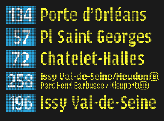
1. Parisine Girouette: Typical content.
2. Parisine Girouette: Design process, from initial design to final use.
3. Parisine Girouette: Three different typefaces: large size, small sizes for two different contents.
4. to 6. Parisine Girouette: Use on buses displays
7. Parisine Girouette: On the top, one of the previous typeface used on the displays.
8. Parisine Girouette: Depending the light the result can be very different.
— RATP produced a video about the project, available on Vimeo.
— Pecha Kucha Paris, 15 November 2012, Jean François Porchez about the project
Awards
— Club des directeurs artistiques: 44e Palmarès Prix 2012, Typography category, typeface design. Custom typeface family Parisine Girouette for RATP, 02-2013.
— Observeur du design 13 Parisine Girouette received a star (étoile) at the Observeur du design 13, APCI. 11-2012. Official page.
Copyright
Parisine Girouette is a proprietary typeface who will never be made available to the general public.