Today’s Parent


 1
1 2
2Today’s Parent
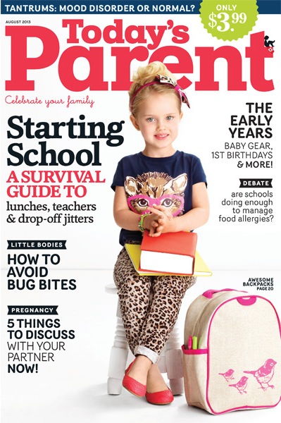
Today’s Parent masterhead, designed to fit their redesign and new typeface selection (2012): in particular Cheltenham as titling typeface. Previous nameplate was a geometrical sanserif without any specific adjustments. To take two examples: the spacing between a and r was problematic as the weight of e. Our objective was to create a new nameplate who will reflect the changes. So, the pure slab was remodeled and now feature few rounded endings in echo to the Cheltenham.
The new logotype was carefully adjusted to fit the magazine cover, from its weights, contrast, spacing, proportions between caps and lowercases. The weight of the word Today’s was adjusted to compensate its small size.
Art Director: Alicia Kowalewski
Client: Today’s Parent
1. Today’s Parent: before/after.
2. Today’s Parent cover