Costa


 1
1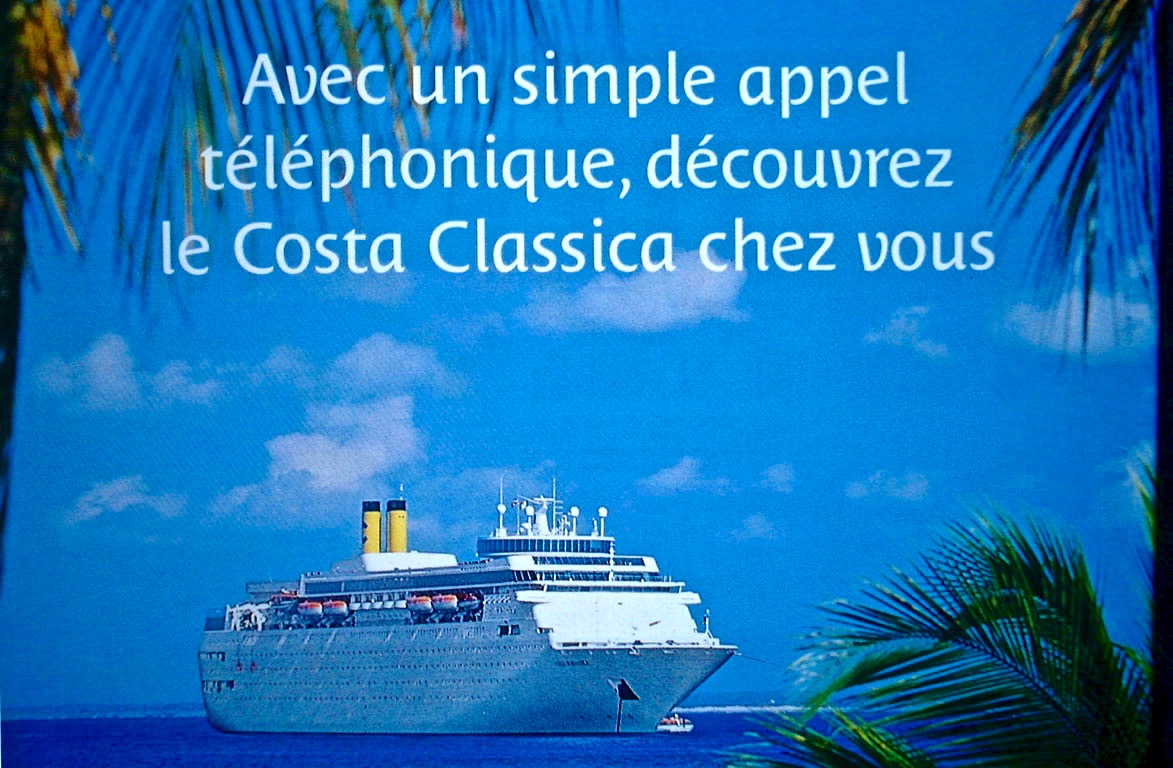 2
2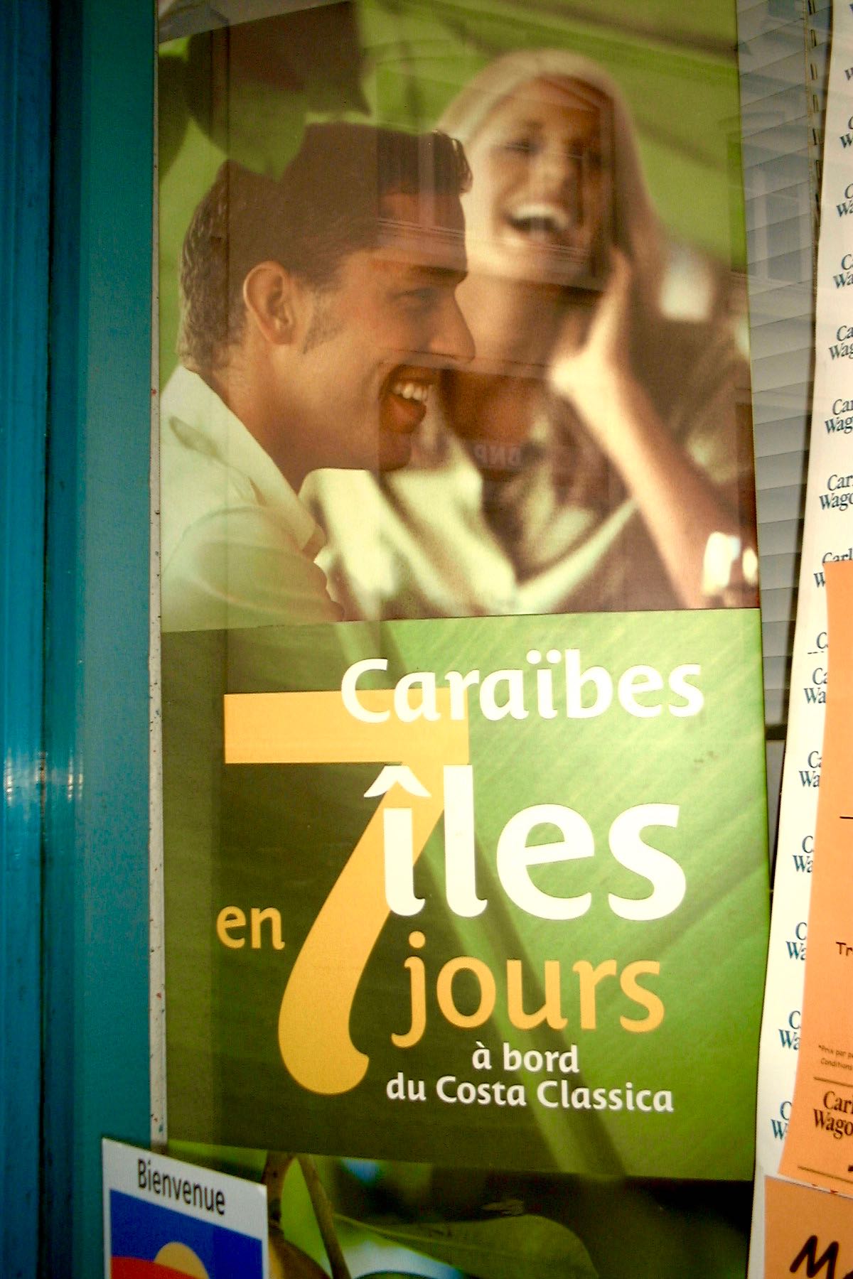 3
3A mediterranean style typeface for Costa Crociere
The Costa is corporate typeface designed for Costa Crociere, an Italian cruise company. The objective was to develop a typeface that allowed all of the material to be easily recognisable despite various stylesheets and layouts. The style of typeface came from the ligatured logotype Costa designed by Landor Associates. The immediate answer was to design disconnected letters and to add some unusual glyphs such as k, v or E in order to give a unique colour to the text.
The idea was to create a sort of mediterranean style of typeface. Using the structure of a somewhat modernised Italian Chancery script to which only the ending serif remained. The serif being more of a flourish creating contrast and referencing the more exotic countries such as those which Costa Crociere present in their catalogs. Costa is a style without neutrality and doesn’t fit comfortably into any typeface classification – this proves to be the novelty of its design as well as guaranteeing its originality.
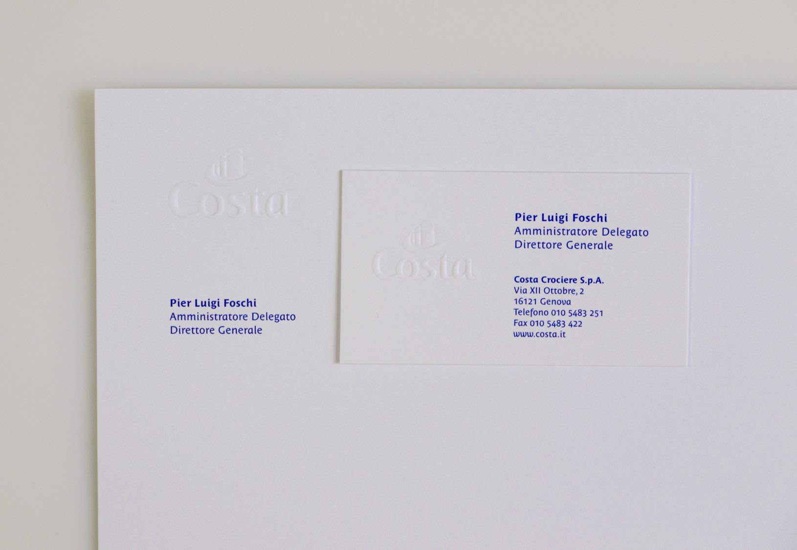
1. to 3. Costa typeface in use.
Awards
Certificate of Type design Excellence (Type Director Club de New York) for the bespoke typeface Costa, 1-2000.
Copyright
Costa is publicly available through Typofonderie and not limited to Costa use.