Ibis

 1
1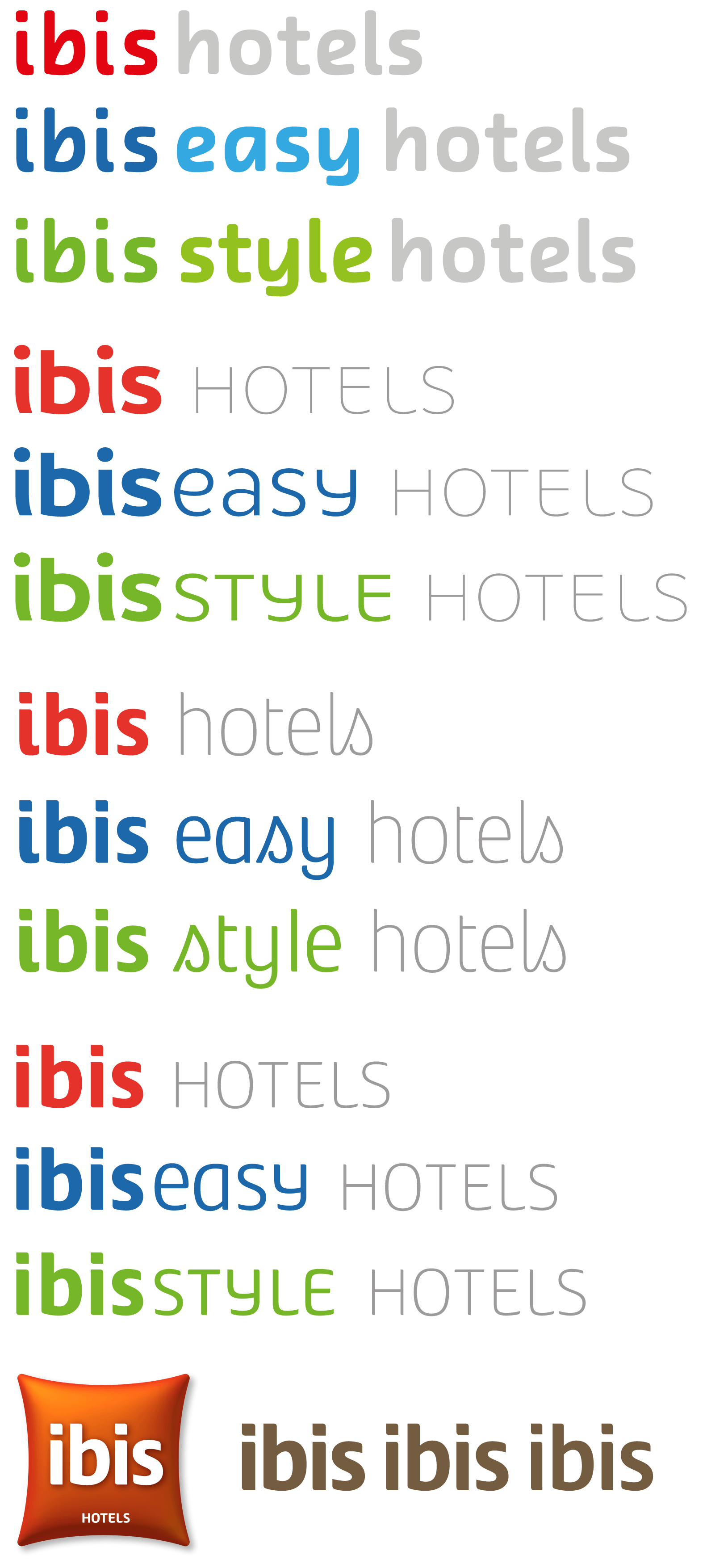 2
2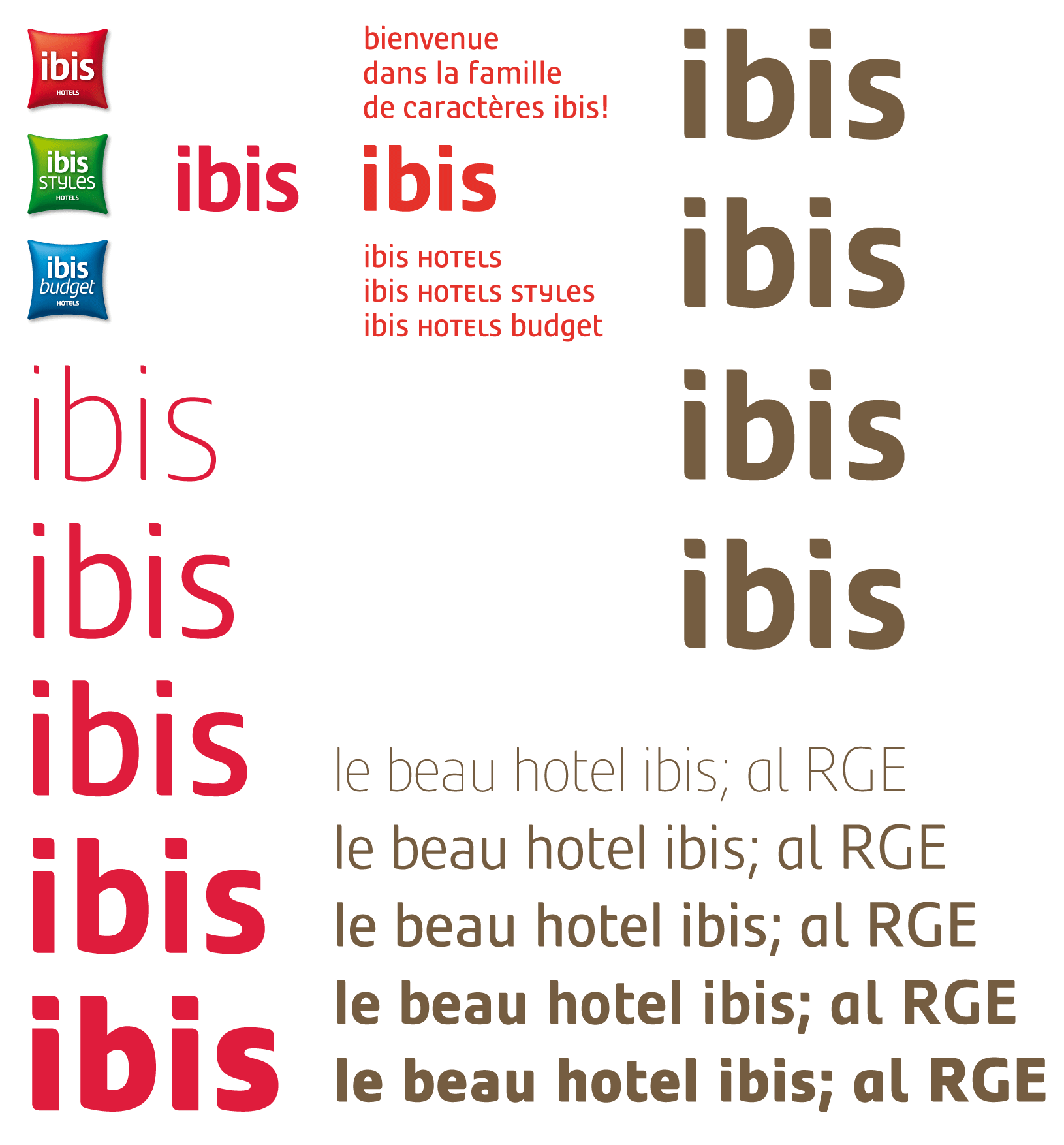 3
3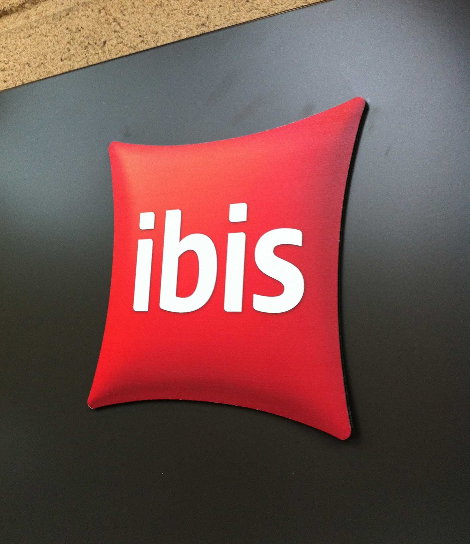 4
4Ibis
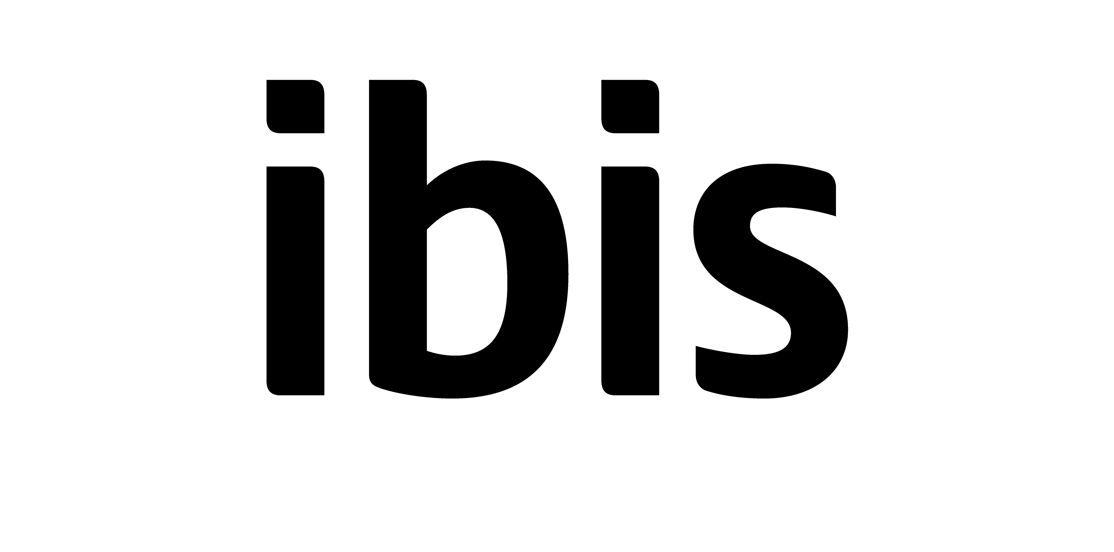
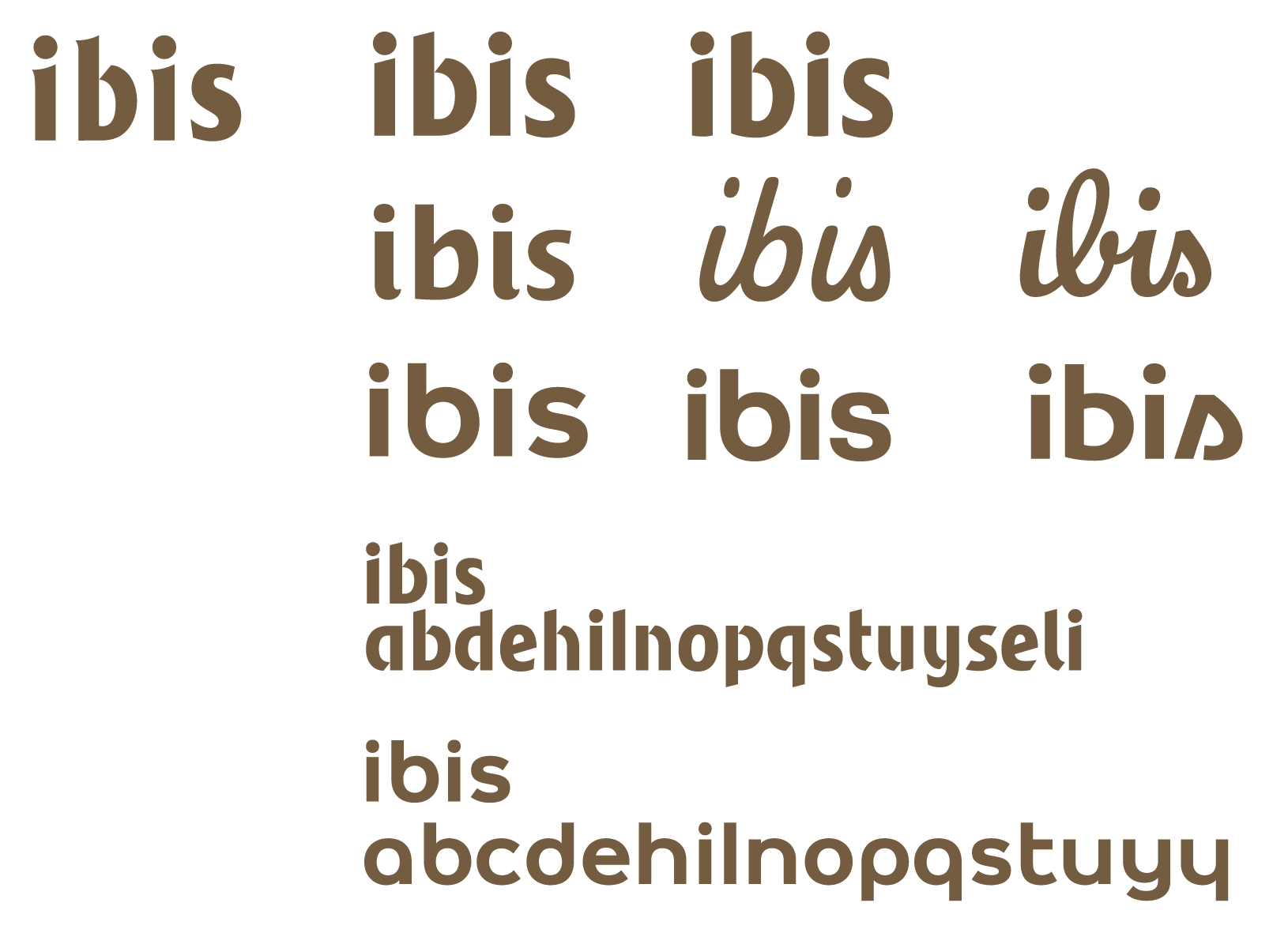
Design of the logotype Ibis Hotel for Accor (2011). It was project over several months, rebuilding the brand completely from the merge of the three historical Accor branches: Ibis, Etap and All seasons. We tried a lot of options with the team at Wcie, but at the end, Accor selected the All season existing pilow as symbol. Meanwhile, during several weeks, we worked on various typographic solutions, some ended up in typefaces sketches.
Client: Wcie
1. Ibis early stage of logotype sketches.
2. Ibis typefaces options.
3. Ibis final logotype together with proposals for corporate typeface. We searched for the right asymetric rounded finish as well various weights. After several months of development, the typeface project was finally put on side and never developed.