Valeo

 1
1 2
2Valeo
Logotype Valeo (the symbol was a concept from the creative director), for Dragon Rouge, 2004. We kept the squarish shapes from the historical logotype but simplified the design, removed the slab serifs. The a is now based on italic forms and the design objective was to add energy and movement to the brand. We can see similar forms on Allumi Pro distributed by Typofonderie.com.
Creative Director: Aaron Levin.
Client: Dragon Rouge.
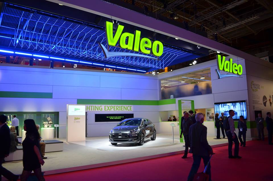
1. Valeo logotype in use.
2. Valeo historic logotype was our starting point.