Tour d’Argent

 1
1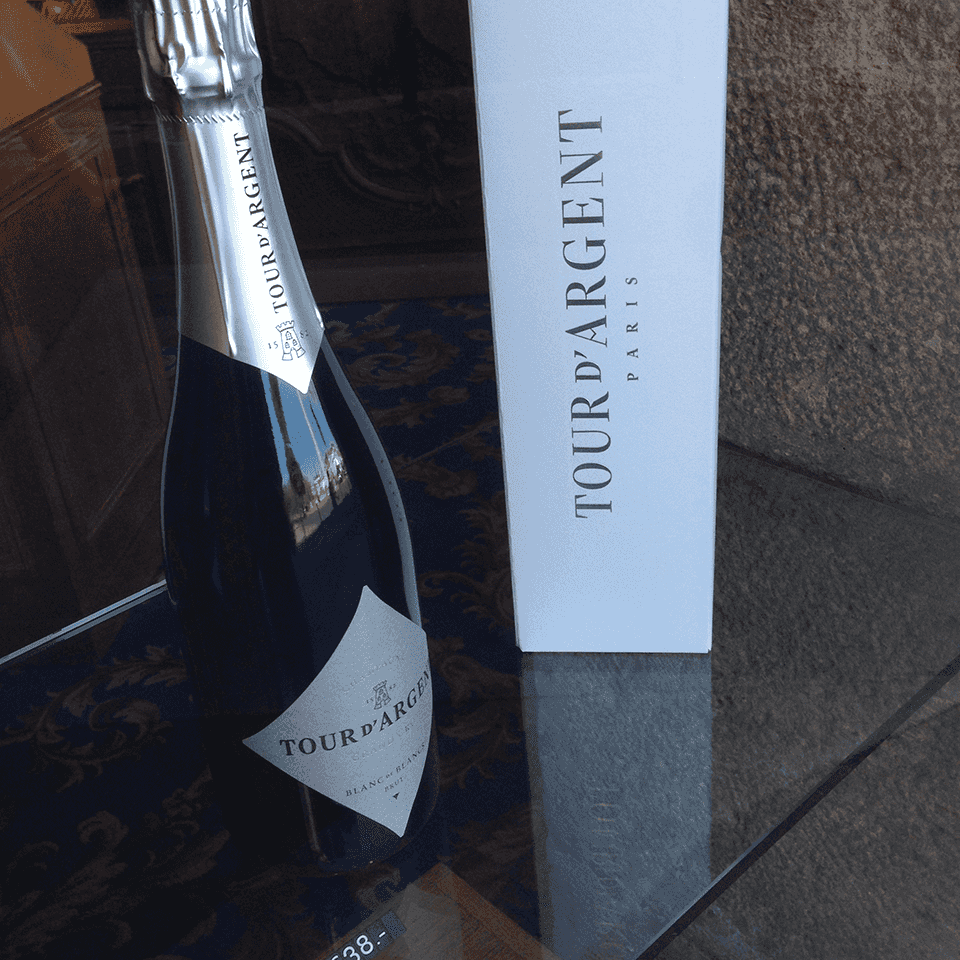 2
2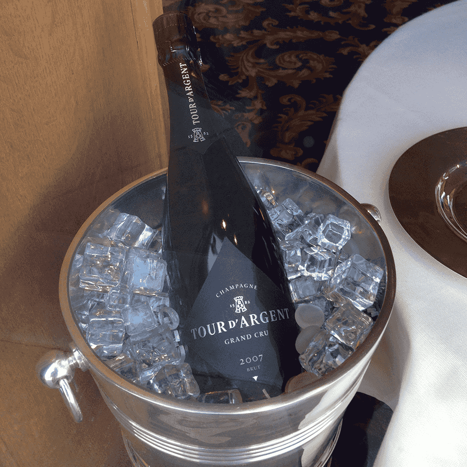 3
3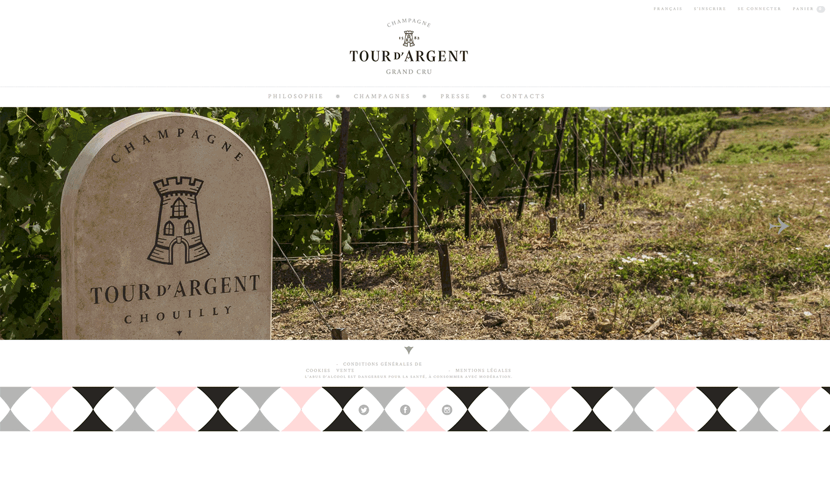 4
4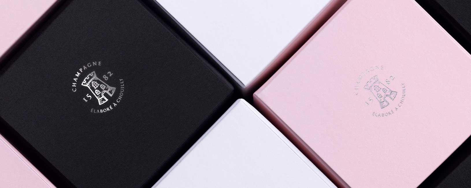 5
5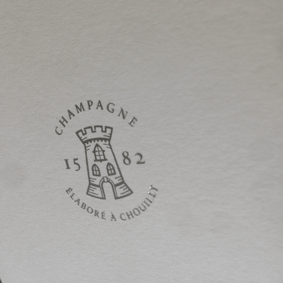 6
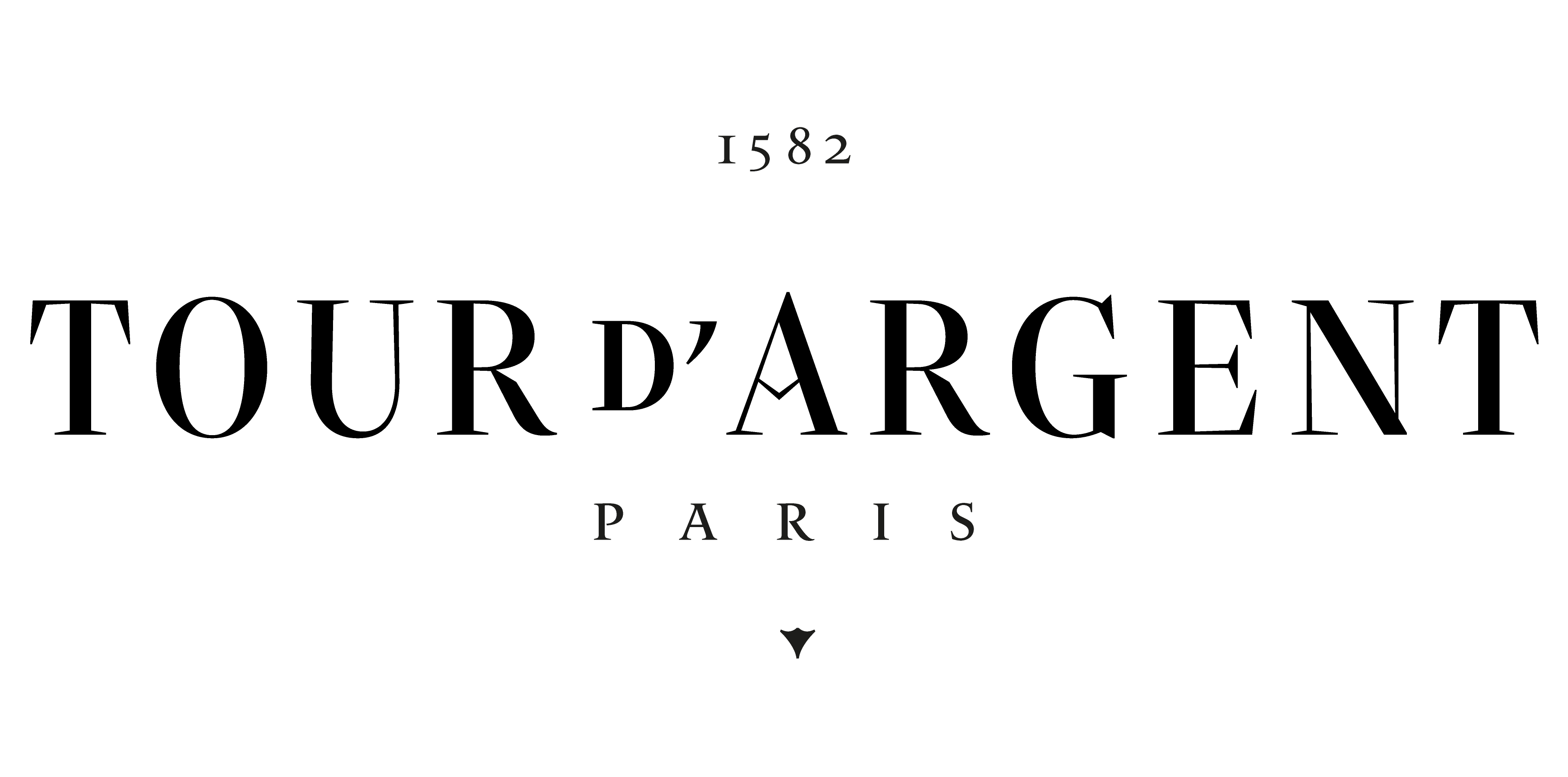
6Designing the logotype for the new identity of the famous Parisian restaurant
We worked on the typographic elements to assert the authentic story of Tour d’Argent. Various typographic proposals have been made in order to find the best solution who convey the Tour d’Argent heritage. The result is inspired by the archive from the famous parisian restaurant, taking it’s roots from the 50s typographic style with a contemporary twist.
The new logotype paid an homage to Vendôme typeface used by the restaurant for years. As the sign the building still in place proved it too, sharp serifs have been in vogue during the fifties in France, it’s why we’ve added sharp details to the new logotype such the angle on the R and specific serifs on certains positions of the letters who build the logotype. As part of the redesign project, we recommended the use of secondary typefaces: Le Monde Livre Classic by Typofonderie and Darby Sans by CommercialType.
Creative Director: Aaron Levin.
Client: Piaton et Associés.
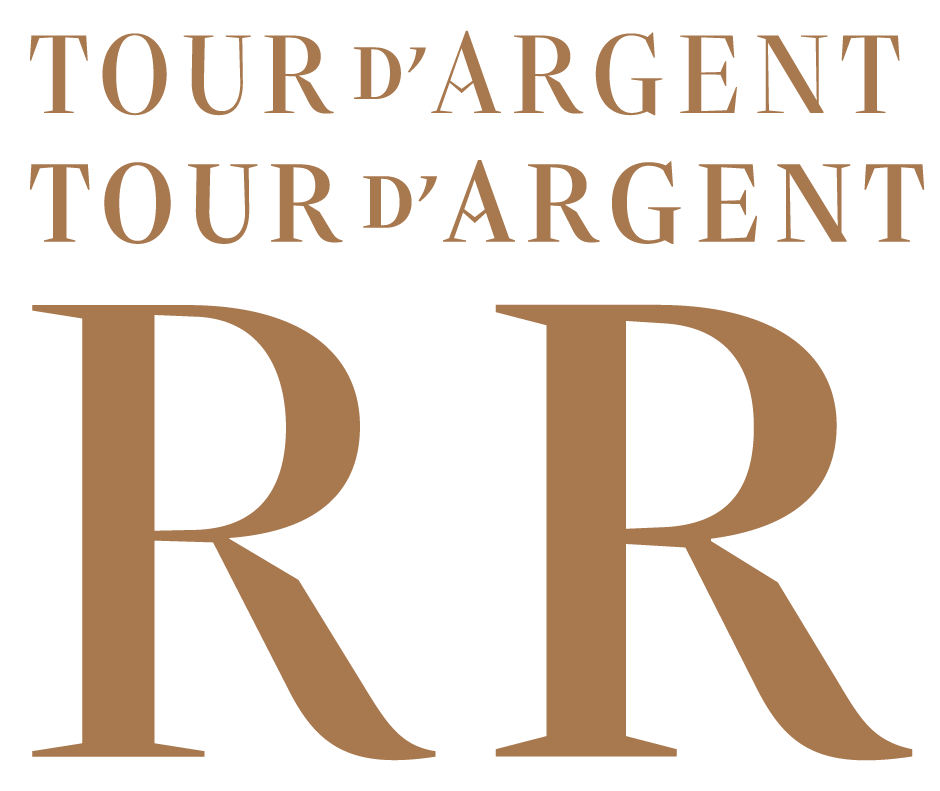
1. We provided a stronger version of Tour d’Argent logotype for small sizes.
2. to 3. Tour d’Argent in use: The high contrast, ultra chic, delicate version is intended for large sizes as on this bottle of Champagne designed by Piaton et Associés.
4. to 5. Tour d’Argent website and packaging designed by Piaton et Associés.
6. Tour d’Argent monogram.