Singulier


 1
1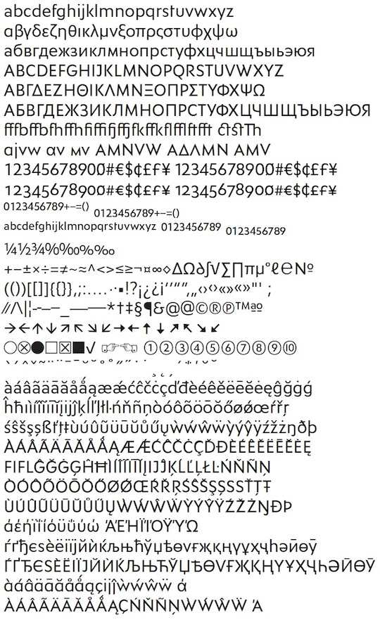 2
2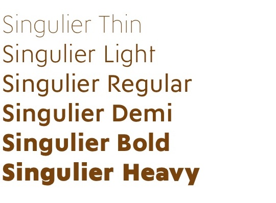 3
3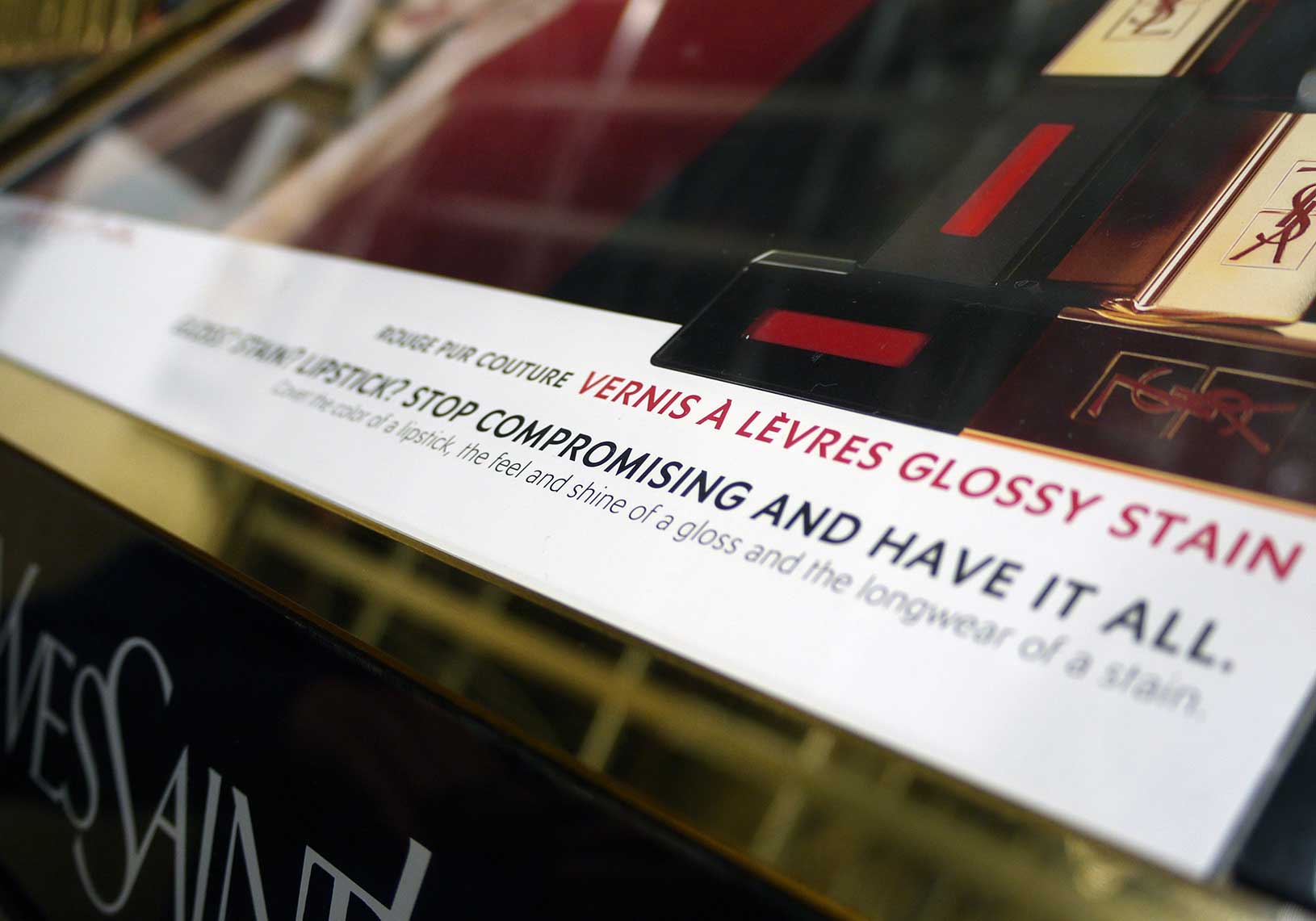 4
4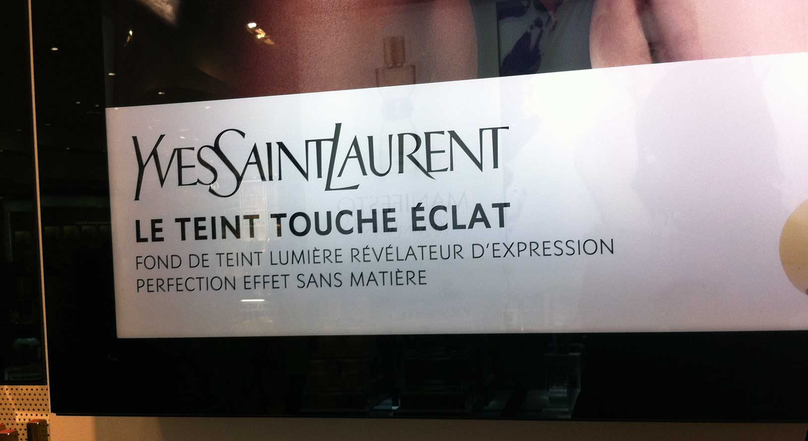 5
5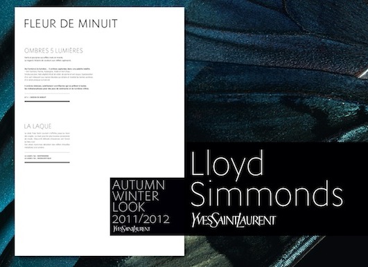 6
6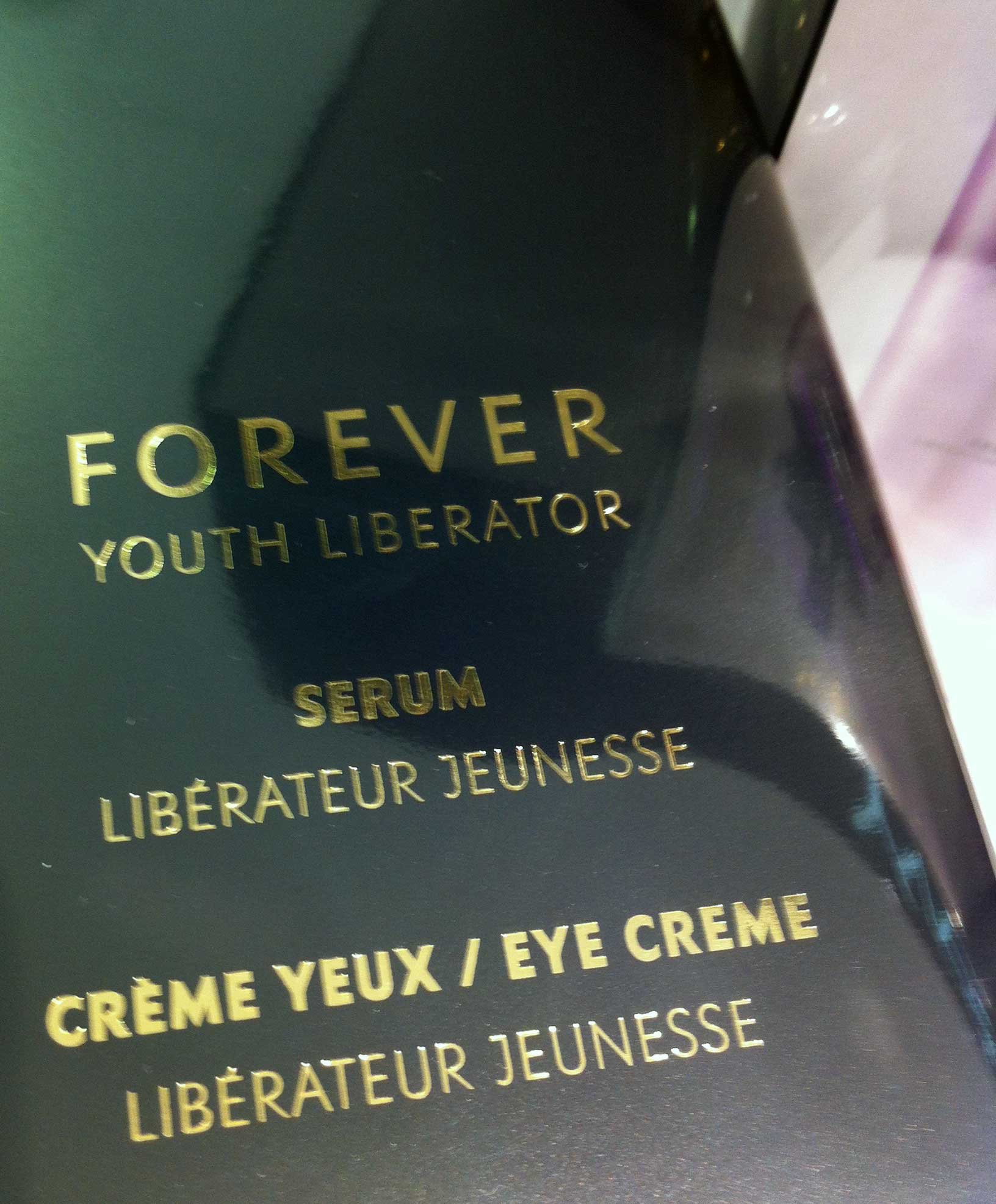 7
7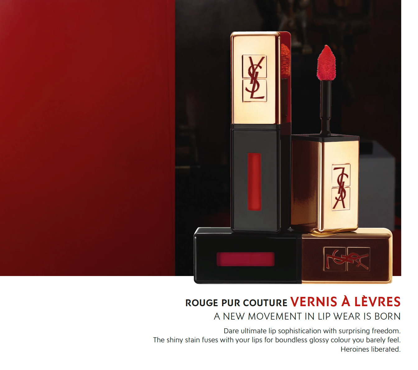 8
8Singulier
The sans serif created for Yves Saint Laurent Beauté, Singulier is a geometric typeface inspired by the monogram and logotype Yves Saint Laurent created by Cassandre in the early 60’s. His style is powerful, simple, without losing the original references. This variation is typical of the contemporary world of typographic fashion and cosmetics. Singulier is intended to strengthen the brand Yves Saint Laurent for its entire communication.
The Helvetica was used by YSL Beauté for its global communication, packaging until recent years. Late 2009, during the first meetings between the head of YSL Beauté graphic studio and Jean François Porchez, germinate quickly the idea of a new typeface, more specific to YSL Beauté. In the luxury sector, typography plays a major role in communication, once past the first two levels of hierarchy: brand + muse. This new development would bring to the brand identity, a stronger differentiation in this highly competitive world of cosmetics.
ZeCraft team worked on two typographic options in April 2010, the first one, close to Cassandre style and Optima: Deemed too conservative by the team, it will be quickly put aside. This is the more radical option, a geometric sans serif, a bit like Futura, often associated with luxury, fashion… which immediately arouses interest among YSL Beauté. It will become after a few months of work, the Singulier, a family broken down into 6 weights, 3 writing systems are supported: Latin, Greek, Cyrillic.
This new contemporary typeface and sewing both round and angular, is elegant, universal, along the line of the definition of the dynamic young woman. It fully meets the requirements of a typeface used in publishing, print ads, packaging: Clean, precise, very simple without losing essential knowledge to highlight the diversity of content. In order to be successful at any time, sophisticated versions of letters like A, V were added to the titling versions. This geometric sans serif is a reflection of Mr. Saint Laurent: Timeless, as if the lettering YSL was absorbed. The references are clear, the left start of N, the opening of the R, P unique shape, small angles on the t, f echo the brand created during the sixties by Cassandre. However, it is a visual tribute, never a literal adaptation. Just a real transposition for YSLBeauté, a contemporary brand in cosmetics world.
Client: Yves Saint Laurent Beauty.
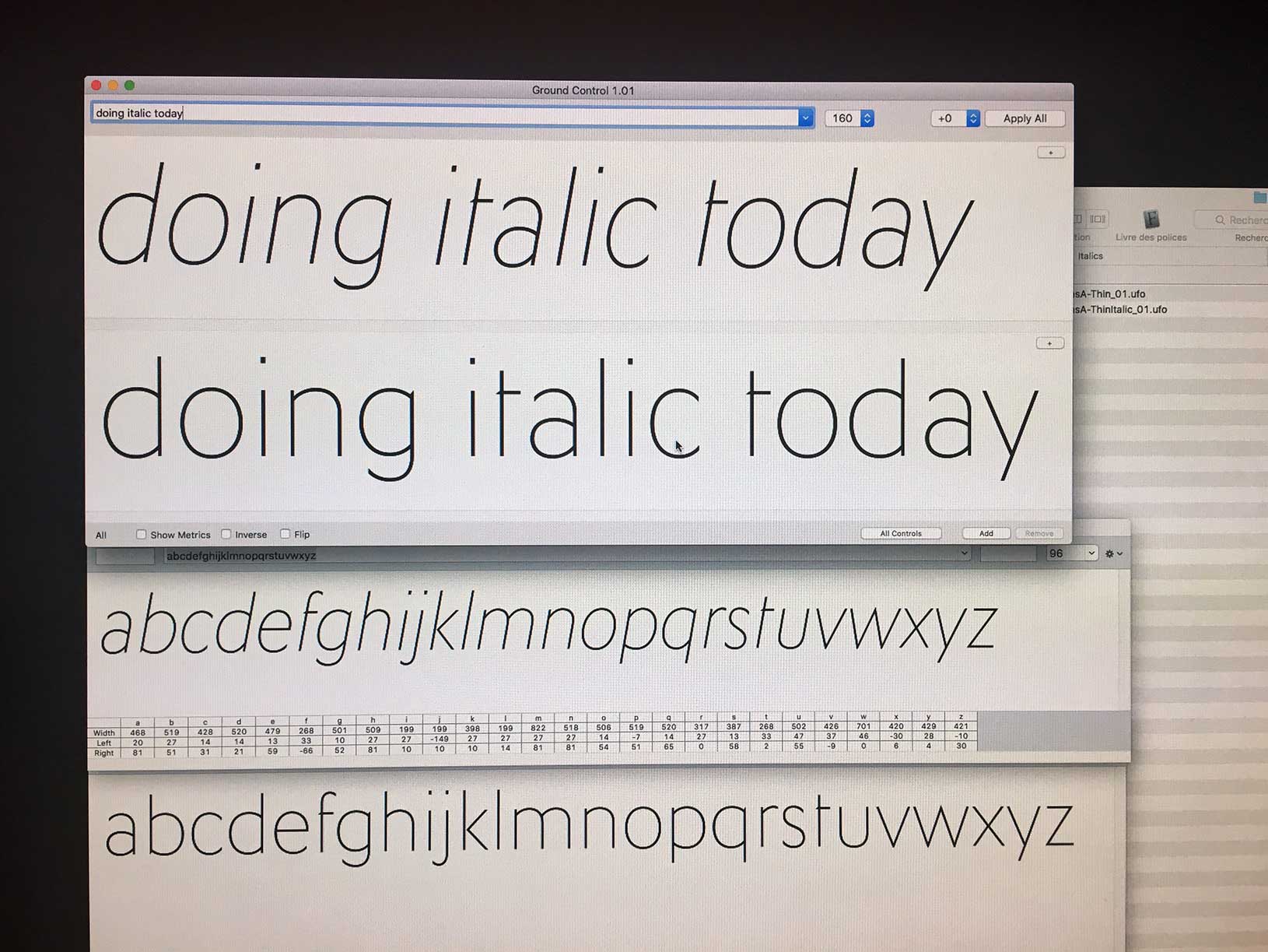
1. Singulier typeface sketches on screen.
2. Singulier typeface alphabet.
3. Singulier typeface family.
4. to 8. Singulier typeface in use by Yves Saint Laurent Beauty.
Awards
Club des directeurs artistiques: 43e Palmarès Prix 2011, Typography category, typeface design. Custom typeface family Singulier for Yves Saint Laurent Beauté, 04-2012.
Copyright
Was a an exclusive typeface family, not publicly available until 2013. Contact Typofonderie for any licensing question.