Maclean’s

 1
1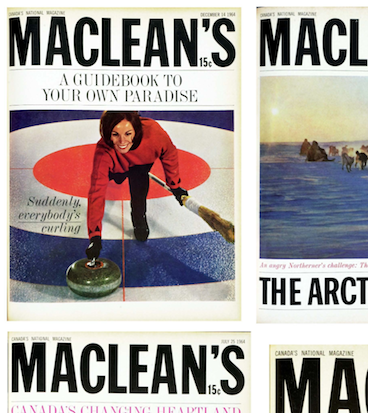 2
2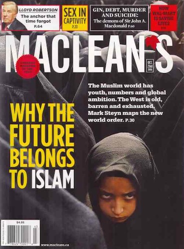 3
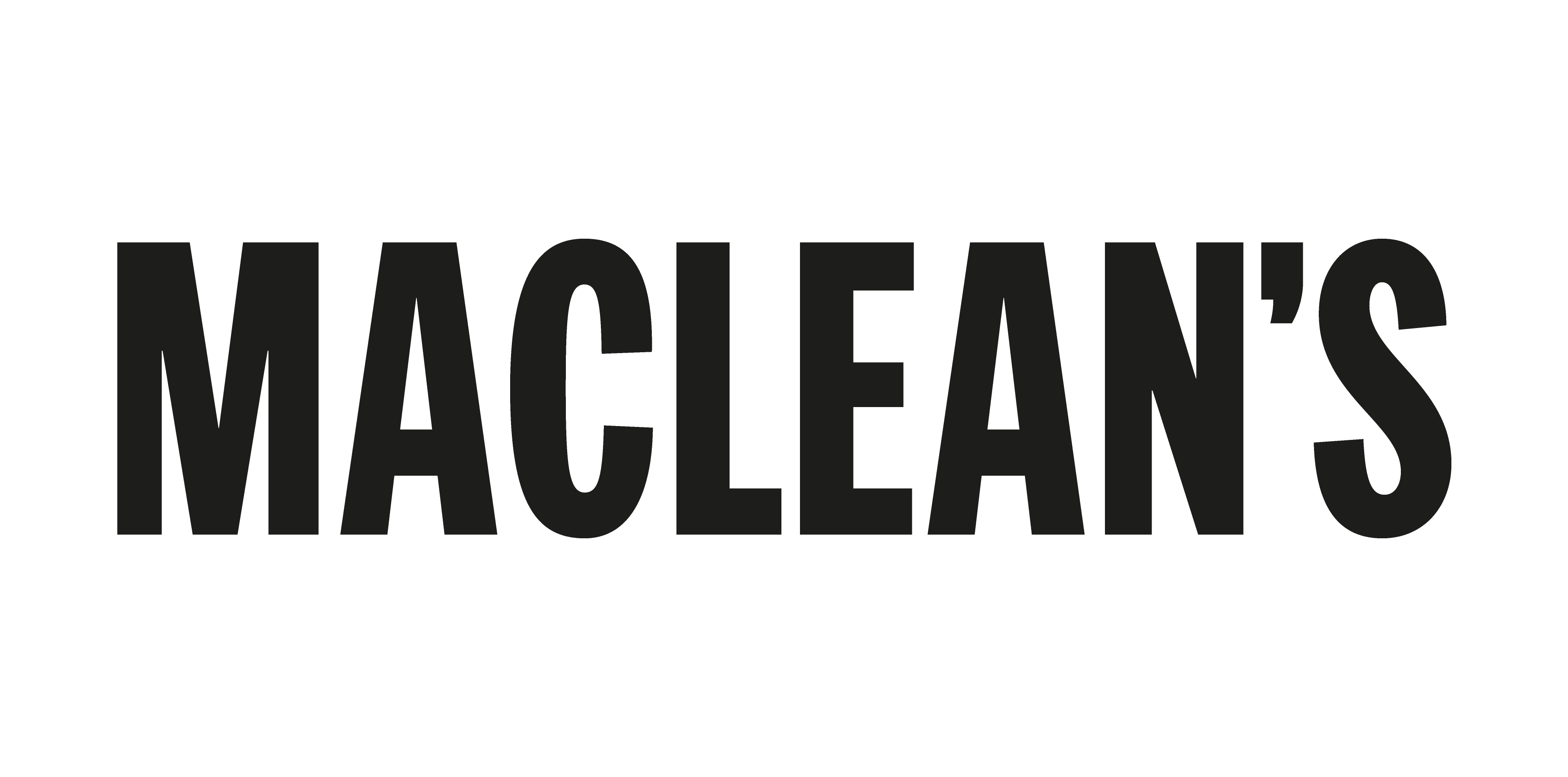
3Maclean’s nameplate
In 2009, ZeCraft was asked by Jason Logan in charge of the cover design of Canadian Business to improve their current masthead which was to be used for their upcoming redesign.
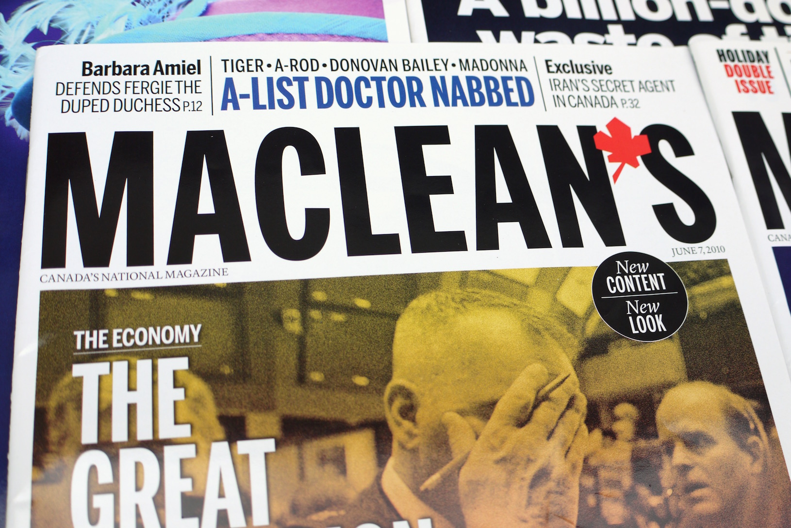
This time, Jason Logan teamed again with Jean François Porchez for Maclean’s cover. The idea was to recreate the 60’s version of Maclean’s nameplate. The job wasn’t so simple, as an autotrace of the original wasn’t the immediate solution. Maclean’s masthead was fully redesigned from scratch, to create the perfect balance between the open forms of the C+L and the quite heavier M+A+N diagonals letterforms. When the best form was achieved, several grades have been designed and tested, to create the best result on the cover when used with usual headlines. A good collaboration again.
Read more about this project on Typofonderie Gazette.
Client: Maclean’s, Rogers.
Art director: Jason Logan
Comparisons
1. New Maclean’s nameplate on the 2010 cover.
2. Maclean’s cover in 1964.
3. Maclean’s cover in 2006.