The Walrus

 1
1The Walrus
Logotype The Walrus. Nameplate for The Walrus Magazine, 2008. Under the direction of the art director, Brian Morgan, we’ve built a piece based on some very interesting exchange about typeface history, extract:
What interested us about Ambroise when we specified it was it’s ability to call up an era of profound ideas — the establishment of the metric system and modern civil administration, Chateaubriand and Balzac. But it did so without feeling like it had anything to do with fashion, which is the fate of all Didones, in North America, at least.
So, Brian wanted something close to Ambroise that he already use on its layout, but with English flair, close to Scotchs. I proposed several ideas, quickly from earlier typical Scotch proposals, I added to it more horizontal serifs: top of A, terminal of the R, lowercases styled U. The result is much better than the previous nameplate set in Le Monde Livre Classic. We extended this masthead into a full typeface, check it out!
Client: The Walrus Magazine.(Canada)
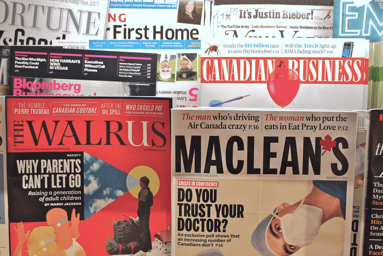
1. The Walrus cover along MacLean’s and Canadian Business magazines for which we’ve also designed their masthead.