The Independent Magazine

 1
1The Independent Magazine
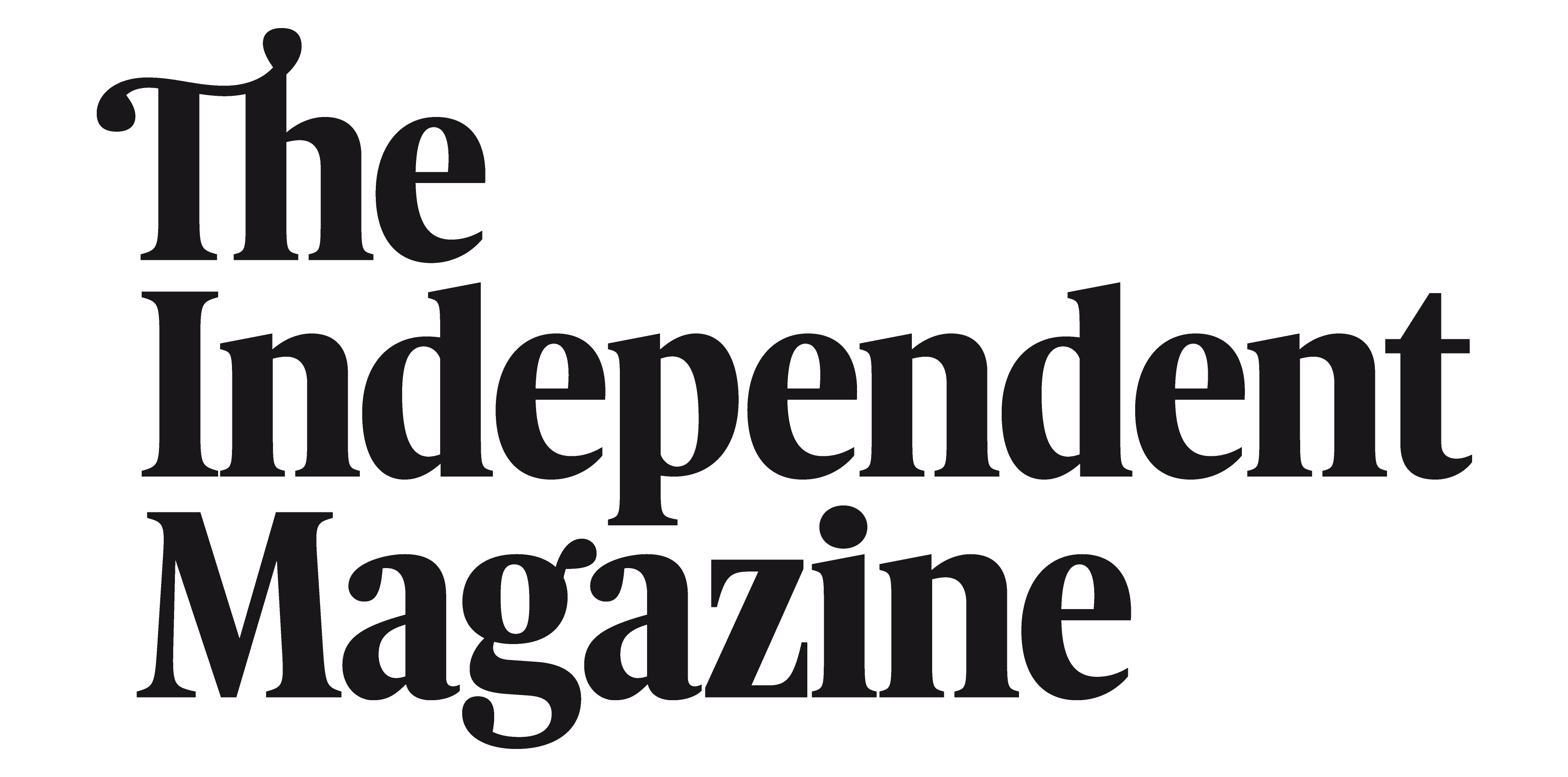
The Independent Magazine masterhead, designed in 2011 to fit their redesign and new typeface selection: Among them, the Poynter series as titling typefaces. Previous nameplate was set in a compact all caps sanserif. Our objective was to create a compact nameplate set in caps and lowercases based on style who will fit Poynter. Its not just three words, but a logotype. Few specific typographic details help to built a brand, such the ligature Th, with some echos on the g ear and bottom loop. Presented here in three lines, the nameplate can also be set in one line setting depending the cover design.
Art Director: Kevin Bayliss.
Client: The Independent Magazine
Awards
Club des directeurs artistiques: 43e Palmarès Nominee 2011, Typography category, logotype. The Independent Magazine logotype for The Independent Magazine, 04-2012.