Conran Design


 1
1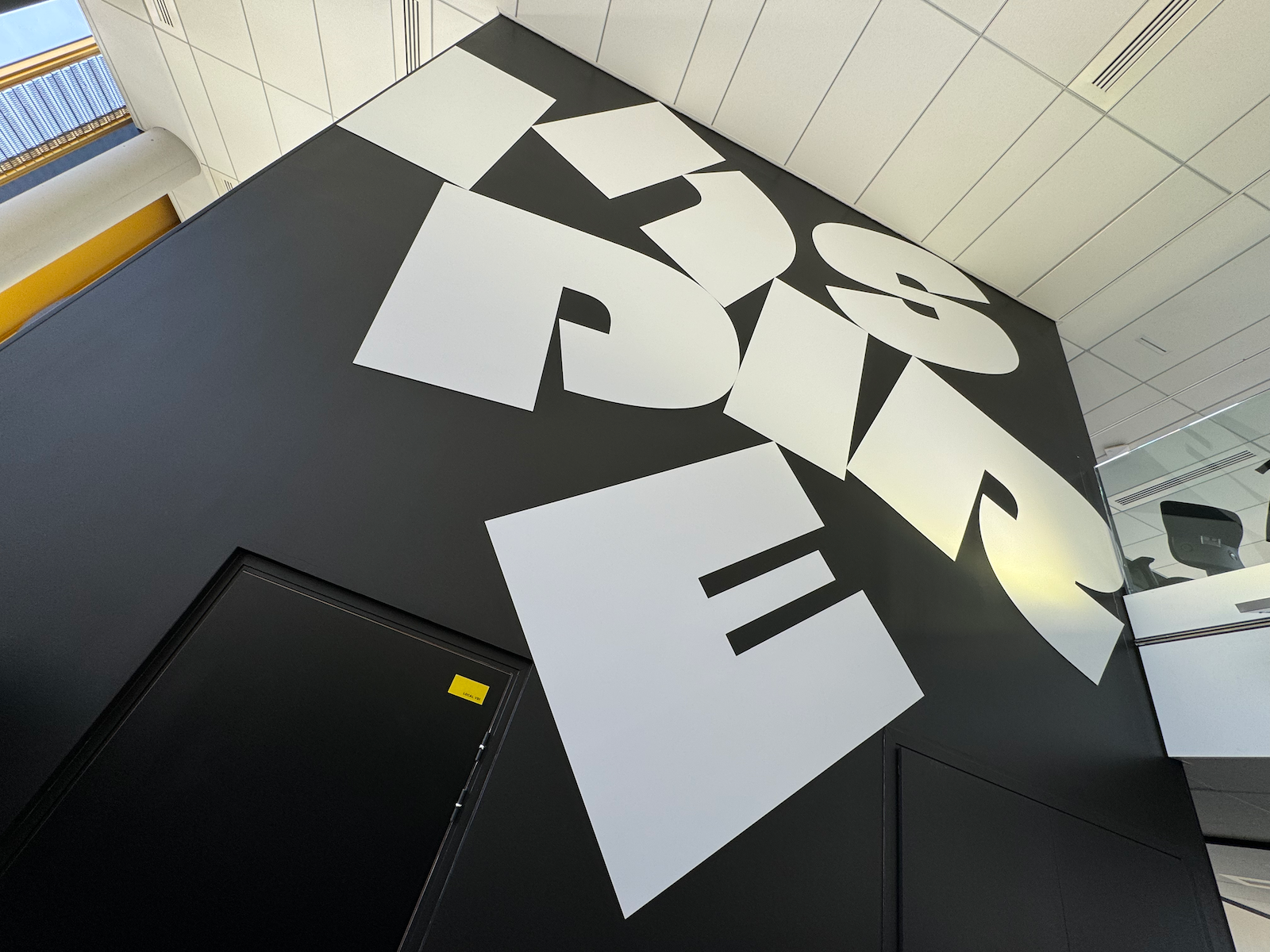 2
2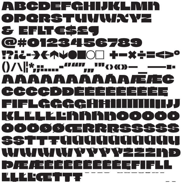 3
3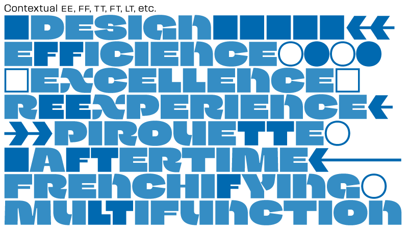 5
5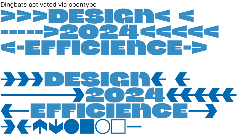 6
6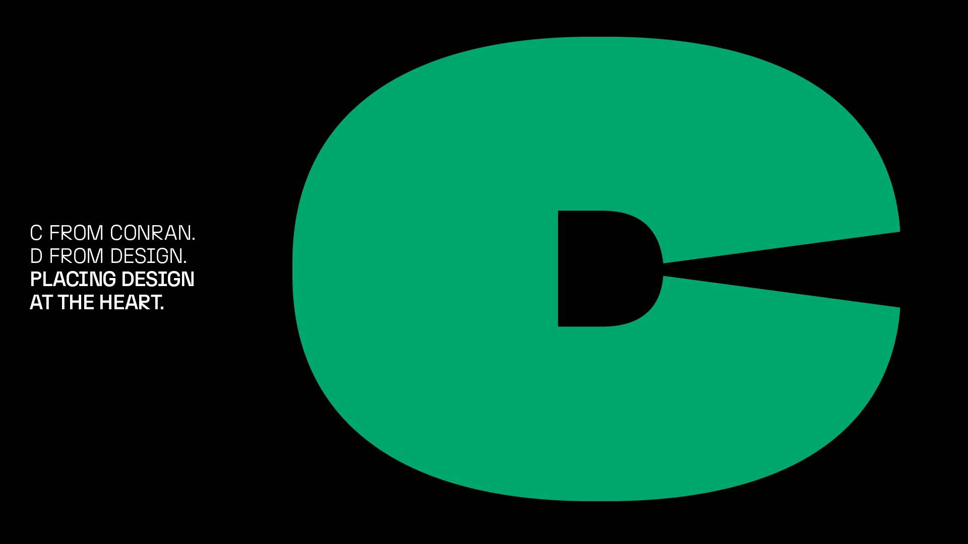 7
7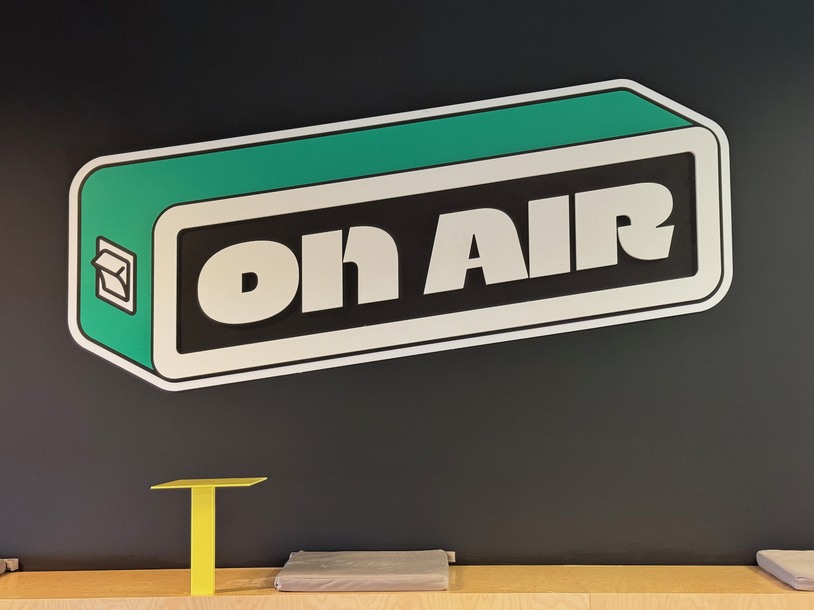 8
8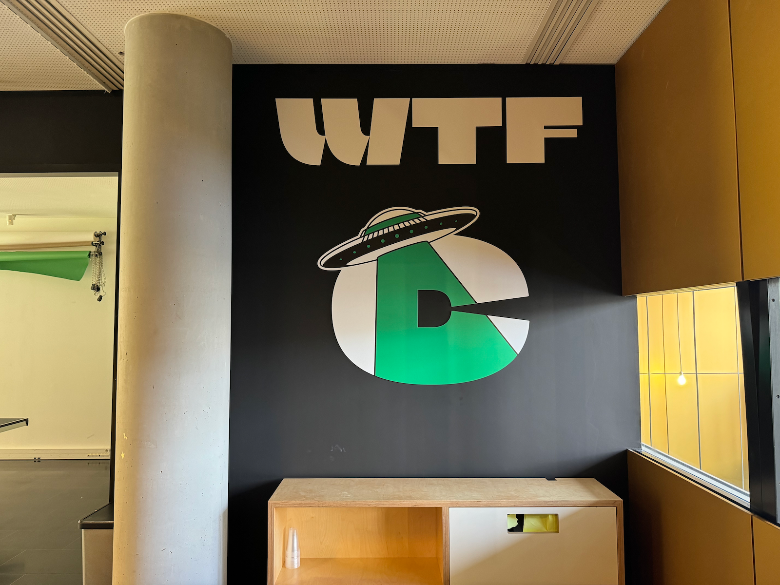 9
9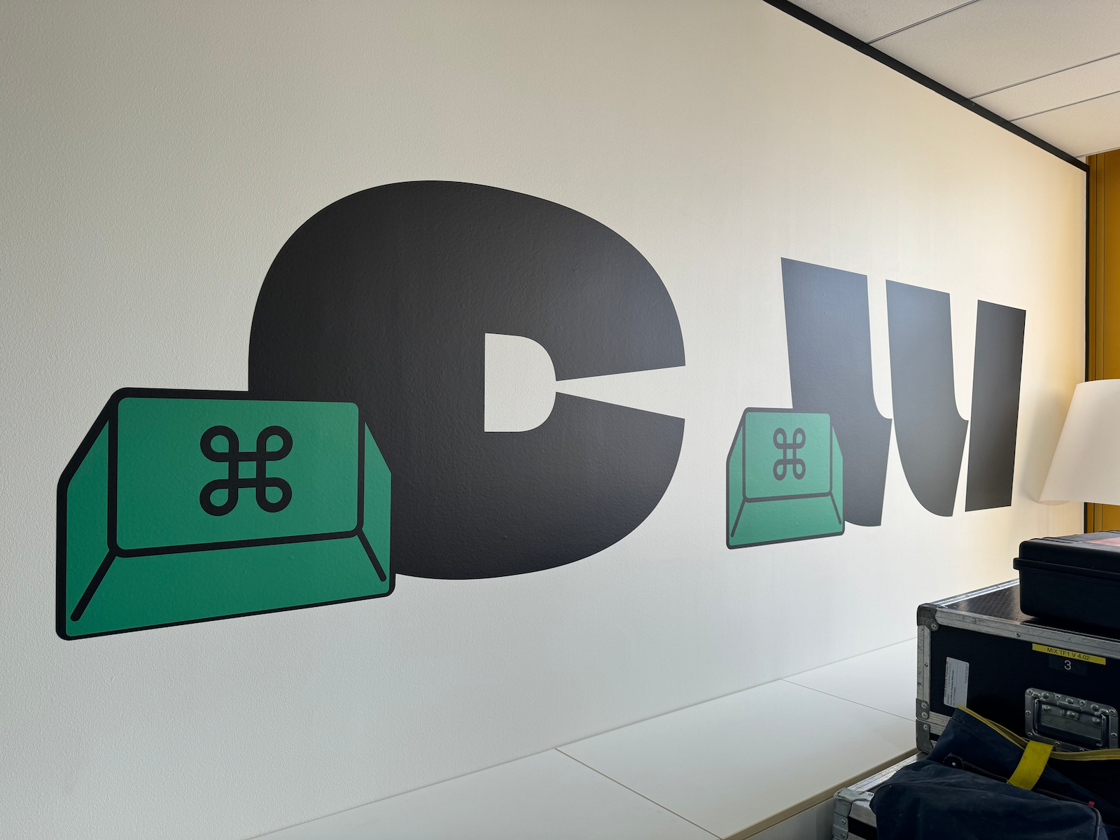 10
10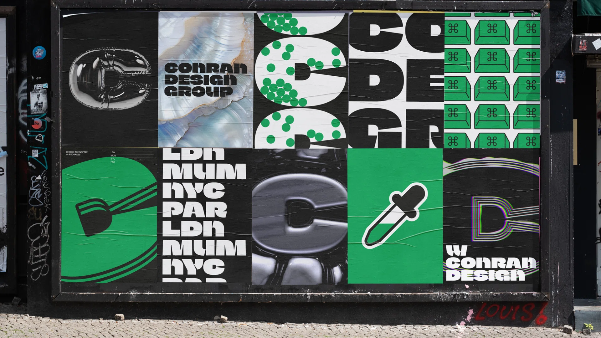 11
11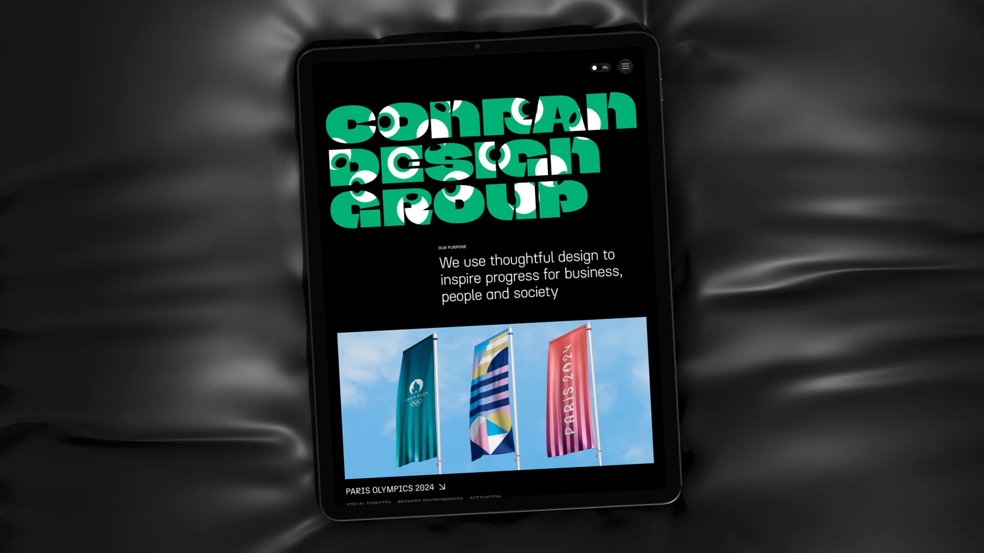 12
12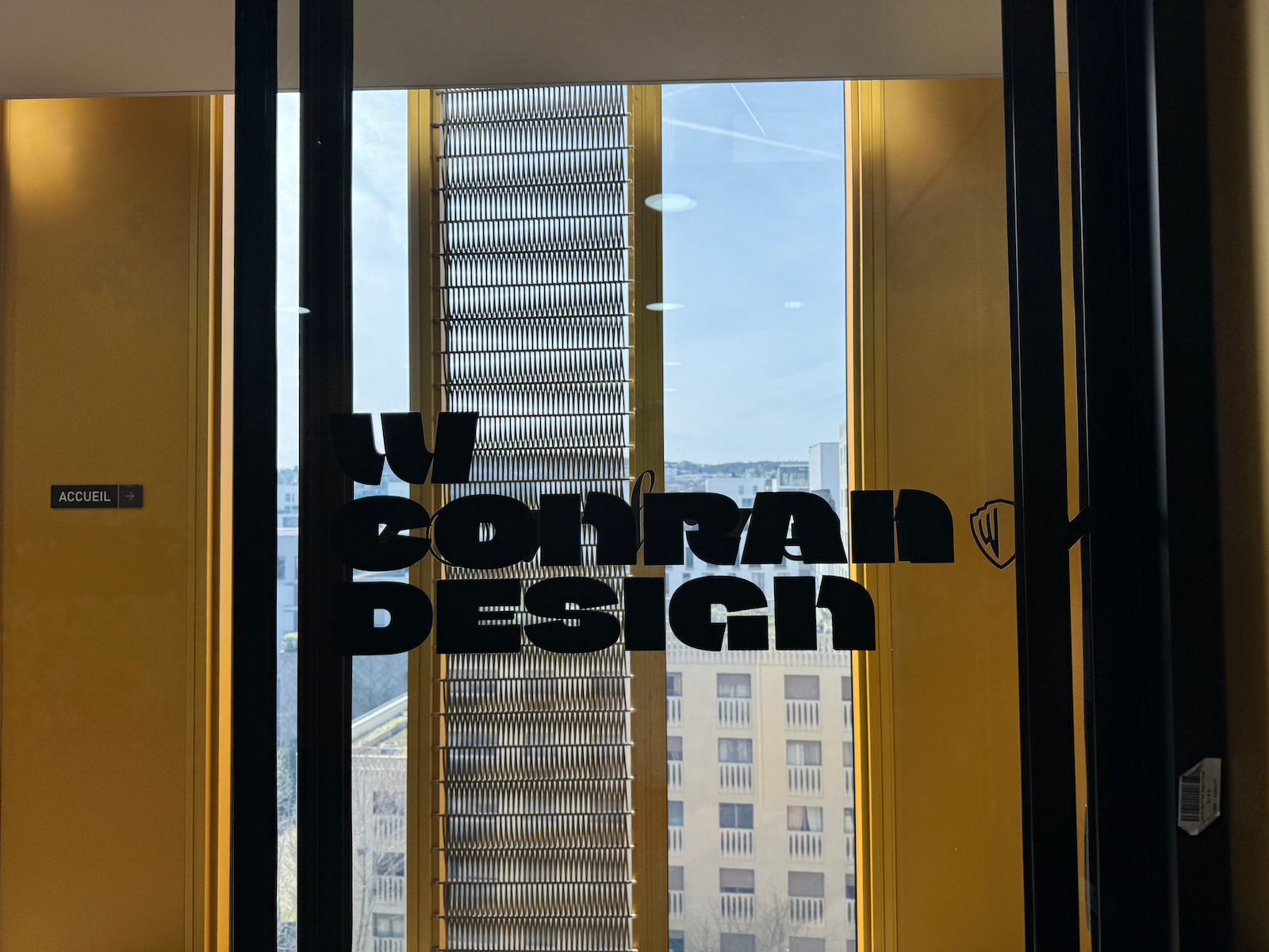 13
13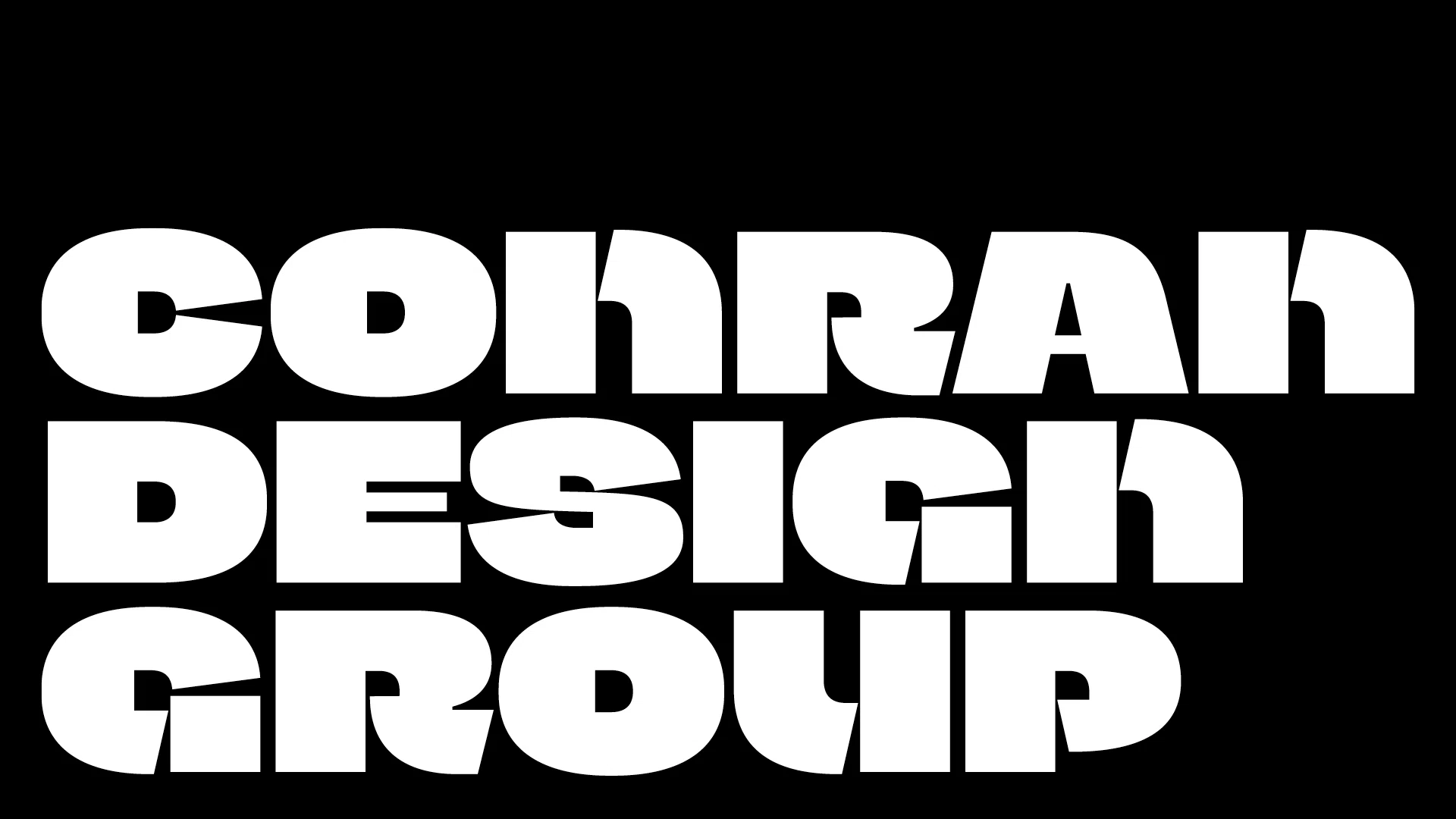 14
14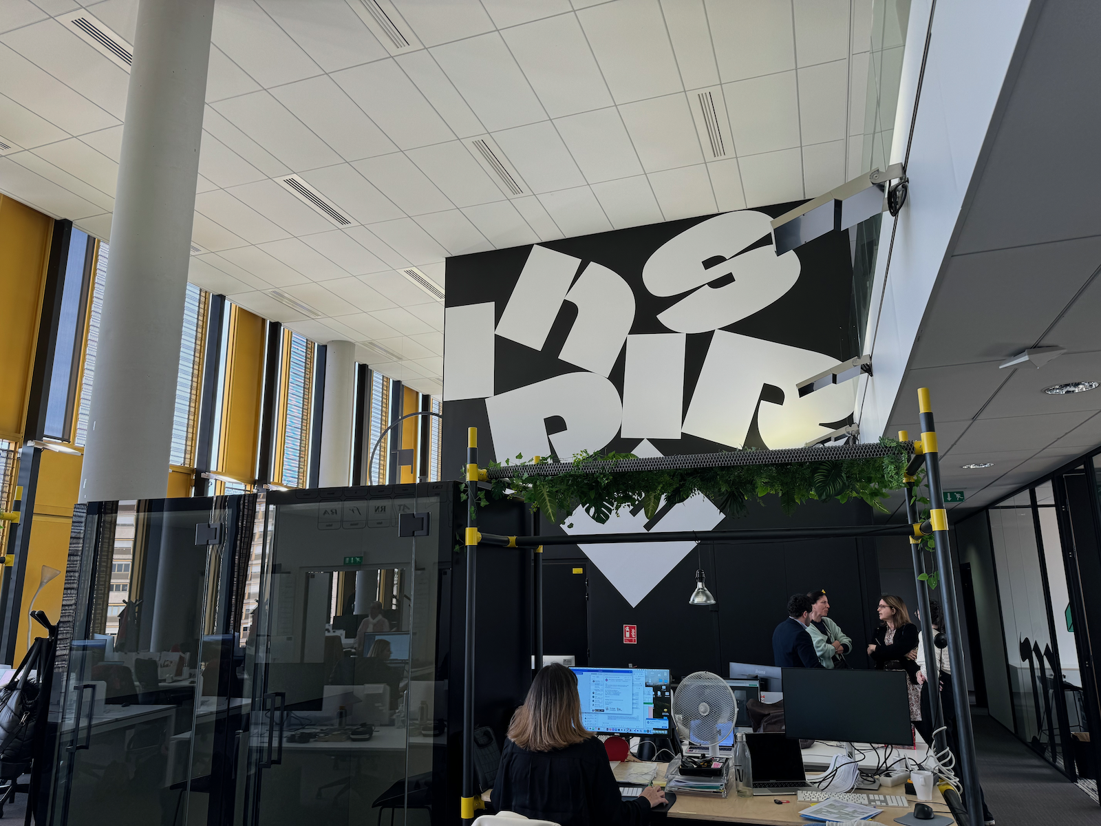 15
15Conran Design typeface
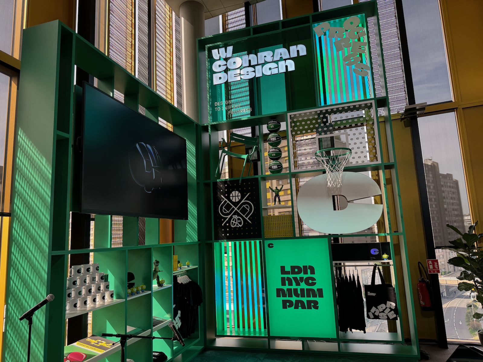
Founded over 60 years ago by Sir Terence Conran, Conran Design Group has undergone a design overhaul as it becomes Havas’ brand and design network, with the French design agency, “W Conran Design as a founding partner.”
Conran Design Group needed to feel big, bold and playful. The idea was a branding typeface with a strong personality, which allows you to install a brand territory without the need to use the wordmark. Strong in spirit but joyful and optimistic at the same time. That was the brief for the typeface!
You notice the angles and diagonals that bring a unique touch to the Conran Design Group brand, as well the heavy weight, an tight spacing. Some counterforms are unusual, such as that of the C which reveals a D. Some letter pairs have been designed to reinforce the impact of words when identical letters are side by side: EE, LL, TT, etc.
W Conran Design’s ECD Paul Groves says: “With such a strong typographic style, we then thought it would be interesting to go beyond the wordmark and create a typeface that could be used for key words like inspire, design, progress.”
“We’ve always been passionate about creating original typefaces designs for our clients, so it was natural to take this direction for our own brand,” says Paul Groves.
Client: W Conran Design Group .
References: Conran Design Group rebrands with help of Le Monde type designer Jean François Porchez by Liz Gorny. Conran Design Group Unveils a Fresh, Progress-Minded Identity by Amelia Nash. Iconic Brand Signals New Era for Conran Design Group.
1. to 2. W Conran Design office.
3. Conran Design alphabet.
4. Contextual ligatures.
5. Dingbats and arrows.
6. The iconic C.
7., 8., 9., 10. Use of the typeface on Conran Design office walls.