Cabinet d’écriture

 1
1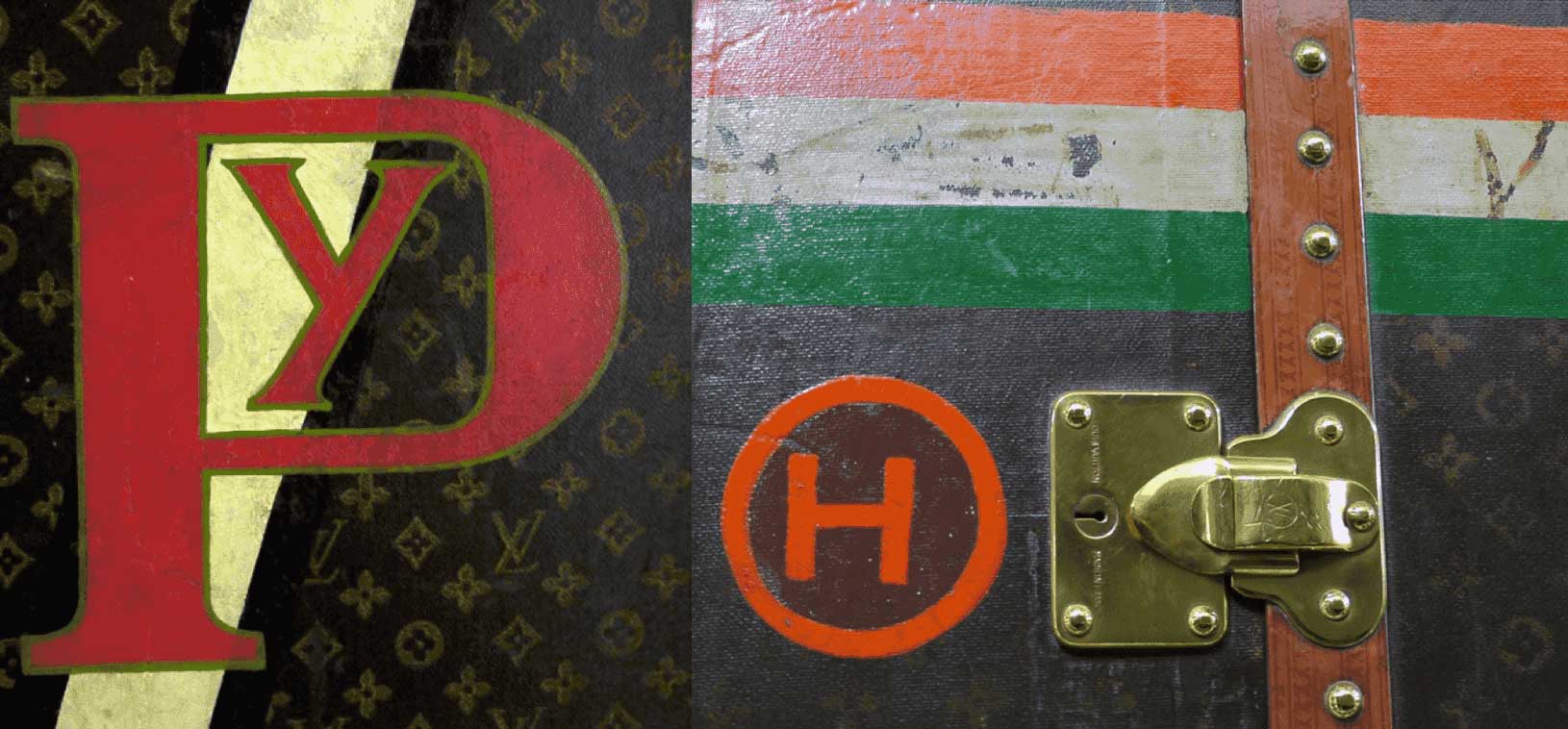 2
2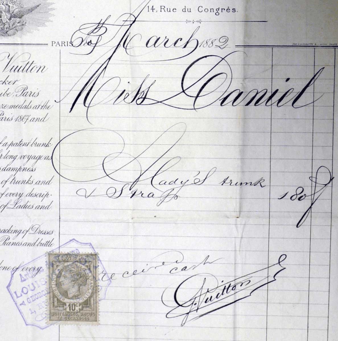 3
3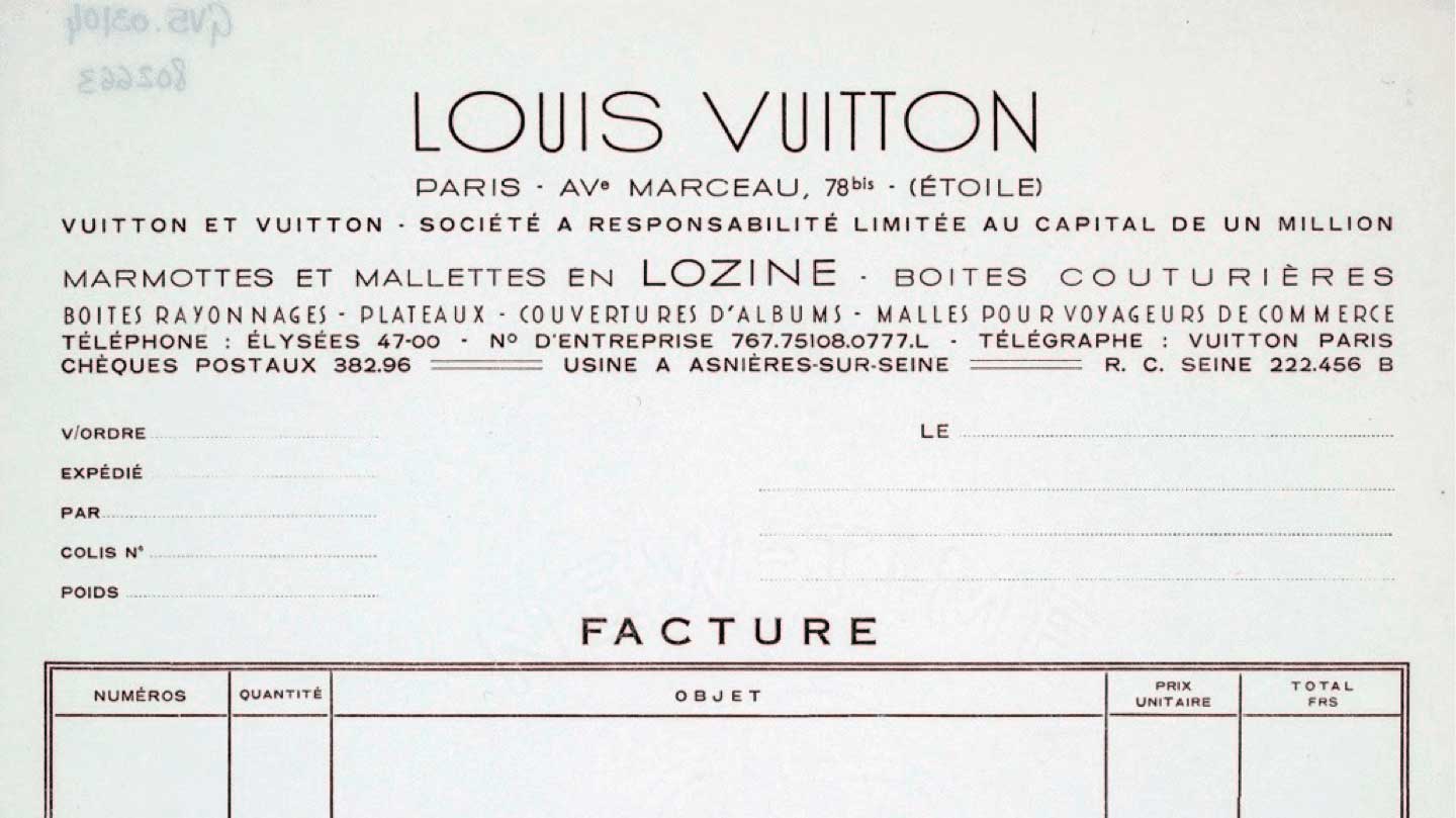 4
4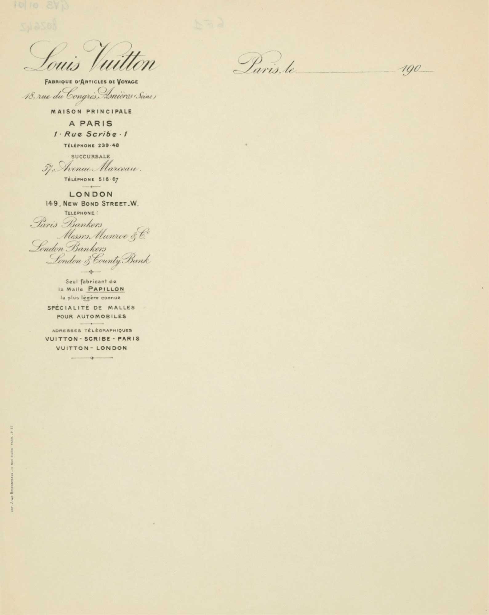 5
5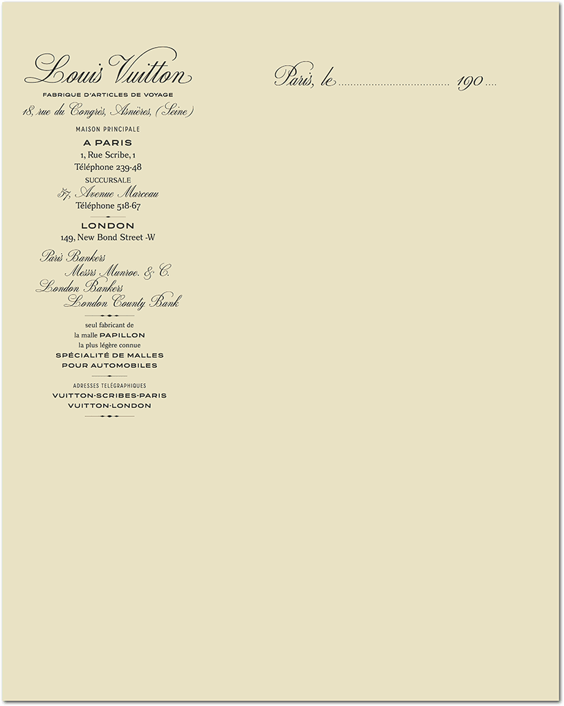 6
6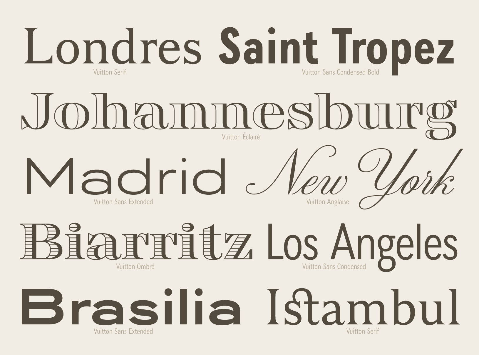 7
7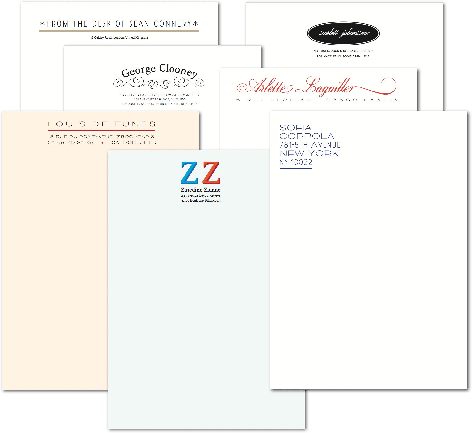 8
8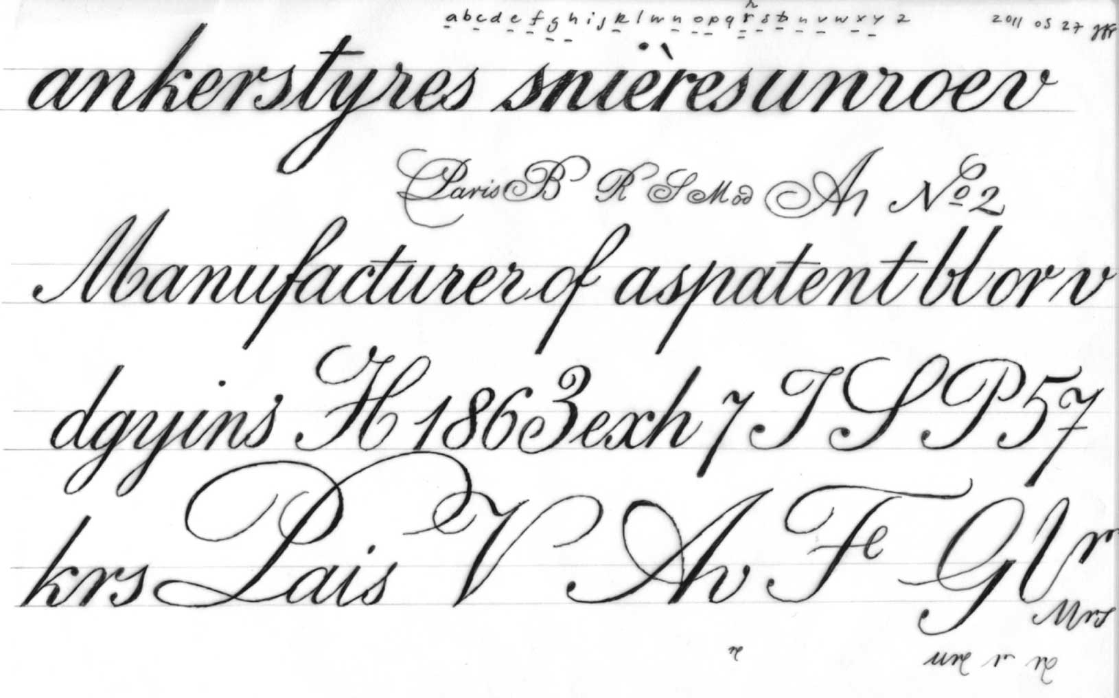 9
9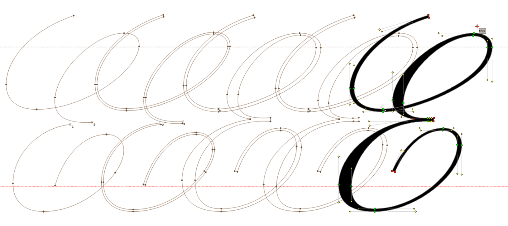 10
10 11
11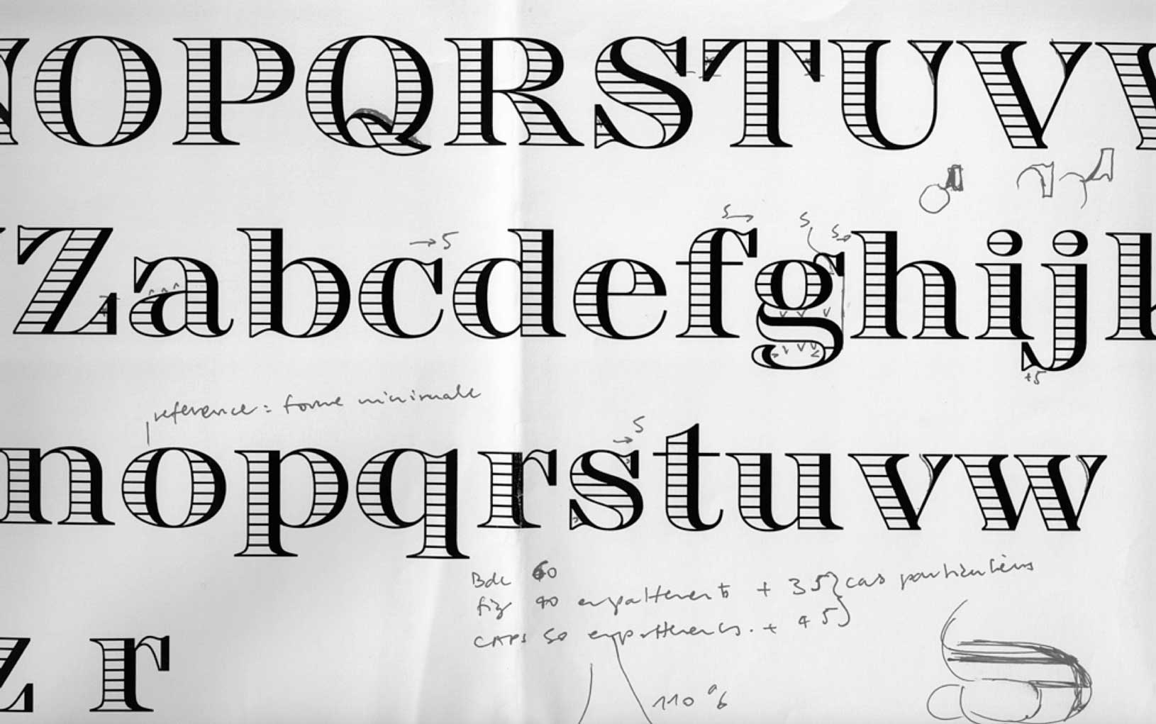 12
12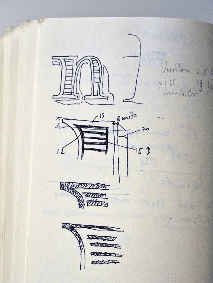 13
13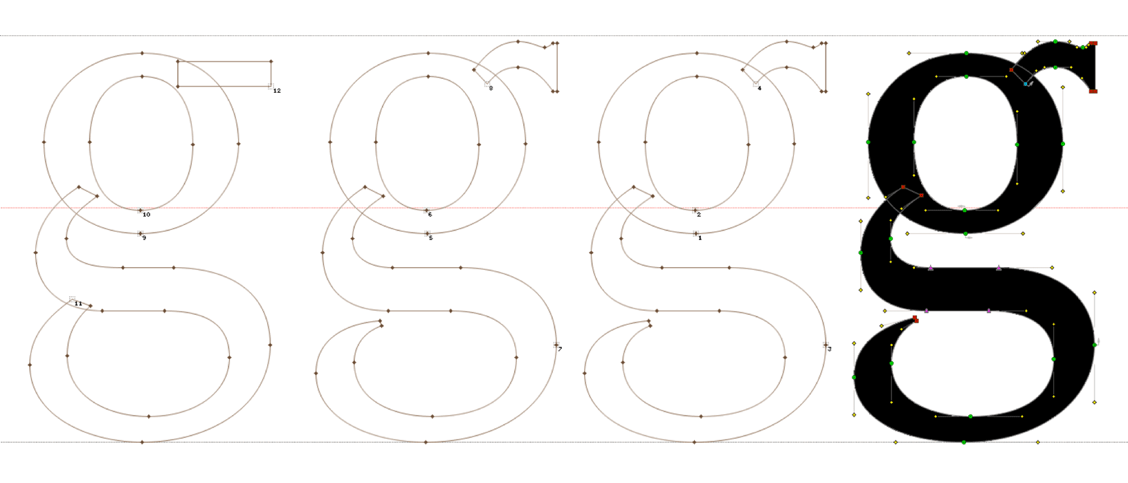 14
14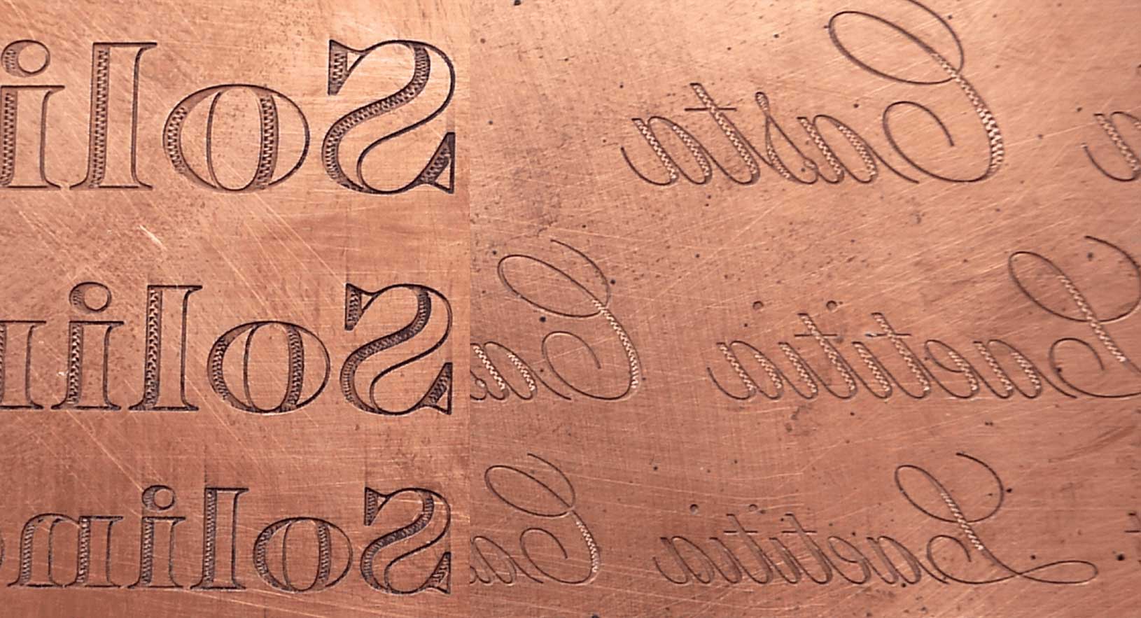 15
15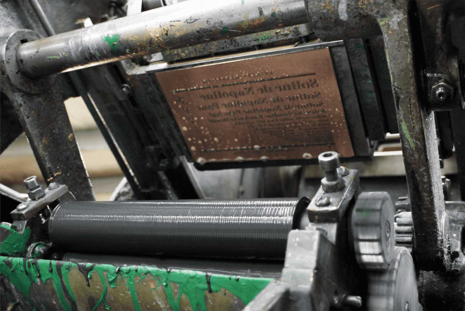 16
16Louis Vuitton alphabets for the Cabinet d’écriture
This collection of unique alphabets for the Cabinet d’écriture is designed to bring back to reality the long history of the 19th and early 20th century engraved French style. We conducted research based on Vuitton archives, worked closely with Vuitton design team during more than a year. The printing on special papers, using a tailored range of colors will be done through copper-plate engraving, stamping, in a pure French savoir-faire. The new typeface collection is exclusively used for Vuitton bespoke stationery and personalizable writing materials.
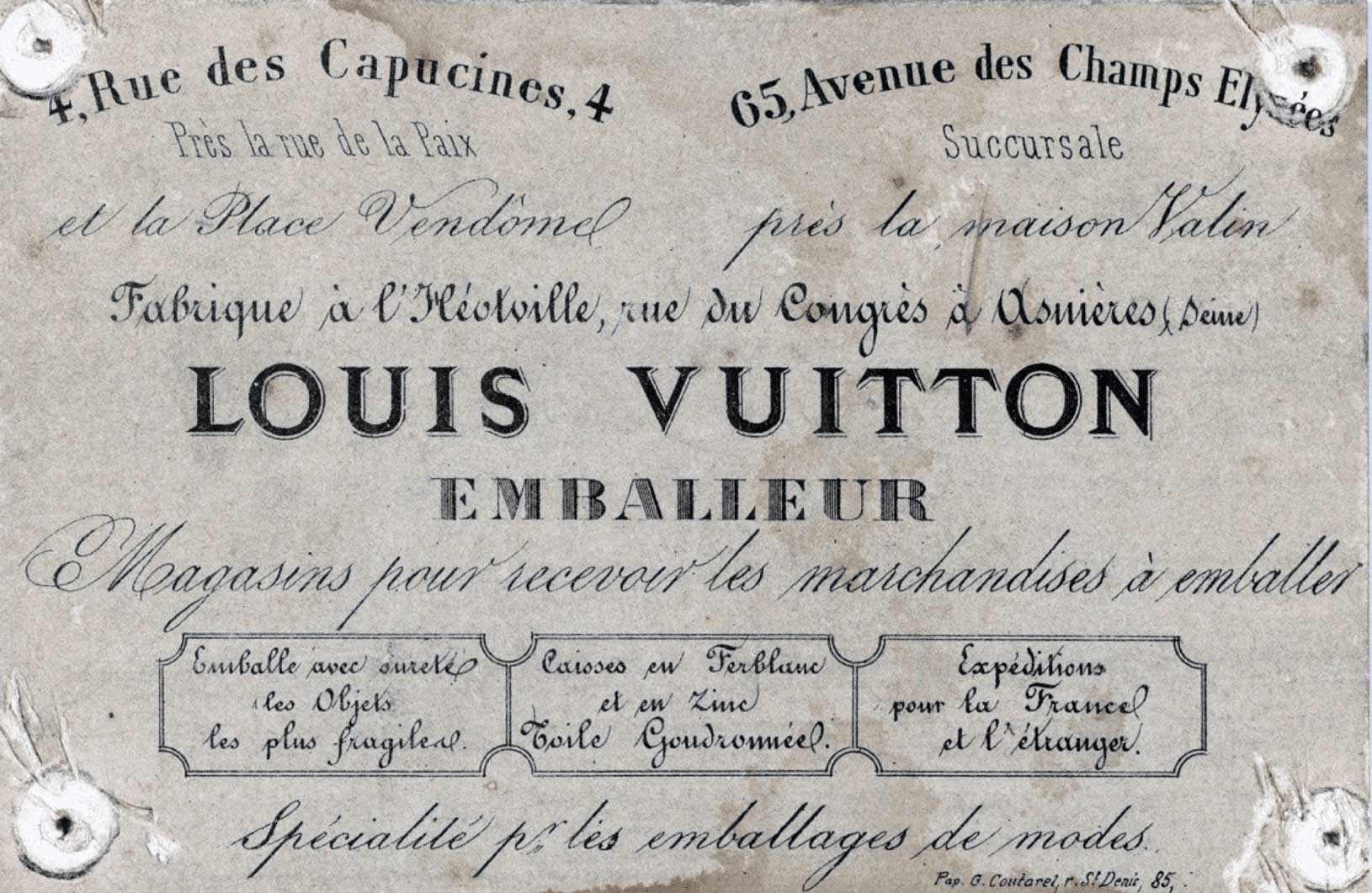
Since the early years, the Vuitton family is connected to design, graphics and typography. Louis Vuitton, as Gaston Louis Vuitton share great interest in anything related to design. The famous Monogram pattern is even designed by the founders in order to protect their product against copies. Gaston Louis Vuitton collect old books, hotels stickers and many others items connected to graphic design and typography. He is a master in calligraphy as you can see on this invoice wrote by him as natural way to conduct everyday operations. We have worked closely with Vuitton design team, visiting the archive of the company several times. We worked on a collection of historical references as sources of inspiration for the made to order stationary project. The objective was to create different typographic assemblages for the stationery. In Luxury, clear roots make the different. Even if adapt them to our contemporary eyes.
In France, we use the word Anglaise for Copperplate scripts. The starting point was the historical Vuitton letterheads. To catch the proportions and style, we have to reproduce various key shapes. The serif version concept was based on the 2007 bi-color typeface Vuitton Persona that we have created for the made to order bags. The style of the caps have to be adapted to lowercases, to emulate a sort of Latine, a typical non purely alike foundry type, more close to what engravers can do, day to day in their shop. Something not clearly based on any typographic classifications. The sanserif is a mixture of a geometric shapes with Grotesk elements, pure Art Deco forms, weird figures that only a lettering artist can create at the time. The Engraved version was one of the most difficult thing to achieve. Everything have to align and match the x-height.
Stamping technic favor the details that are generally not possible with a laser printer… it’s very impressive to discover that old printing technics still superior to latest technology. The result is an assemblage of styles who create specific atmosphere in association of specially made papers and colors. At the end, the Cabinet d’écriture typeface project, is 10 fonts, 6878 glyphs, 638 421 kerning pairs.
Client: Louis Vuitton Malletier.
1. to 4. Louis Vuitton Malletier historical references: Labels, Monograms on trunks, Stationary, Invoices featuring calligraphy by Gaston Vuitton.
5. to 6. Louis Vuitton Malletier historical stationary compared to the stationary reset with Vuitton cabinet d’écriture typefaces.
7. Vuitton cabinet d’écriture typeface family.
8. Vuitton cabinet d’écriture fake stationary used to demonstrate the various styles of the typefaces.
9. Vuitton cabinet d’écriture Anglaise sketches made from archives sources.
10. Vuitton cabinet d’écriture Anglaise step by step outlines.
11. Vuitton cabinet d’écriture Ombrés digital sketches in order to find the right number of horizontal lines.
12. Vuitton cabinet d’écriture Ombrés corrections to be made.
13. Vuitton cabinet d’écriture Ombrés notes about the positions of various outlines on screen.
14. Vuitton cabinet d’écriture Serif step by step design of the g lowercase.
15. to 16. Vuitton cabinet d’écriture copperplate and stamping printing tests.
Copyright
Vuitton Cabinet d’écriture typefaces collection will never be made available to the general public.