France 2026 Serif


 1
1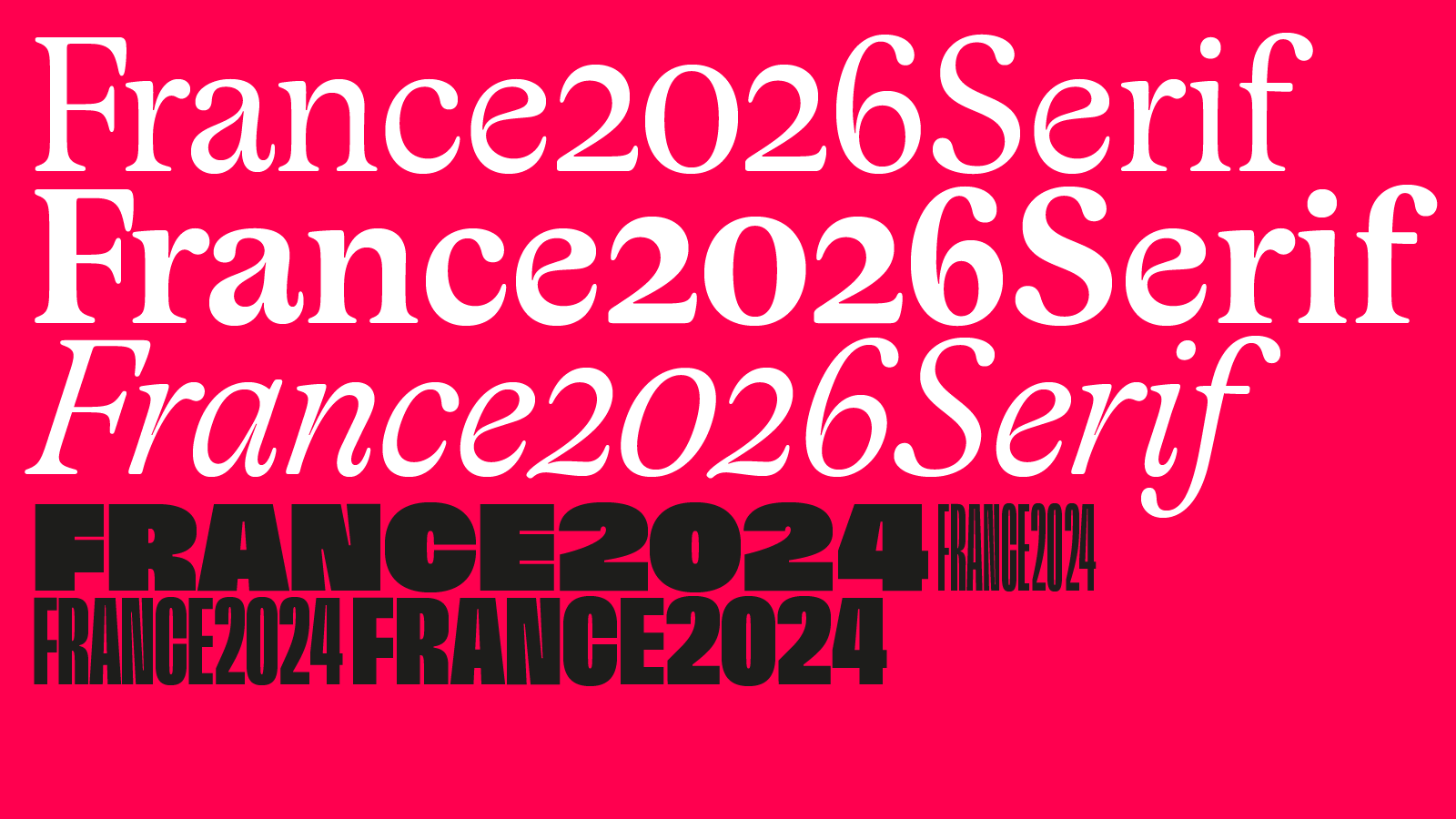 2
2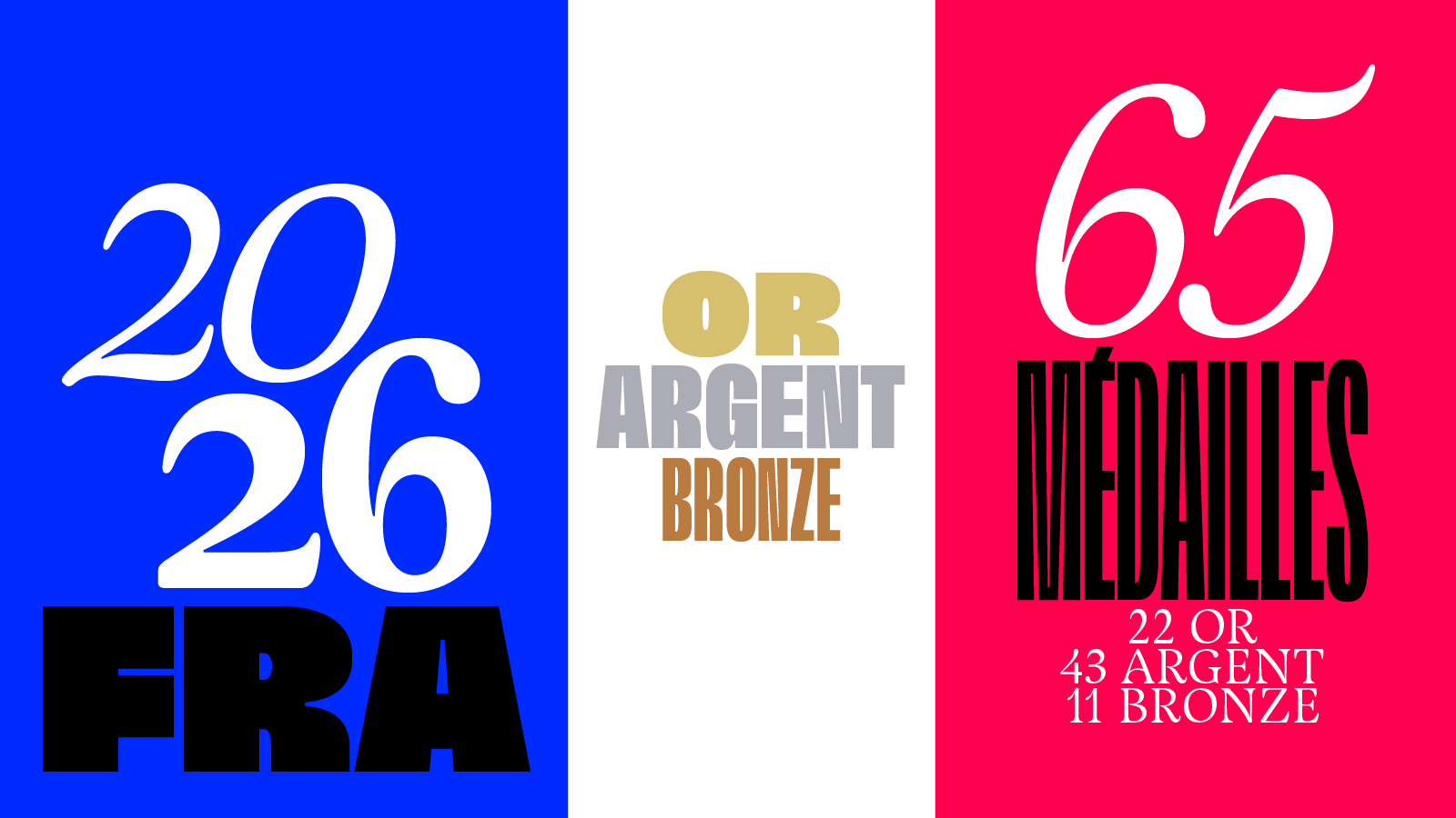 3
3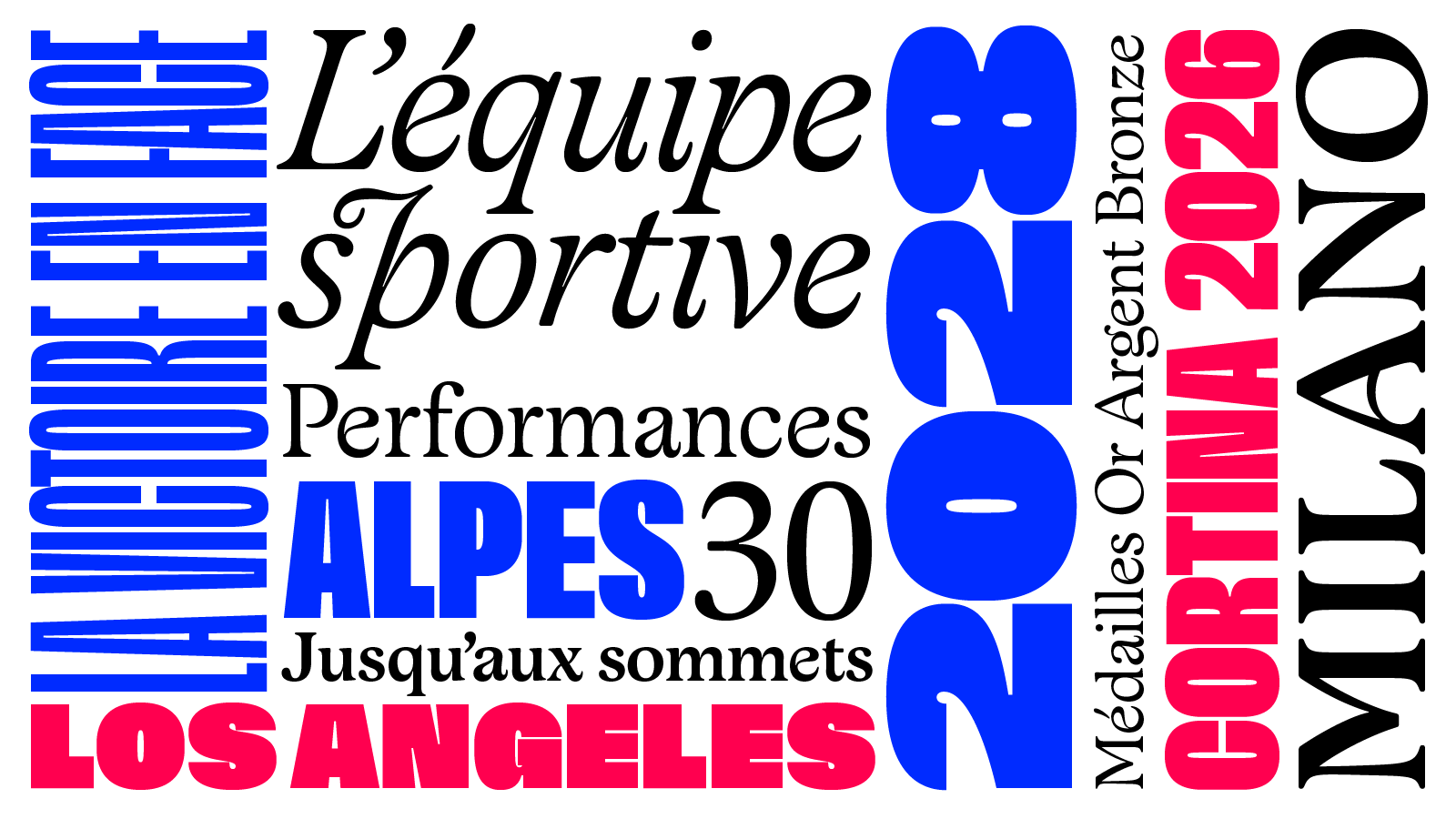 4
4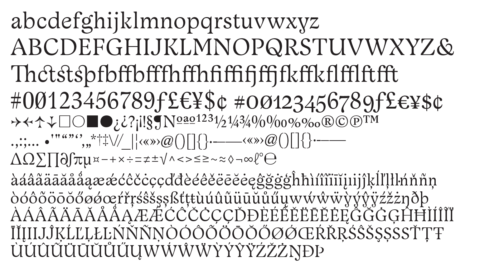 5
5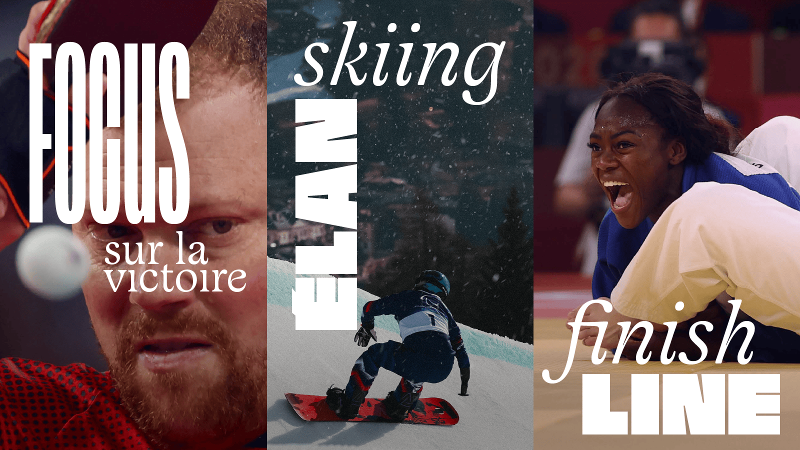 6
6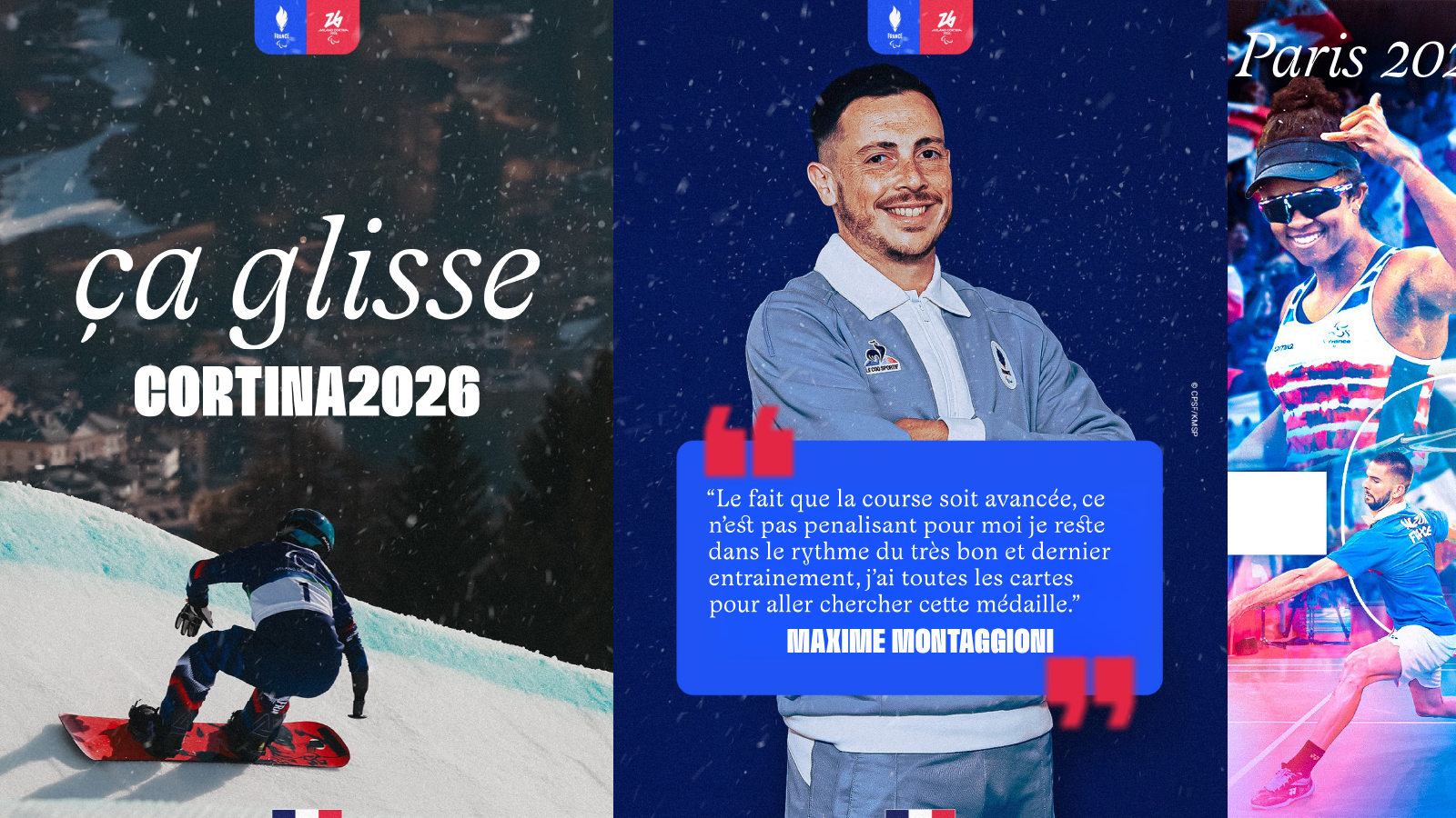 7
7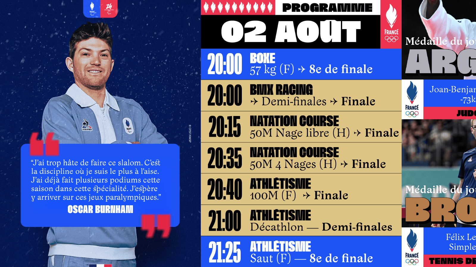 8
8France 2026 Serif
France 2026 Serif is the official typeface of the French team to be used together with France 2024 Sans. While France 2024 Sans is rigorous and massive, France 2026 Serif wants to be more human, fluid. These two families respond to different practices.
The typeface France 2026 Serif reaffirms an Art Nouveau influence. The French Art Nouveau movement is characterised by fluid forms, influenced both by nature and handwriting, the gesture of the brush. The Art Nouveau period in typography is represented by Auriol by George Auriol, a typeface where the gesture of the brush by touch is clearly visible. It is also the work of Hector Guimard, architect, designer of iconic elements of the Parisian metro, including the wordmark Métropolitain which takes up the curves of nature, volutes that bring a certain sensuality to the letter forms on the entrances of the Parisian metro.
France 2026 Serif is designed as a headline and text typeface. Its relatively low contrast allows good readability on the screen. Some details that disappear in text are revealed in large size, bringing these delicate nuances, especially in the way in which the horizontal of the e joins the left rounded shape, as well as letter like n, draw more cursive than normal for a Roman typeface. Italics are drawn very inclined, with many curves, in volutes, ornamented.
Because the objective is to have two totalities in the communication of the French Olympic team: a frank and massive typeface, France 2024 which affirms victories, commitment. And another, France 2026 Serif that reinforces the human experience of athletes.
In addition, we designed the wordmark France.
Clients: Comité national olympique et sportif français, whose role is to disseminate and defend the fundamental principles and values of Olympism, in accordance with the Olympic Charter.
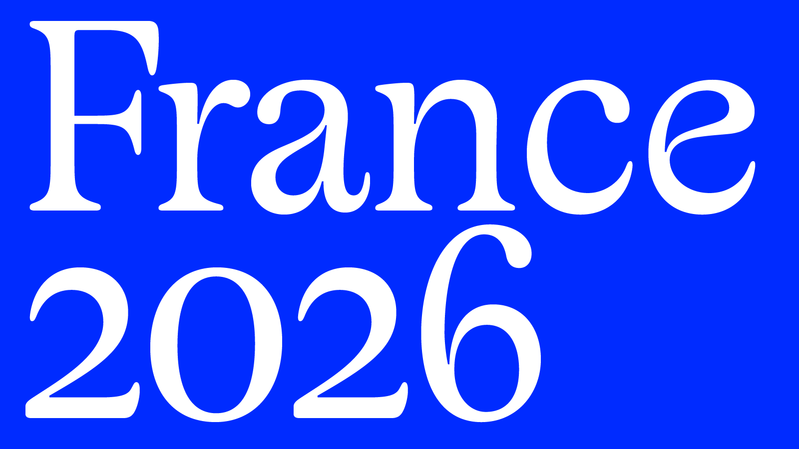
1. France 2026 Serif.
2. France 2026 Serif and France 2024.
3. & 4. France 2026 Serif and France 2024 font pairing.
5. France 2026 Serif alphabet.
6. to 8. Usage in context.