Chatelaine

 1
1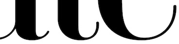 2
2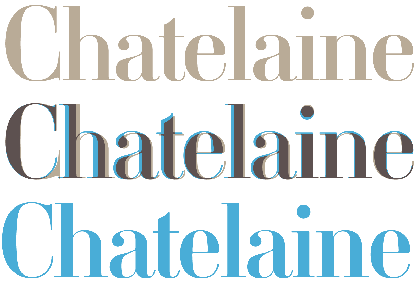 3
3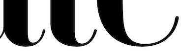 4
4 5
5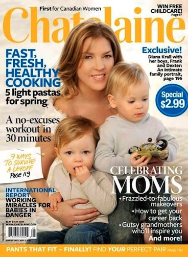 6
6Chatelaine
There is several ways to create a good masterhead for a magazine. Generally the starting point is the actual design in use. Typically it need some improvements on spacing, weights, contrast, details here and here. In some others cases, because the magazine was fully redesigned, the team in charge of the design select a typeface, set a word, play with its spacing a bit: the result is not always perfect. Chatelaine masterhead follow more or less this situation. The past design was based on Times probably with few details modified through the years. The new art director of Chatelaine, Sandy Kim asked Jean François Porchez to adapt his Ambroise for the new masterhead. The first problematic thing was the double serif the C cap, specially because the previous logotype featured a special C with a bowl on the top. After several proposals, the final masterhead was at first glance very similar to Ambroise. The reality is different. In fact the minor adjustments make the difference between a standard typeface and a logotype, even very simple ones like fashion magazine’s Didots-Bodonis. In a recent cover critic, Scott Newlands says about it: The refreshed logo isn’t a huge variation on its predecessor but is very contemporary and should speak well to Chatelaine’s readers.
Client: Chatelaine, Rogers communication inc.
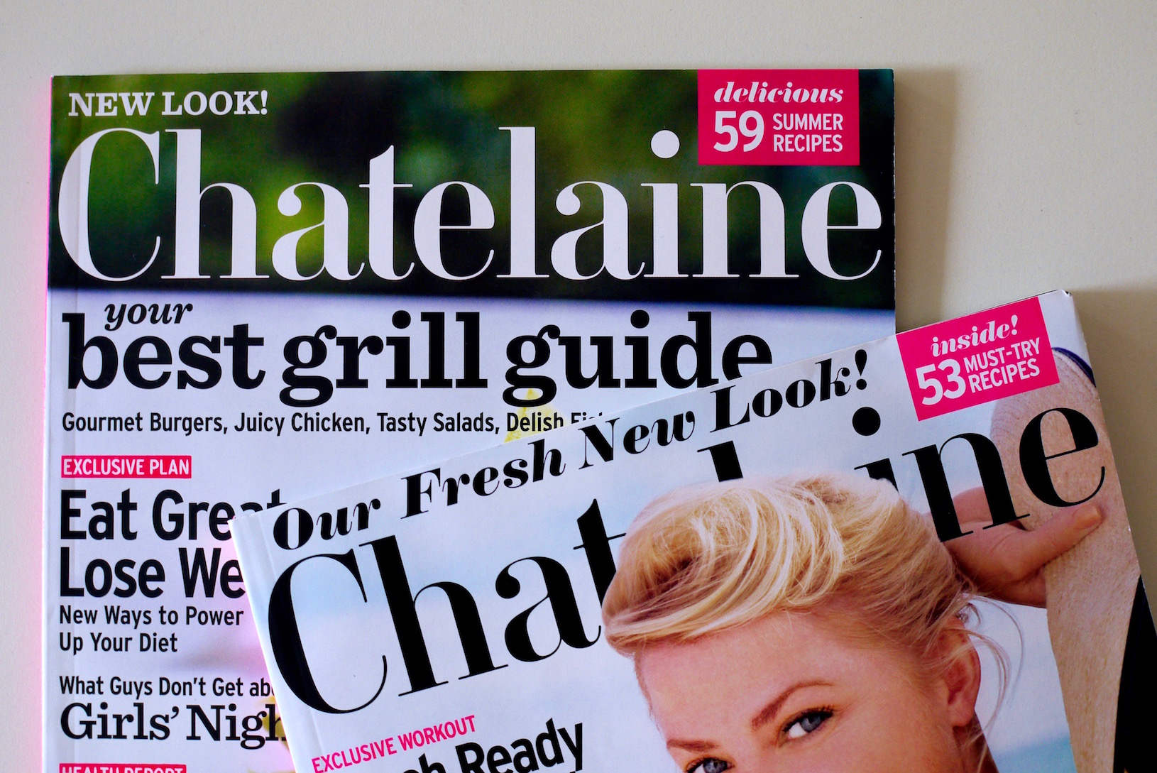
1. Chatelaine covers.
2. and 4. Endings compared: Ambroise on top versus final design bottom. At the end, simplicity need a lot of work, in order to looks obvious and nice. On Chez Porchez blog, you can enjoy some of the first proposals for this project. The nameplate was introduced in June 2010 along the redesign of the English edition. French version for Québec wasn’t yet relaunched.
3. The word set in Ambroise is nice but you can be able to immediately spot that the e seems very wide and open. The terminals of a, t, e are not enough related for a logotype. Weight can be a little bit adjusted too: stems seems a bit lighter compared to curves forms: Its a typical thing for a Didot, but doesn’t work for a logotype! And indeed the double serif of the C and its size wasn’t so nice to fit well with the rest of the word.
This overlap demonstrate well how it can be different, when at firstglance they seems almost identical.
The final design feature a new C, with a specific top serif, more soft on its finish. The proportions of the various letters have been carefully adjusted: the most visible thing, is the narrow e;. The terminals of the a, t, e and C have been designed to work well all together. The x-height is slightly higher. Finally the distribution of the white space around letters have been improved: just compare a-t-e or the a-i-n with no more overlap serifs. Check out a larger size image of the Chatelaine new logotype.
5. Chatelaine cover: after.
6. Chatelaine cover: before.