Canadian business


 1
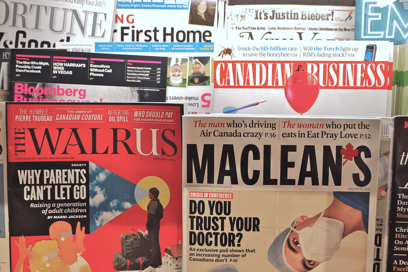
1Canadian Business
In 2009, ZeCraft was asked by Canadian Business to improve their current masthead which was to be used for their upcoming redesign. We discussed the possibilities with Jason Logan, in charge of the cover redesign, about the future design. The first step was to correct all problems with the current typeface used to set the new nameplate: Onyx. While a typeface can be good in some uses, for instance headlines settings, when it comes to a real brand, it quickly shows limitations. We can see a bit of Vendôme on the final result, but it’s because of the triangular serifs.
Interviewed by Marketing Magazine following the relaunch, Jason Logan described the new nameplate as: as being like a “well-tailored suit.” It aspires to have a more “slick European” flavour, as opposed to a “blunt” American tone. Read more about this project on Typofonderie Gazette. Canadian Business: Before/After on Issuu.
Art director: Jason Logan.
Client: Canadian Business, Rogers.
1. Canadian Business cover along The Walrus and Maclean’s for which we also designed the masthead.