Le Monde


 1
1 2
2 3
3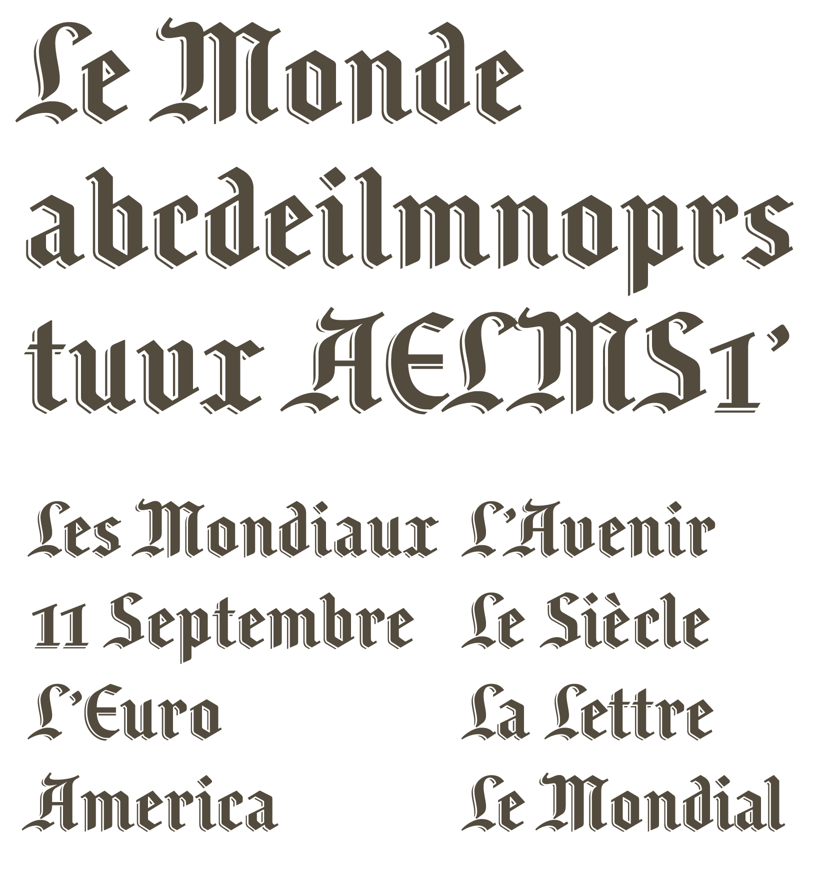 4
4Le Monde
Logotype Le Monde, for Le Monde newspaper, 1994. The idea was to simplify the historical logotype from 1944, polishing the shapes and details, and offering a good signal to readers in 1994: Your newspaper is a modern newspaper, it’s not anymore this old institution. The xheight was enlarged to improve the impact and contrast on the front page.
Two versions of Le Monde nameplate have been designed. One for large sizes, another for small sizes and website. From it, various projects helped to created a partial alphabet between 1994 and 2005. Project part of Le Monde typeface project, the source of today Le Monde Journal + Le Monde Sans typefaces.
Client: Le Monde
1. Le Monde logotype: M large and small sizes compared.
2. Le Monde logotype: before.
3. Le Monde logotype: after.
4. Partial Le Monde Logotype alphabet.